Key takeaways
- Format: Phone UI with hand-drawn arrow callouts.
- Best for: Fintech and SaaS products for online businesses.
- Hook: Seeing familiar ad platforms in the transaction list.
- Reuse it: Point arrows from benefit lines to a real app screen.
Available sizes
What is a feature callout ad?
A feature callout ad is a static image that shows a single product with short text labels pointing to its key features or benefits, usually joined to the product by thin lines. It explains several selling points at a glance without a long caption, which is why it's common for supplements, skincare, electronics and kitchenware.
See all feature callouts ads →Why this feature callouts ad works
- 01
Familiar merchants
Shopify, Facebook and Google charges instantly tell e-commerce owners this is for them.
- 02
Hand-drawn arrows
Casual arrows feel human and guide the eye from benefit to proof.
- 03
Lime CTA button
The bright button is the only saturated colour, making the action obvious.
- 04
Compliance line
The partner-bank disclaimer adds legitimacy to a financial product.
Full creative breakdown
Who this ad targets
This ad targets e-commerce founders, DTC brand owners and performance marketers aged 25 to 45 who spend thousands each month on paid ads. They want rewards on ad spend, cleaner bookkeeping and control over team spending. They are comfortable with fintech apps and new business banking tools. Lookalike audiences built from past purchasers are a strong next step once the ad has data.
Copywriting analysis
Each callout leads with a verb (automate, simplify, create), making the benefits feel actionable. The transaction list acts as silent copy, proving the use case without a headline. The CTA uses the brand name to build recall. The headline sets the emotional frame and the callouts handle the rational proof. Short labels are easy to scan in a feed, and each one removes a specific objection a buyer might have before clicking. Together, the words and visuals give the viewer one clear reason to click.
Visual design
Warm linen and real hands soften a financial product and make it feel approachable. The phone sits on the left, cropped at the bottom, with callouts stacked on the right. White sans-serif text and arrows keep the look clean, and the lime button adds a modern fintech accent. The square 1:1 format keeps every element readable on mobile, and the clear hierarchy guides the eye from brand to message to product.
How to adapt this template for your brand
- List the features of your business card and keep only the three to six buyers ask about most.
- Rewrite each feature as a two-to-four-word benefit label.
- Pair each label with a simple line icon or place it in a pill or card.
- Arrange the callouts around a clean hero image of the product or a person using it.
- Swap the callout order and test which benefit drives the best click-through rate.
Tips for fintech ads on Meta
On LinkedIn, run this business card creative as single-image Sponsored Content targeted by job title and industry, and keep the intro text under 150 characters so it is not truncated. On Meta, use the same 1:1 file in Feed and crop a 4:5 version for mobile. Keep key text away from the edges, and open the primary text with the work problem the product solves.
About this creative
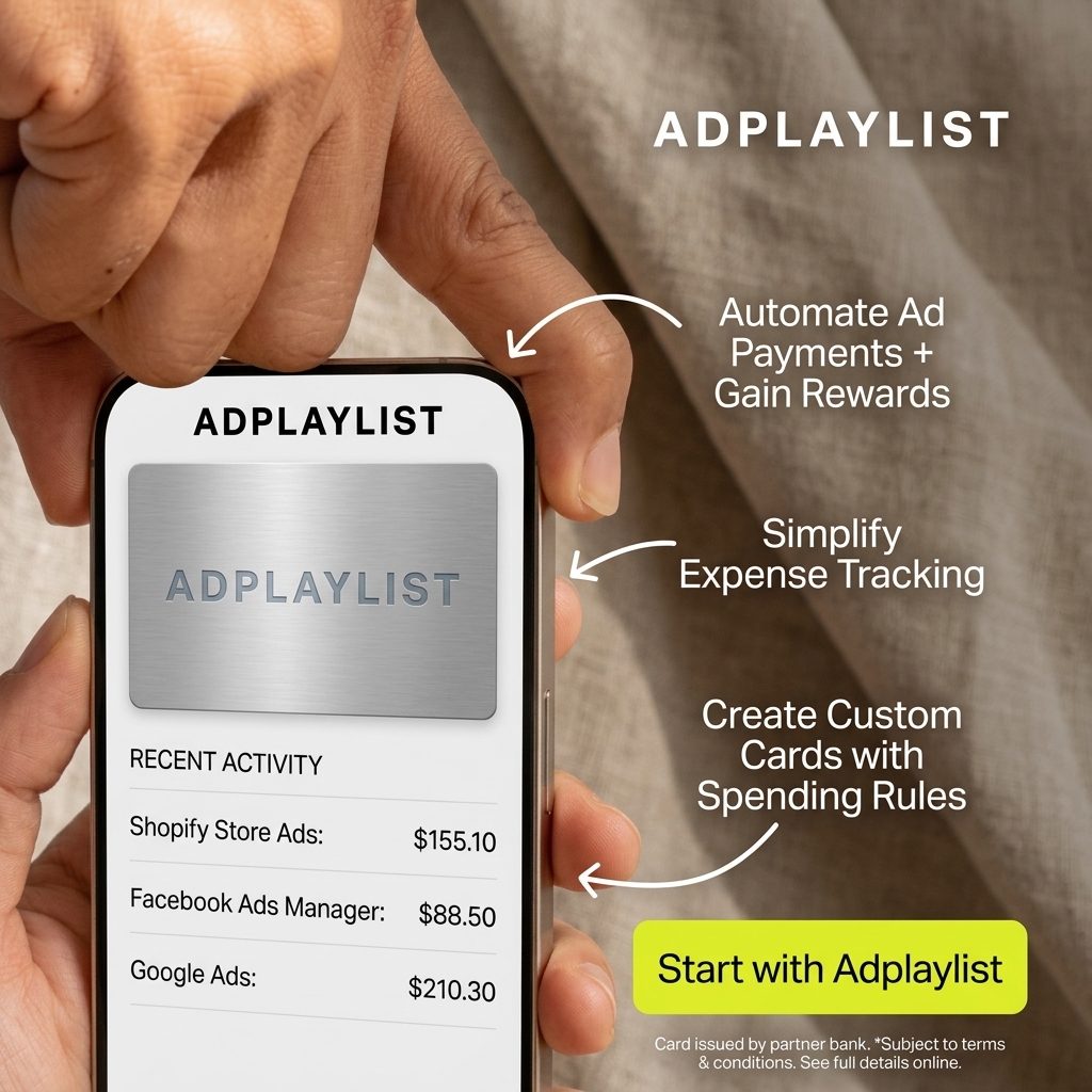
The creative shows a close-up of hands holding a phone against a soft beige linen background. The screen shows the Adplaylist app with a brushed metal card and a recent activity list of Shopify store ads at $155.10, Facebook Ads Manager at $88.50 and Google Ads at $210.30. Three hand-drawn white arrows point from callouts on the right: automate ad payments and gain rewards, simplify expense tracking and create custom cards with spending rules. A lime green button says Start with Adplaylist, above a small partner-bank disclaimer. As a feature callouts ad, it pairs a hero visual with short, scannable benefit labels. Each callout answers a buying question in a few words, so the viewer can grasp the value without reading a paragraph. Icons, pills and cards make the benefits feel concrete and easy to compare, which works well for audiences who are already weighing up options.
Meta ad · 1200 × 1200 · Fintech
Ad Spend Card Ad Template – Feature callouts Example
This ad spend card ad template uses a feature callouts format to show a hand holding a phone with an ad spend card and recent activity, with three arrowed feature callouts. It is a strong reference for fintech and SaaS products for online businesses. Below: the copy, why it works and five steps to adapt it.
Added
All brand names and logos are property of their owners. Adplaylist is not affiliated with or endorsed by these brands.
Details
Ad copy
Primary text
Pay for Shopify, Facebook and Google ads from one card, earn rewards on every dollar and set custom spending rules for your team. Start with Adplaylist today.
Description
Automate payments and earn rewards
On-image text
ADPLAYLIST | ADPLAYLIST (card) | RECENT ACTIVITY | Shopify Store Ads: $155.10 | Facebook Ads Manager: $88.50 | Google Ads: $210.30 | Automate Ad Payments + Gain Rewards | Simplify Expense Tracking | Create Custom Cards with Spending Rules | Start with Adplaylist | Card issued by partner bank. *Subject to terms & conditions. See full details online.
Headline ideas for this template
- 1Earn rewards on every ad dollar.
- 2One card for Meta, Google and Shopify ads.
- 3Ad spend, finally under control.
- 4Set rules, not limits, on team spend.
- 5Turn your ad budget into rewards.
Meta image ad specs
| Placement | Ratio | Size (px) |
|---|---|---|
| Feed | 1:1 or 4:5 | 1080×1080 / 1080×1350 |
| Marketplace | 1:1 | 1200×1200 |
| Messenger inbox | 1:1 | 1200×1200 |
| Stories & Reels | 9:16 | 1080×1920 |
This template is 1:1. Request 4:5 or 9:16 to cover all placements.
Browse similar by tag