Key takeaways
- Format: Outdoor lifestyle portrait with a two-part contrast line at the bottom.
- Best for: Rehab centers and peer-support programs speaking to loneliness and shame.
- Hook: "Addiction is isolating" names a feeling almost every viewer in recovery knows.
- Reuse it: Pair a hard truth with its opposite in one sentence and bold the hopeful half.
Available sizes
What is a lifestyle ad?
A lifestyle ad shows the product being used in a real setting by the kind of person who buys it. Instead of listing features, it sells the feeling or outcome of owning the product, which makes it a strong fit for fashion, home, travel and wellness brands.
See all lifestyle ads →Why this lifestyle ad works
- 01
Contrast in one line
The sentence moves from problem to promise in under ten words. The parallel structure makes it memorable.
- 02
Emotional, not clinical
It speaks to loneliness, not symptoms or substances. That emotional truth connects faster than any feature list.
- 03
Relatable, natural portrait
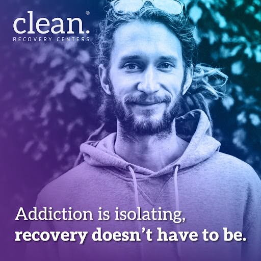
The casual outfit and outdoor setting feel like a real person, not a model. Viewers can picture themselves or someone they love.
- 04
Text kept low
Placing the message at the bottom leaves the face fully visible. The ad reads as a portrait first and a message second.
Full creative breakdown
Who this ad targets
This ad targets adults living with substance use who feel cut off from friends and family, as well as people in early recovery who fear going it alone. Its relaxed, outdoorsy look appeals to younger adults and people who might not relate to clinical rehab imagery. It is a strong awareness ad for cold audiences and also works for families who want to see that their loved one would be supported by a community.
Copywriting analysis
The line uses antithesis: "Addiction is isolating" sets up the pain, and "recovery doesn't have to be" flips it. The comma splice keeps the line flowing as a single thought, which feels conversational rather than formal. Ellipsis does the rest. The viewer fills in "isolating" after "doesn't have to be," which makes the line feel clever without being difficult. Bolding the second half guides skimmers straight to the hopeful message. The copy avoids promising outcomes and instead offers a feeling of connection, which is both persuasive and policy-friendly for health advertising.
Visual design
The portrait fills the frame, with the subject centered slightly to the right and the face in the upper half. The duotone overlay runs from teal at the top to purple at the bottom, darkening the lower area so the white text is easy to read. The logo sits top left, opposite the text at the bottom, which balances the layout. A clean sans-serif in two weights creates a clear hierarchy without extra design elements.
How to adapt this template for your brand
- Identify the strongest emotional pain your audience feels, such as loneliness, shame or exhaustion.
- Write one sentence that names that pain and then flips it into a hopeful promise.
- Choose a natural, relaxed portrait in a setting that suggests freedom or calm.
- Add a gradient overlay that darkens the bottom, then place the text there and bold the hopeful half.
- Put the logo in the opposite corner and test readability at thumbnail size.
Tips for addiction recovery ads on Meta
Run this square creative in Meta Feed and test a 4:5 version for more mobile space. Emotional, non-clinical messages often perform well with broad targeting, so give Meta's algorithm room with Advantage+ audiences. Avoid personal language like "Are you lonely because of your addiction?" which can break personal attributes rules. Addiction treatment ads require certification on Meta, so confirm your account is approved.
About this creative
This square Meta ad from Clean Recovery Centers features a relaxed, bearded young man with dreadlocks and sunglasses on his head, wearing a hoodie and standing outdoors in front of green foliage. He smiles gently at the camera, which makes him feel approachable and real rather than staged. The brand's duotone gradient, purple at the bottom and teal at the top, covers the image and keeps the look consistent with the rest of the campaign. The Clean Recovery Centers logo sits in the top-left corner. Across the bottom, a two-line message reads "Addiction is isolating, recovery doesn't have to be." The first half is in regular weight, while "recovery doesn't have to be" is bold, so the hopeful half stands out. The ad speaks to one of the strongest emotions in addiction, loneliness, and positions treatment as a way back to people. The natural outdoor setting reinforces freedom and openness.
Meta ad · 338 × 600 · Addiction Recovery
Addiction Recovery Ad: Isolation vs Community Lifestyle Creative
This square lifestyle ad from Clean Recovery Centers uses a simple contrast, "Addiction is isolating, recovery doesn't have to be," over a calm outdoor portrait. It shows how one well-built line can name a painful truth and offer hope at the same time. Use it as a template for rehab, peer support and recovery community campaigns.
Added
All brand names and logos are property of their owners. Adplaylist is not affiliated with or endorsed by these brands.
Details
Ad copy
Primary text
Addiction can make you feel completely alone. Recovery is different. At Clean Recovery Centers, you'll be surrounded by people who understand and want to see you thrive. Reach out today and take the first step together.
Description
Compassionate, community-based care
On-image text
Addiction is isolating, recovery doesn't have to be. | clean. Recovery Centers
Headline ideas for this template
- 1Recovery Is Better Together
- 2You Don't Have to Do This Alone
- 3Find Your People in Recovery
- 4From Isolation to Connection
- 5A Community That Has Your Back
Meta image ad specs
| Placement | Ratio | Size (px) |
|---|---|---|
| Feed | 1:1 or 4:5 | 1080×1080 / 1080×1350 |
| Marketplace | 1:1 | 1200×1200 |
| Messenger inbox | 1:1 | 1200×1200 |
| Stories & Reels | 9:16 | 1080×1920 |
This template is 1:1. Request 4:5 or 9:16 to cover all placements.