Key takeaways
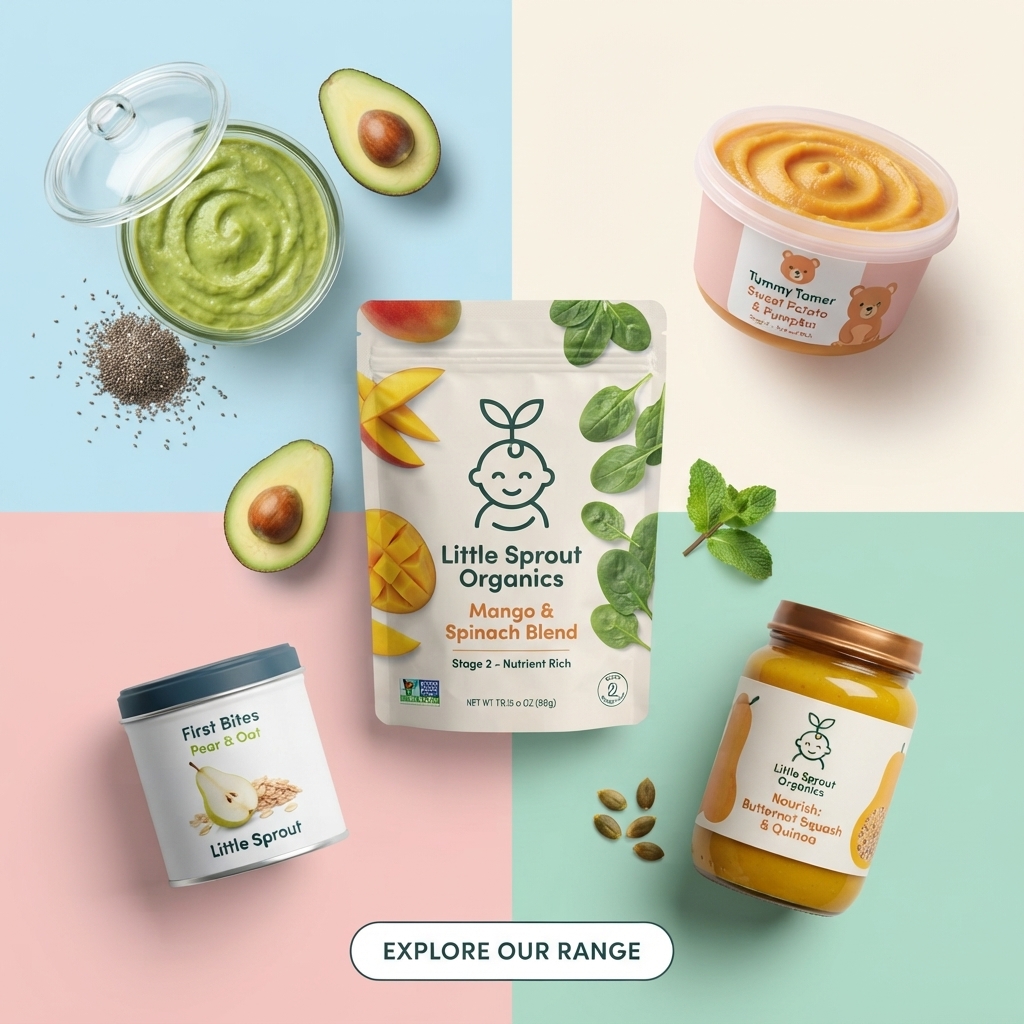
- Format: Colour-block quadrant product shot showing four formats plus a hero.
- Best for: Brands with a varied range across stages and pack types.
- Hook: Four pastel blocks that instantly catch the eye.
- Reuse it: Keep the grid and central hero; change colours and products.
Available sizes
What is a product shot ad?
A product shot ad puts the product itself at the centre of the frame, usually on a clean or styled background with little text. It works best when the packaging or product is distinctive enough to stop the scroll and the viewer already understands what it does.
See all product shot ads →Why this product shot ad works
- 01
Grid makes variety digestible
Splitting the frame into quadrants gives each product its own zone, so a busy range still feels organised.
- 02
Hero product leads
The centre pouch is the obvious focal point, with the others supporting it.
- 03
Pastels feel baby-friendly
Soft blue, pink, cream and mint feel gentle and on-brand for baby products while still standing out.
- 04
Mixed formats show breadth
Pouch, jars, tub and tin tell parents there is an option for every situation.
Full creative breakdown
Who this ad targets
This ad targets parents of babies and toddlers at different stages who are already interested in organic baby food and want to explore more options from one brand. It suits shoppers browsing online who enjoy a visual overview of a range. The pastel, design-led look appeals to modern millennial parents who are drawn to aesthetic packaging and may share products on social media.
Copywriting analysis
On-image copy is limited to product labels and one CTA. Labels do the selling: Stage 2 – Nutrient Rich, Tummy Tamer, First Bites and Nourish are short descriptors that hint at each product's job. 'Explore Our Range' is an inviting, low-pressure CTA that matches the variety theme. Without a headline, the ad relies on visuals to communicate, so the primary text should explain what makes the range special, such as organic ingredients or stage-based nutrition. A short headline would also help cold audiences.
Visual design
The four-colour grid creates instant structure and visual interest. The hero pouch overlaps the centre point, linking all quadrants. Each corner product is angled slightly, adding movement. Fresh ingredients such as avocado, mint and seeds break up the hard colour lines and add texture. The white outlined CTA is simple and sits neatly at the bottom centre, keeping the focus on the products above.
How to adapt this template for your brand
- Divide your background into four soft colour blocks.
- Place your hero product over the centre point.
- Put one supporting product in each quadrant.
- Add fresh ingredients between products to soften the grid.
- Finish with a simple outlined 'Explore' CTA at the bottom.
Tips for baby food ads on Meta
On Meta, this works well as the first card of a carousel, with each following card zooming into one quadrant's product. Add a headline in the primary text since the image has none. For Instagram, test a version with a short headline above the grid. Use broad parent audiences and let Advantage+ find buyers interested in variety packs and first foods.
About this creative
The creative divides the background into four pastel blocks: baby blue top left, cream top right, blush pink bottom left and mint green bottom right. In the centre, overlapping all four, sits a white stand-up pouch printed with mango slices and spinach leaves, the line-drawn sprout baby logo, and the name Little Sprout Organics Mango & Spinach Blend, Stage 2 – Nutrient Rich. Each quadrant holds another product: an open glass jar of green avocado purée with chia seeds and halved avocados top left, a pink tub labelled Tummy Tamer Sweet Potato & Pumpkin with a bear illustration top right, a white tin of First Bites Pear & Oat bottom left and a glass jar of Butternut Squash & Quinoa with a copper lid bottom right. Mint leaves and pumpkin seeds are scattered between them. A white outlined pill at the bottom says 'Explore Our Range'. The look is fresh, playful and highly organised.
Meta ad · 1200 × 1200 · Baby Food
Baby Food Range Ad: Pastel Quadrant Product Shot
This Little Sprout Organics ad splits the background into four pastel quadrants and places a different product in each, with a hero pouch in the centre. Avocado, mint, chia and pumpkin seeds add freshness, making it a modern product shot template for showing a varied range at once.
Added
All brand names and logos are property of their owners. Adplaylist is not affiliated with or endorsed by these brands.
Details
Ad copy
Primary text
Explore our range of nourishing first foods. From Stage 2 Mango & Spinach Blend to Butternut Squash & Quinoa, Sweet Potato & Pumpkin and Pear & Oat First Bites, Little Sprout Organics has something for every stage and taste.
Description
Organic purées and first bites for every stage.
On-image text
Little Sprout Organics Mango & Spinach Blend | Stage 2 – Nutrient Rich | Net Wt 3.15 oz (88g) | Tummy Tamer Sweet Potato & Pumpkin | First Bites Pear & Oat, Little Sprout | Little Sprout Organics Nourish: Butternut Squash & Quinoa | EXPLORE OUR RANGE
Headline ideas for this template
- 1One brand for every stage
- 2Pouches, jars and snacks they will love
- 3Explore organic first foods
- 4Mango, quinoa, pumpkin and more
- 5Find their new favourite flavor
Meta image ad specs
| Placement | Ratio | Size (px) |
|---|---|---|
| Feed | 1:1 or 4:5 | 1080×1080 / 1080×1350 |
| Marketplace | 1:1 | 1200×1200 |
| Messenger inbox | 1:1 | 1200×1200 |
| Stories & Reels | 9:16 | 1080×1920 |
This template is 1:1. Request 4:5 or 9:16 to cover all placements.
Browse similar by tag