Key takeaways
- Format: Curated collection edit with series numbering
- Best for: Bridal boutiques, fashion retailers and luxury labels
- Hook: 'Part 2' implies there is more to see and a series to follow
- Reuse it: Run it as a numbered series, changing the gown and background each time
Available sizes
What is a listicle ad?
A listicle ad presents the product's benefits or reasons to buy as a short numbered list, like an article headline ("5 reasons…"). The list format is easy to scan in a feed and lets one creative answer several objections at once.
See all listicle ads →Why this listicle ad works
- 01
Series hook
'Part 2' creates curiosity and suggests ongoing content, encouraging follows and repeat engagement.
- 02
Over-the-shoulder pose
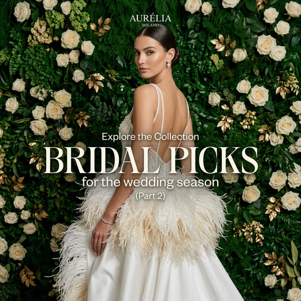
The look back invites the viewer in and shows off the dramatic open back at the same time.
- 03
Colour contrast
Ivory against deep green makes the gown the brightest element and draws the eye immediately.
- 04
Italian luxury cue
'Milano' under the logo instantly signals fashion credibility and premium quality.
Full creative breakdown
Who this ad targets
This ad targets fashion-forward brides around 25 to 38 who want a statement gown with texture, such as feathers, pearls or open backs. They follow bridal trends on Instagram and Pinterest and enjoy browsing curated edits before booking appointments. The Milan branding and lavish styling suggest a mid-to-luxury budget. The 'wedding season' angle also reaches brides with dates in the coming months, plus stylists and bridal influencers looking for inspiration to share.
Copywriting analysis
The copy is structured like an editorial headline stack. 'Explore the collection' is the invitation, 'Bridal picks' is the bold hook and 'for the wedding season' adds timeliness. '(Part 2)' is the cleverest element because it signals a series, rewarding those who saw Part 1 and prompting newcomers to look back. The word 'picks' frames the brand as a curator with taste rather than just a seller. The copy does not name the gown or price, which keeps it inspirational, so the landing page should feature the specific edit to avoid a disconnect after the click.
Visual design
The model stands centrally, with the lower half of her gown spilling toward the bottom edge. A dense, textured flower wall fills every corner, adding luxury without distracting from the ivory dress. The type mixes a large high-contrast serif with a light rounded sans-serif for a modern editorial feel, placed over the skirt where the background is lighter. The small logo at the top balances the large headline below.
How to adapt this template for your brand
- Pick a hero piece from the edit you want to promote.
- Choose a rich, textured backdrop that contrasts with the product colour.
- Pose the model to show the most distinctive design detail.
- Stack an invitation, bold headline and timing line in editorial type.
- Number the creative as part of a series and release follow-ups regularly.
Tips for bridal ads on Meta
On Meta, turn this into a carousel where the first card is this image and the following cards show each gown in the edit. Target engaged audiences and bridal fashion interests in Feed and Instagram. In Stories, make sure the headline sits within the central safe zone. Retarget people who engaged with Part 1 using Part 2 to build sequence awareness. Use 'Shop now' or 'Learn more' and link directly to the edit page rather than the homepage.
About this creative
This square ad for Aurélia Milano shows a dark-haired model with a sleek low bun looking back over her shoulder at the camera. She wears a backless ivory bridal gown with thin pearl-beaded straps, an embellished bodice and a voluminous skirt trimmed with cream ostrich feathers over satin. A slim diamond bracelet and drop earrings complete the look. Behind her is a dense flower wall of white and cream roses, deep green foliage, pale green hydrangeas and gold-painted leaves, giving a luxurious, garden-party feel. The small 'Aurélia Milano' wordmark sits at the top centre. In the lower half, the text reads 'Explore the collection' in a light sans-serif, followed by 'Bridal picks' in a large high-contrast cream serif, then 'for the wedding season' and '(Part 2)'. The rich green background makes the ivory gown and feathers pop.
Meta ad · 1200 × 1200 · Bridal
Bridal Collection Ad Template: Seasonal Picks Edit
This bridal collection ad from Aurélia Milano presents a seasonal 'Bridal picks' edit, with a model in a backless feather-trimmed gown in front of a lush white rose wall. It is a square image template for bridal boutiques and fashion brands promoting curated collections or series content.
Added
All brand names and logos are property of their owners. Adplaylist is not affiliated with or endorsed by these brands.
Details
Ad copy
Primary text
The second edit is here. From feathered skirts to pearl-beaded backs, explore our bridal picks for the wedding season and find the gown that feels like you.
Description
Explore the collection.
On-image text
AURÉLIA MILANO | Explore the Collection | BRIDAL PICKS | for the wedding season | (Part 2)
Headline ideas for this template
- 1Bridal picks: the feather edit
- 2Part 3: the gowns you asked for
- 3This season's most-saved bridal looks
- 4Our editors' favourite wedding gowns
- 5The bridal edit you'll want to save
Meta image ad specs
| Placement | Ratio | Size (px) |
|---|---|---|
| Feed | 1:1 or 4:5 | 1080×1080 / 1080×1350 |
| Marketplace | 1:1 | 1200×1200 |
| Messenger inbox | 1:1 | 1200×1200 |
| Stories & Reels | 9:16 | 1080×1920 |
This template is 1:1. Request 4:5 or 9:16 to cover all placements.
Browse similar by tag