Key takeaways
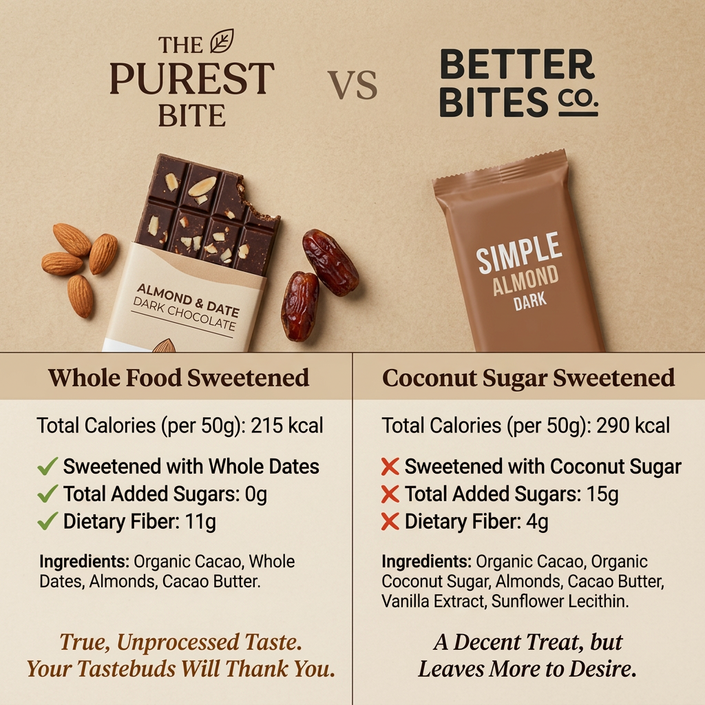
- Format: Two-column us-vs-them comparison with ticks, crosses and ingredient lists.
- Best for: Clean-label food, healthy snacks and products with a measurable nutritional edge.
- Hook: “VS” between two brand logos promises a verdict shoppers want to read.
- Reuse it: Swap in your product and a generic rival, keep three hard numbers per side and the tick/cross contrast.
Available sizes
What is a comparison ad?
A comparison ad sets the product against an alternative, such as a competitor, the old way of doing things or a cheaper option, usually in a two-column layout or table. It helps buyers who are already weighing options see quickly why this one is the better choice.
See all comparison ads →Why this comparison ad works
- 01
Numbers beat adjectives
0g vs 15g added sugar and 11g vs 4g fibre are instantly understood. Concrete figures feel like proof rather than marketing claims.
- 02
Ticks and crosses guide the eye
Green ticks and red crosses let viewers grasp the verdict in under a second. The detail rewards anyone who stops to read.
- 03
Open bar vs sealed wrapper
The unwrapped, bitten bar with whole ingredients feels honest and tasty. The closed competitor wrapper looks generic and processed by comparison.
- 04
Shorter ingredient list
Four ingredients against six visually signals purity. Clean-label shoppers check ingredient length first, so the ad answers their question up front.
Full creative breakdown
Who this ad targets
The ad targets health-conscious snackers, mostly 25–45, who already buy “better-for-you” chocolate but read labels closely. They avoid added sugar, follow whole-food, paleo or low-sugar diets, and may track fibre and calories. Many are already customers of coconut-sugar brands, so the comparison aims to win switchers rather than convert regular chocolate eaters. Secondary audiences include parents choosing treats for children and fitness enthusiasts looking for a cleaner sweet snack.
Copywriting analysis
The copy is mostly data, which is the point: it lets the label speak. Section headers “Whole Food Sweetened” vs “Coconut Sugar Sweetened” reframe the category so that coconut sugar, usually seen as healthy, becomes the inferior option. Each claim is short and scannable, starting with the nutrient so the eye can compare row by row. The closing taglines add emotion: “True, Unprocessed Taste. Your Tastebuds Will Thank You.” promises pleasure, not just health, while “A Decent Treat, but Leaves More to Desire.” criticises the rival politely, avoiding an aggressive tone. Using a fictional or unnamed competitor keeps legal risk lower; with a real brand, every figure must be verifiable.
Visual design
A warm beige, kraft-paper palette signals natural, organic food and fits the chocolate tones. The layout is strictly split: brand logos and products on top, a ruled two-column table below, divided by a thin vertical line. The hero product is styled with props and a bite mark, while the competitor is shown flat and closed. A dark brown serif is used for headers and italic taglines, and a clean sans serif for data. Green and red icons are the only saturated colours, making the verdict pop.
How to adapt this template for your brand
- Choose three or four measurable attributes where your product clearly wins, such as sugar, fibre, protein or price.
- Place your logo and the competitor’s (or a generic ‘Other brands’) on top with a large ‘VS’ in between.
- Style your product open and surrounded by real ingredients; show the rival plainly in its packaging.
- Build a two-column table with green ticks for your side, red crosses for theirs, and full ingredient lists below.
- Close each column with a short italic tagline: an emotional promise for yours, a polite downside for theirs.
Tips for food & beverage ads on Meta
On Meta, this works well in Feed and as a carousel first card, followed by a close-up of the ingredients. Target interests like clean eating, paleo, keto and organic food, and retarget visitors who viewed the product. On TikTok, turn it into a quick side-by-side reveal where a creator flips both bars and reads the labels aloud. Check ad policies: comparative claims about named competitors must be accurate and substantiated, so use a generic rival if unsure.
About this creative
This square 1200×1200 comparison ad sets The Purest Bite against Better Bites Co. on a warm beige, paper-textured background. The top half shows both brands’ logos with a large “VS” between them. On the left, an unwrapped Almond & Date Dark Chocolate bar with a bite taken out is surrounded by whole almonds and dates, signalling real ingredients. On the right, the competitor’s bar stays sealed in a plain brown wrapper labelled “Simple Almond Dark”. The bottom half is a two-column table. The left column, “Whole Food Sweetened”, lists 215 kcal per 50g, whole dates, 0g added sugars and 11g fibre, each with a green tick, plus a four-item ingredient list. The right column, “Coconut Sugar Sweetened”, shows 290 kcal, coconut sugar, 15g added sugars and 4g fibre with red crosses and a longer ingredient list. Italic taglines close each side, praising the hero product and gently downplaying the rival.
Meta ad · 1200 × 1200 · Food & Beverage
Chocolate Bar Ad Template: Us vs Them Comparison
This square comparison ad pits The Purest Bite’s date-sweetened dark chocolate against a coconut-sugar competitor. A split layout with product shots, green ticks, red crosses and full ingredient lists makes it a ready-to-use template for healthy snacks, clean-label food and any product with a clear nutritional advantage.
Added
All brand names and logos are property of their owners. Adplaylist is not affiliated with or endorsed by these brands.
Details
Ad copy
Primary text
Not all “healthy” chocolate is created equal. Our Almond & Date Dark Chocolate is sweetened only with whole dates — 0g added sugar, 11g fibre and just four real ingredients. Taste the difference.
Description
Dark chocolate sweetened with whole dates.
On-image text
The Purest Bite VS Better Bites Co. | Almond & Date Dark Chocolate | Simple Almond Dark | Whole Food Sweetened: Total Calories (per 50g): 215 kcal; Sweetened with Whole Dates; Total Added Sugars: 0g; Dietary Fiber: 11g; Ingredients: Organic Cacao, Whole Dates, Almonds, Cacao Butter. True, Unprocessed Taste. Your Tastebuds Will Thank You. | Coconut Sugar Sweetened: Total Calories (per 50g): 290 kcal; Sweetened with Coconut Sugar; Total Added Sugars: 15g; Dietary Fiber: 4g; Ingredients: Organic Cacao, Organic Coconut Sugar, Almonds, Cacao Butter, Vanilla Extract, Sunflower Lecithin. A Decent Treat, but Leaves More to Desire.
Headline ideas for this template
- 1Same chocolate craving. 15g less added sugar.
- 2Read the label. Then choose.
- 3Sweetened by dates, not by sugar.
- 4Four ingredients. Zero added sugar.
- 5The “healthy” chocolate that actually is.
Meta image ad specs
| Placement | Ratio | Size (px) |
|---|---|---|
| Feed | 1:1 or 4:5 | 1080×1080 / 1080×1350 |
| Marketplace | 1:1 | 1200×1200 |
| Messenger inbox | 1:1 | 1200×1200 |
| Stories & Reels | 9:16 | 1080×1920 |
This template is 1:1. Request 4:5 or 9:16 to cover all placements.