Key takeaways
- Format: Split layout: product shelf on top, six-icon benefit grid below
- Best for: Introducing a brand to a new retail audience
- Hook: “Now at Target” news plus a ‘why we're different’ promise
- Reuse it: Swap your six key differentiators into the icon grid
Available sizes
What is a feature callout ad?
A feature callout ad is a static image that shows a single product with short text labels pointing to its key features or benefits, usually joined to the product by thin lines. It explains several selling points at a glance without a long caption, which is why it's common for supplements, skincare, electronics and kitchenware.
See all feature callouts ads →Why this feature callouts ad works
- 01
News first, reasons second
The top half delivers the update that matters to existing fans, while the grid educates newcomers.
- 02
Icons make claims scannable
Six short labels with simple icons can be absorbed in seconds without reading paragraphs.
- 03
Differentiation framing
“Why We're Different” invites comparison with conventional cleaners without naming competitors.
- 04
Full range visibility
Showing five products signals a complete system that can replace an entire cleaning cupboard.
Full creative breakdown
Who this ad targets
This ad targets Target shoppers who are new to Branch Basics and need a quick reason to pick it over familiar brands, as well as clean-living followers who already know the brand and want to hear it is in store. Typical viewers are US millennials and parents who scan labels for plant-based, non-GMO and fragrance-free credentials.
Copywriting analysis
Two headlines do two jobs. “Now at Target” is pure news, short and confident. “Why We're Different” sets up the list and uses italics on ‘Different’ for emphasis. The six labels are one to three words each and read like certifications, with no fluffy adjectives. The mix of ‘positive’ claims (plant based, biodegradable) and ‘free-from’ claims (fragrance free, no harmful preservatives) covers both what is in and what is not.
Visual design
The split creates a clear reading order. The top photo uses warm, low-key lighting with deep brown tones, letting the white headline pop. The lower half is flat cream, which keeps the icon grid legible. The brown icons echo the shelf wood, linking both halves. The italic serif accent on ‘Now’ and ‘Different’ adds a signature brand touch. Spacing in the grid is even and generous, giving a calm, premium feel.
How to adapt this template for your brand
- Shoot your product range on a shelf or surface for the top half.
- Add a short news headline (new retailer, new launch, new size).
- Pick six differentiators and pair each with a simple line icon.
- Arrange them in a 3×2 grid on a flat background colour.
- Use one italic word in each headline for brand personality.
Tips for cleaning products ads on Meta
Built for Meta Stories and Reels placements, so keep the top 14% and bottom 20% free of key text where profile icons and the CTA sticker sit. Run it as a static Story first, then test a 3–5 second motion version (slow zoom or text reveal). Pair it with a matching 4:5 crop for Feed so Advantage+ placements can pick the best fit, and keep the offer or claim in the first line of primary text for viewers who skip the image.
About this creative
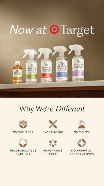
This Branch Basics story ad is divided into two horizontal halves. The top half is a warm, softly lit product photo: five products lined up on a wooden shelf, including the amber Concentrate bottle and four spray bottles with green, coral, blue and lilac labels. Above them, white text reads “Now at Target” with the red Target bullseye replacing the ‘O’ placement. The bottom half switches to a cream background with the heading “Why We're Different”, the last word set in italic. Beneath it sits a two-row grid of six brown line icons with uppercase labels: Human-Safe, Plant Based, Non-GMO, Biodegradable Formula, Fragrance Free and No Harmful Preservatives. The muted brown and cream palette feels natural and premium. The layout lets a viewer first register the news and the product family, then scan the reasons to choose this brand over conventional cleaners in a few seconds.
Meta ad · 338 × 600 · Cleaning Products
“Why We're Different” Feature Callout Ad from Branch Basics
This vertical Branch Basics ad splits the frame in two: a moody product shelf with “Now at Target” on top, and a six-icon “Why We're Different” benefit grid below. It combines retail launch news with feature callouts, ideal when you need to introduce a brand to new shoppers in one creative.
Added
All brand names and logos are property of their owners. Adplaylist is not affiliated with or endorsed by these brands.
Details
Ad copy
Primary text
Big news: Branch Basics is now at Target! 🎯 Human-safe, plant-based, non-GMO, biodegradable and fragrance-free cleaning – with no harmful preservatives. Find the full line on your next Target trip.
Description
Human-safe, plant-based cleaning
On-image text
Now at Target | Why We're Different | HUMAN-SAFE | PLANT BASED | NON-GMO | BIODEGRADABLE FORMULA | FRAGRANCE FREE | NO HARMFUL PRESERVATIVES
Headline ideas for this template
- 1Six Reasons to Switch Your Cleaners
- 2What's Not in Our Cleaners Matters
- 3Find Human-Safe Cleaning at Target
- 4The Cleaner Cupboard Swap, Now at Target
- 5Plant-Based Cleaning You Can Pick Up Today
Meta image ad specs
| Placement | Ratio | Size (px) |
|---|---|---|
| Feed | 1:1 or 4:5 | 1080×1080 / 1080×1350 |
| Marketplace | 1:1 | 1200×1200 |
| Messenger inbox | 1:1 | 1200×1200 |
| Stories & Reels | 9:16 | 1080×1920 |
This template is 1:1. Request 4:5 or 9:16 to cover all placements.