Key takeaways
- Format: Illustrated side-by-side us-versus-them comparison.
- Best for: Supplements and drinks that solve a common category frustration.
- Hook: A frowning versus smiling face makes the difference obvious in a second.
- Reuse it: Draw the old way versus your way with clear emotion and one key visual difference.
Available sizes
What is a comparison ad?
A comparison ad sets the product against an alternative, such as a competitor, the old way of doing things or a cheaper option, usually in a two-column layout or table. It helps buyers who are already weighing options see quickly why this one is the better choice.
See all comparison ads →Why this comparison ad works
- 01
Instant visual contrast
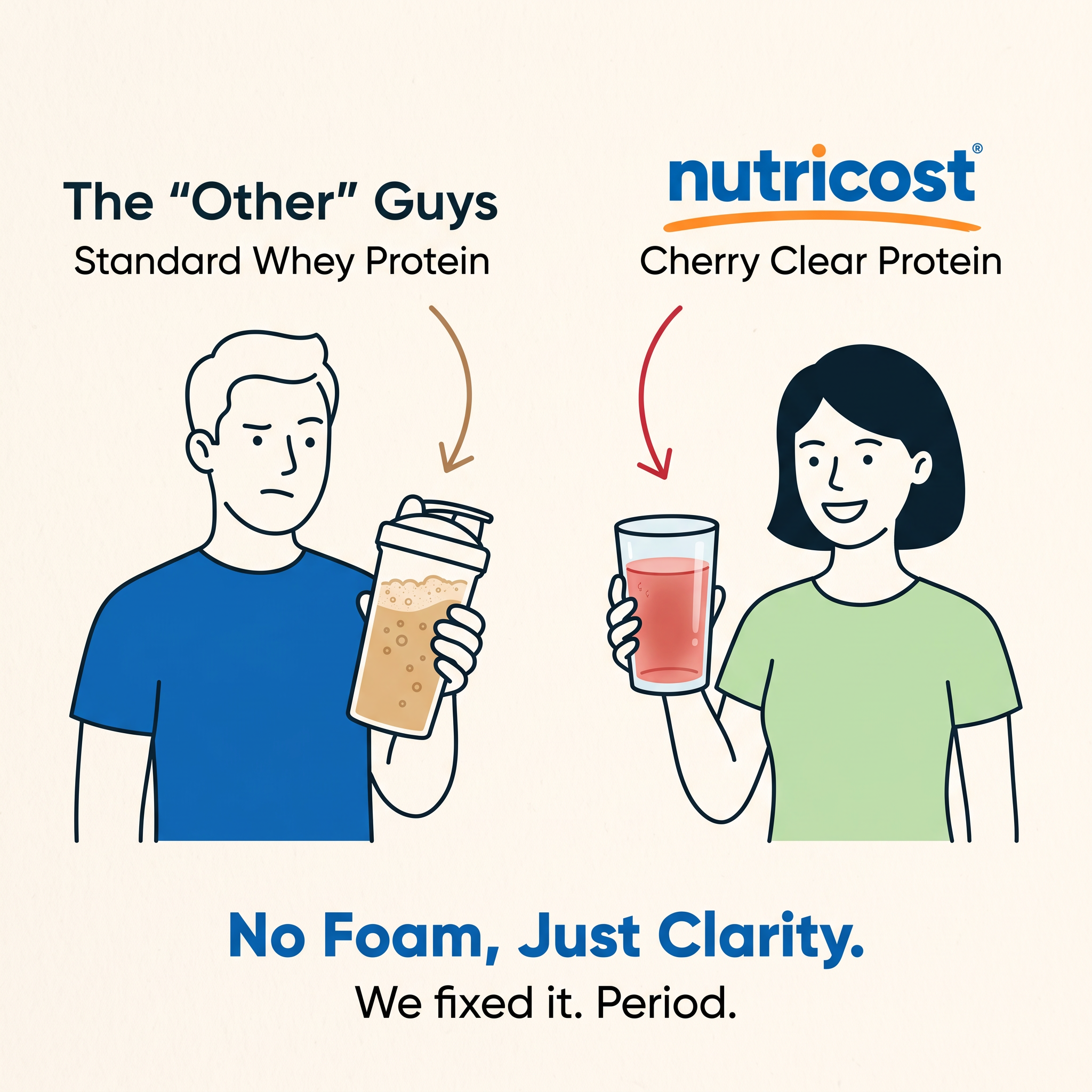
Foamy beige versus clear red is easy to understand without reading, so the benefit lands in the first second.
- 02
Emotion sells the switch
The frown and smile tell viewers how each product feels to drink, connecting the feature to an experience.
- 03
Illustration stands out
Most supplement ads use gym photos or tubs; a flat illustration breaks the pattern in a crowded feed.
- 04
Confident, punchy close
'We fixed it. Period.' sounds bold and final, positioning Nutricost as the brand that solved the problem.
Full creative breakdown
Who this ad targets
The ad targets fitness-minded adults aged roughly 20–45 who use or have tried protein shakes but dislike their thick texture, foam or heaviness. It also speaks to people who find milky shakes hard to drink after workouts or in hot weather, and to newcomers who want protein that feels like a refreshing drink. Value-conscious buyers who shop for supplements online, often on Amazon, fit Nutricost's affordable positioning well.
Copywriting analysis
The labels set up a clear comparison: 'The "Other" Guys' uses quotation marks to playfully dismiss competitors without naming them. 'Standard Whey Protein' versus 'Cherry Clear Protein' highlights the category difference. The headline 'No Foam, Just Clarity.' uses a no-X-just-Y structure that is easy to remember, and 'clarity' works both literally (clear drink) and figuratively (clear choice). 'We fixed it. Period.' adds attitude and confidence. The copy does not mention protein content or taste, so adding '20g protein' or 'tastes like juice' could strengthen the purchase case.
Visual design
The design uses a cream background with thick black outline illustrations and flat colour fills. Blue and green T-shirts, a beige shake and a red drink provide clear colour coding. Arrows in matching colours guide the eye from the labels to the drinks. The symmetrical two-column layout makes comparison effortless. The bold blue headline at the bottom matches the logo colour, tying the message to the brand. The overall style feels friendly, modern and approachable.
How to adapt this template for your brand
- Identify the biggest frustration with standard products in your category.
- Draw or photograph two people side by side: one unhappy with the old option, one happy with yours.
- Label the left side 'The other guys' and the right side with your brand and product name.
- Use arrows and colour coding to highlight the key visual difference.
- Close with a short 'No X, just Y' headline and a confident one-liner.
Tips for health & fitness ads on Meta
On Meta, illustrated comparisons stand out in Feed; test this against a real photo version to see which earns more clicks. For Reels and TikTok, recreate it as a split-screen video of someone shaking foamy whey versus pouring clear protein. Avoid naming competitors directly to stay within ad policies. On Amazon Sponsored Brands and Google Shopping, use the 'No Foam' message in headlines. Retarget engaged viewers with flavour variants.
About this creative
This Nutricost ad uses a simple line-illustration style on a cream background. It is split into two halves. On the left, under the label 'The "Other" Guys – Standard Whey Protein', a man in a blue T-shirt frowns at a shaker bottle filled with a beige, bubbly, foamy shake. A brown curved arrow points at the drink. On the right, under the Nutricost logo with its orange swoosh and 'Cherry Clear Protein', a smiling woman in a light green T-shirt holds a clear glass of light red, juice-like protein drink, highlighted by a red arrow. The contrast is immediate: unhappy versus happy, cloudy versus clear. At the bottom, the bold blue headline 'No Foam, Just Clarity.' sums up the difference, followed by the confident line 'We fixed it. Period.' The flat, friendly illustration style makes the comparison feel light-hearted rather than aggressive, and it would stand out among photo-heavy supplement ads.
Meta ad · 1200 × 1200 · Health & Fitness
Nutricost Clear Protein Ad – Illustrated Comparison Template
This Nutricost ad promotes Cherry Clear Protein with an illustrated us-versus-them comparison. A frowning man holds a foamy standard whey shake, while a smiling woman holds a clear cherry drink. Use this template for supplements, food and drink, and any product that fixes a common category frustration.
Added
All brand names and logos are property of their owners. Adplaylist is not affiliated with or endorsed by these brands.
Details
Ad copy
Primary text
Tired of thick, foamy protein shakes? Nutricost Cherry Clear Protein mixes into a light, refreshing drink that tastes more like juice than a shake. Same protein, none of the heaviness.
Description
Refreshing cherry clear whey protein
On-image text
The "Other" Guys | Standard Whey Protein | nutricost® | Cherry Clear Protein | No Foam, Just Clarity. | We fixed it. Period.
Headline ideas for this template
- 1Protein That Drinks Like Juice
- 2Ditch the Foam, Keep the Protein
- 3Clear Protein, Clear Choice
- 4Finally, a Protein Shake That Isn't a Shake
- 5Light, Refreshing, Cherry Clear Protein
Meta image ad specs
| Placement | Ratio | Size (px) |
|---|---|---|
| Feed | 1:1 or 4:5 | 1080×1080 / 1080×1350 |
| Marketplace | 1:1 | 1200×1200 |
| Messenger inbox | 1:1 | 1200×1200 |
| Stories & Reels | 9:16 | 1080×1920 |
This template is 1:1. Request 4:5 or 9:16 to cover all placements.
Browse similar by tag