Key takeaways
- Format: Action-moment lifestyle photo showing the product being used.
- Best for: Layering and adaptable apparel where use matters more than look.
- Hook: A rider caught in the act of zipping on a layer.
- Reuse it: Show the moment your product is put on or used, not just worn.
Available sizes
What is a lifestyle ad?
A lifestyle ad shows the product being used in a real setting by the kind of person who buys it. Instead of listing features, it sells the feeling or outcome of owning the product, which makes it a strong fit for fashion, home, travel and wellness brands.
See all lifestyle ads →Why this lifestyle ad works
- 01
Shows the use, not just the product
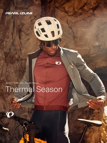
Pulling on the jacket demonstrates layering in one glance. Viewers instantly understand when and why they would need it.
- 02
Two products in one shot
The grey jacket and the burgundy jersey are both clearly visible. It promotes a layering system, which can raise basket size.
- 03
A real moment on the ride
The pause by the rock wall feels unposed and familiar. Every rider knows that stop to add a layer before a descent.
- 04
Warm backdrop, cool message
Sunlit rock keeps the cold-weather story inviting. The ad feels positive instead of grey and wintry.
Full creative breakdown
Who this ad targets
The ad targets experienced road and gravel cyclists who ride long days with changing temperatures and know the value of a packable layer. They are typically 28 to 55 and care about premium fit and function. The close, portrait-like framing also appeals to style-conscious riders who want kit that looks good off the bike. It suits prospecting to cycling interest audiences and cross-selling jackets to buyers of jerseys.
Copywriting analysis
The on-image copy is the same campaign pair used across the series: BUILT FOR THE IN-BETWEEN and Thermal Season. In this creative the eyebrow line fits especially well, because the image literally shows an in-between moment, the switch from one layer to two. The image and words reinforce each other, which makes the message stronger than in the other variants. Visible third-party logos on the helmet and bike add authenticity but also distract slightly from the brand. As with the others, the image has no product name or benefit, so the primary text should name the jacket and describe its packability and wind or warmth benefit.
Visual design
The rider fills most of the frame in a tight, mid-shot portrait, with arms spread as he opens the jacket, creating a strong, wide shape. The warm sandstone background, burgundy jersey and grey jacket form a rich, earthy palette. Strong side light adds texture and depth. The headline sits over the jacket in thin white type, with the small eyebrow above and logos in the top and bottom left corners, following the campaign layout.
How to adapt this template for your brand
- Photograph your model in the act of using the product: zipping, pulling on or adjusting.
- Frame tightly so the product and its layers fill the image.
- Choose a warm, textured background that contrasts with the garment colours.
- Place your campaign headline over a calm area of the clothing or background.
- Use the primary text to name both products and the layering benefit.
Tips for cycling gear ads on Meta
On Meta, this portrait ad works well in feed placements and as the lead image of a carousel that then shows the jacket and jersey as separate product cards. Target cyclists who have bought short-sleeve jerseys before to cross-sell the jacket. For Reels, a short clip of the rider zipping up the jacket would make this concept even stronger. Check that third-party logos meet your brand's partner guidelines before scaling.
About this creative
The creative is a portrait lifestyle photo of a cyclist standing next to his bike in front of a warm, sunlit sandstone rock wall. He is caught mid-movement, pulling a light grey jacket on over his shoulders and opening it with both hands, revealing a burgundy short-sleeve jersey with a small white round logo on the chest. He wears a cream helmet, dark wraparound sunglasses and black bib tights, and looks down with a calm, focused expression. A bike with an orange frame and black handlebars is partly visible at the bottom of the frame. A white wordmark sits top left and a round brand mark bottom left. In the middle left, over the jacket, a spaced monospaced eyebrow reads BUILT FOR THE IN-BETWEEN, with the large, thin headline Thermal Season below. The scene captures a real moment on a ride, adding a layer before a descent or as the temperature drops, which makes the product's purpose immediately clear without any explanation.
Meta ad · 338 × 600 · Cycling Gear
Thermal Season Layering Up Cycling Ad
This portrait lifestyle ad shows a cyclist mid-movement, pulling a grey jacket on over a burgundy jersey in front of a sunlit rock wall, under the headline Thermal Season. By showing the act of layering, it explains the product's use in one frame and is a strong template for adaptable apparel campaigns.
Added
All brand names and logos are property of their owners. Adplaylist is not affiliated with or endorsed by these brands.
Details
Ad copy
Primary text
Start cold, finish warm. Our thermal layers go on and off in seconds, so you can adjust on the road and stay comfortable from the first climb to the last descent.
Description
Jackets and jerseys that adapt with you.
On-image text
PEARL iZUMi | SMITH (on helmet) | BUILT FOR THE IN-BETWEEN | Thermal Season | (brand logo) | (bike brand on frame)
Headline ideas for this template
- 1Start Cold, Finish Warm
- 2One Layer Makes the Difference
- 3Layer Up in Seconds
- 4Thermal Season – Ready When You Are
- 5The Jacket for Every Descent
Meta image ad specs
| Placement | Ratio | Size (px) |
|---|---|---|
| Feed | 1:1 or 4:5 | 1080×1080 / 1080×1350 |
| Marketplace | 1:1 | 1200×1200 |
| Messenger inbox | 1:1 | 1200×1200 |
| Stories & Reels | 9:16 | 1080×1920 |
This template is 1:1. Request 4:5 or 9:16 to cover all placements.
Browse similar by tag