Key takeaways
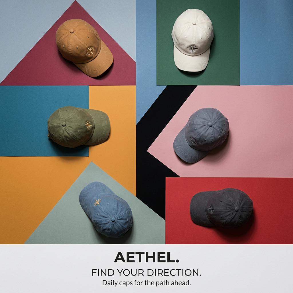
- Format: Overhead flat lay of variants on geometric color block paper.
- Best for: Products with several colorways that need a design-led presentation.
- Hook: A bold, gallery-like color collage stands out from standard product grids.
- Reuse it: Place each variant on its own colored shape and keep text in a clean footer.
Available sizes
What is a product shot ad?
A product shot ad puts the product itself at the centre of the frame, usually on a clean or styled background with little text. It works best when the packaging or product is distinctive enough to stop the scroll and the viewer already understands what it does.
See all product shot ads →Why this product shot ad works
- 01
Color block grabs attention
Bold geometric shapes feel like modern art. The pattern stands out in a feed of plain product photos.
- 02
Every cap gets its stage
Giving each cap its own color block highlights it individually. Viewers can easily compare and choose.
- 03
Clean text footer
Moving all copy to a white band keeps the image uncluttered. Brand and message stay readable on any screen.
- 04
Subtle shared symbol
The embroidered compass on every cap links to "Find Your Direction." It builds a consistent brand mark.
Full creative breakdown
Who this ad targets
The ad targets design-conscious men and women aged roughly 20 to 40 who like minimal everyday basics with a creative edge. They follow independent brands, appreciate graphic design and art-print aesthetics, and want caps that go with many outfits. The daily-cap message suits commuters, students and creatives who wear a cap most days and may buy more than one color.
Copywriting analysis
The copy is short and confined to the footer. The brand name "Aethel." with a full stop feels confident and modern. "Find Your Direction." ties to the compass embroidery and gives an aspirational, slightly reflective tone. The supporting line "Daily caps for the path ahead" clarifies the product type and positions it as an everyday essential. It repeats the journey metaphor without overdoing it. There is no offer or price, so this works best as a brand-awareness or new-colors creative, with conversion details in the primary text.
Visual design
The top four fifths is a dynamic collage of overlapping rectangles and triangles in a rich, varied palette, with a black diagonal adding energy. Caps are spread across the frame at different angles to avoid a rigid grid. Overhead lighting creates soft shadows that make the paper and fabric look tactile. The white footer separates image from text, and black bold sans-serif type gives strong hierarchy.
How to adapt this template for your brand
- Choose colored paper or card in shades that complement your product variants.
- Cut and layer the paper into geometric shapes to cover the background.
- Place one product on each shape at a slightly different angle and shoot from above.
- Add a white footer band with your brand name, headline and a short supporting line.
- Repeat a small brand symbol on every product to connect them visually.
Tips for hats ads on Meta
The bold palette works well in Instagram feeds and on Pinterest, where design-led imagery performs strongly. Use it for awareness and new colorway launches, then retarget with single-color product ads. For Reels, create a stop-motion clip where each cap drops onto its color block. Keep the footer text large enough to read on mobile, and test the image against a plain white version to measure the lift from the bold colors.
About this creative
This square flat-lay ad from Aethel shows six washed cotton dad caps photographed from above, each placed on its own block of colored paper. The background is a geometric collage of shapes in light blue, burgundy, forest green, teal, mustard, sage, pink, red and a black diagonal stripe. The caps come in tan, cream, olive, slate grey, faded blue and charcoal, and each has a small embroidered compass rose on the front panel. Caps are turned at different angles, which adds movement and a casual, styled feel. Soft directional light casts natural shadows, so the scene feels tactile and real. The bottom fifth of the image is a clean white band with the brand name in bold black capitals, followed by the line "Find Your Direction." and a smaller sentence calling them daily caps for the path ahead. The ad feels like a modern art print and positions the caps as an everyday, design-conscious accessory.
Meta ad · 1200 × 1200 · Hats
Dad Cap Ad Template: Color Block Flat Lay
This Aethel ad lays six washed cotton dad caps on a collage of bold, geometric colored paper. Each cap sits on its own color block, showing range and style at a glance, while a white footer delivers the brand and tagline. Use this product-shot format to present many variants in a playful, design-led way.
Added
All brand names and logos are property of their owners. Adplaylist is not affiliated with or endorsed by these brands.
Details
Ad copy
Primary text
Find your direction. 🧭 Aethel daily caps come in six washed colors, each with a subtle embroidered compass. Pick the one that matches your path, or your mood.
Description
Daily caps for the path ahead.
On-image text
AETHEL. | FIND YOUR DIRECTION. | Daily caps for the path ahead.
Headline ideas for this template
- 1Six Colors. One Direction.
- 2Daily Caps for Every Path
- 3Pick Your Color, Find Your Way
- 4The Everyday Cap, Reimagined
- 5Washed Cotton Caps in Six Shades
Meta image ad specs
| Placement | Ratio | Size (px) |
|---|---|---|
| Feed | 1:1 or 4:5 | 1080×1080 / 1080×1350 |
| Marketplace | 1:1 | 1200×1200 |
| Messenger inbox | 1:1 | 1200×1200 |
| Stories & Reels | 9:16 | 1080×1920 |
This template is 1:1. Request 4:5 or 9:16 to cover all placements.