Key takeaways
- Format: Top-down lifestyle shot combined with a row of colourway tiles.
- Best for: One hero product offered in multiple colours.
- Hook: A relatable coffee-break moment seen from an unusual overhead angle.
- Reuse it: Pair one lifestyle photo with clean product tiles for each variant.
Available sizes
What is a lifestyle ad?
A lifestyle ad shows the product being used in a real setting by the kind of person who buys it. Instead of listing features, it sells the feeling or outcome of owning the product, which makes it a strong fit for fashion, home, travel and wellness brands.
See all lifestyle ads →Why this lifestyle ad works
- 01
Mood plus product
The photo sells the lifestyle and the tiles sell the product. Viewers get emotion and information in one glance.
- 02
Unusual angle
The overhead view puts the embroidered cap front and centre while feeling candid.
- 03
Colour choice made easy
Four tiles show every option clearly, which reduces clicks needed to compare.
- 04
Quality cue in the copy
Premium Japanese cotton twill is a specific material claim that justifies the price.
Full creative breakdown
Who this ad targets
The ad targets urban men and women aged around 20 to 38 who live in big cities and like a clean, casual streetwear look. They drink speciality coffee, travel when they can and identify with global city culture, as the NYC - TOKYO - BERLIN line suggests. They care about material quality but want an everyday piece rather than a statement item. The four neutral colours also appeal to people who buy one cap per season or several to match outfits.
Copywriting analysis
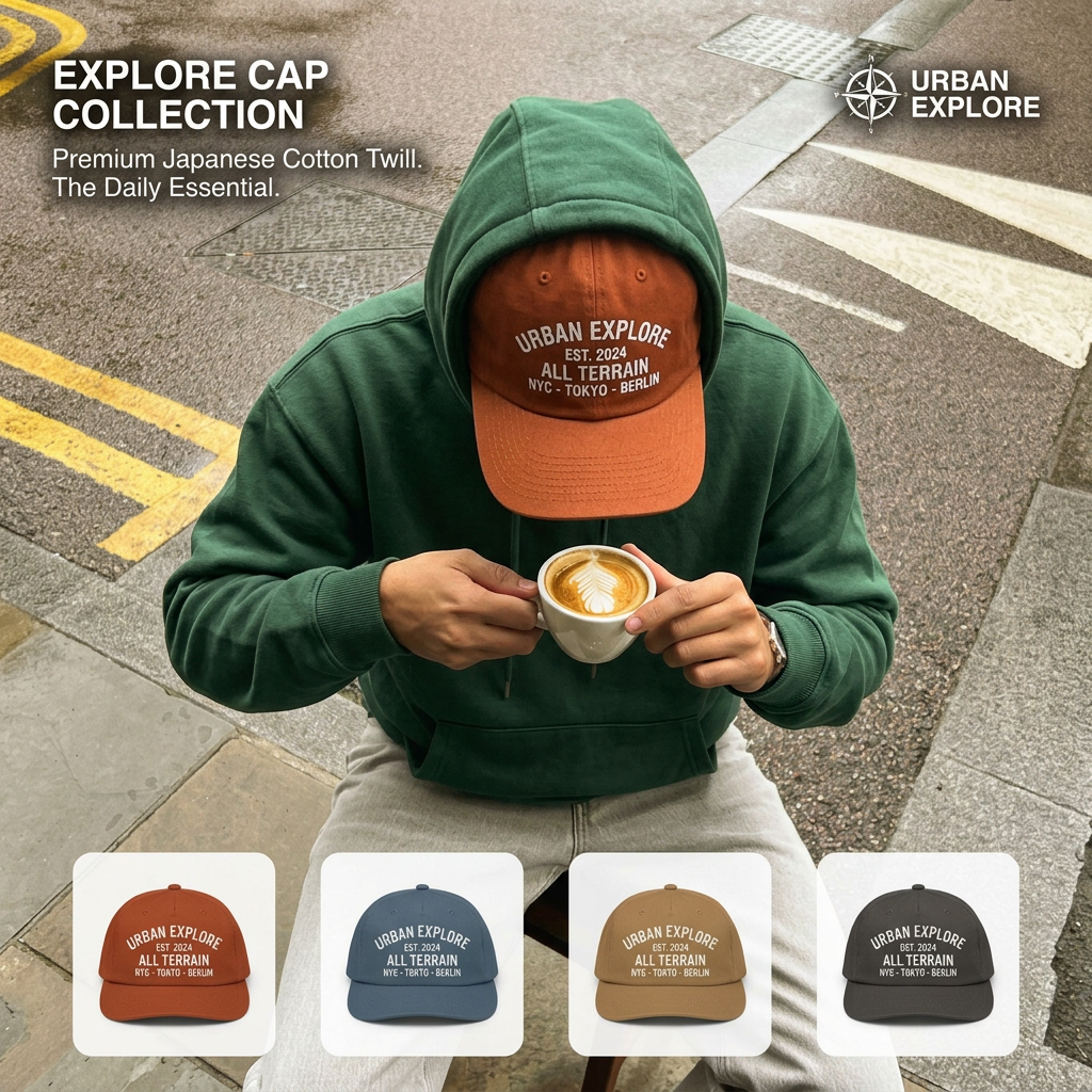
The copy works in layers. EXPLORE CAP COLLECTION names the product and links it to the brand. Premium Japanese Cotton Twill gives a concrete quality reason, while The Daily Essential positions the cap as something you wear every day, not just for special trips. The embroidery on the cap adds brand story with EST. 2024, ALL TERRAIN and three global cities, implying a well-travelled, cosmopolitan buyer. There is no price, offer or call to action on the image, so the tiles do the job of inviting a choice. The tone is calm and confident, which fits a premium basics brand.
Visual design
The overhead angle creates a strong central focal point on the bright orange cap, which stands out against the green hoodie and grey pavement. Yellow road lines and a white cup add contrast and lead the eye to the centre. The white headline sits on a darker area for readability. Four rounded white tiles at the bottom form a tidy product strip that contrasts with the gritty photo. Colours in the photo match the colourways, keeping the whole creative cohesive.
How to adapt this template for your brand
- Shoot one candid lifestyle photo where your product is clearly visible.
- Choose an unusual angle, such as top-down, to make the image feel fresh.
- Add your collection name and one material or benefit line in the top corner.
- Place clean cut-out tiles of each colourway along the bottom.
- Match the product in the photo to the first tile so viewers connect them.
Tips for hats ads on Meta
On Meta, this creative works well as a single image for prospecting and as the cover of a carousel with one card per colour. Use dynamic product ads with the tiles linking to each variant for retargeting. In Stories, move the tiles higher to avoid the reply bar. On TikTok, film a short clip of the coffee moment and end on the colourway strip. Target interests such as speciality coffee, travel and streetwear.
About this creative
This square lifestyle ad from Urban Explore is shot from directly above a person sitting on a city kerb. They wear a forest green hoodie with the hood up, light grey trousers and a burnt-orange cotton cap embroidered URBAN EXPLORE, EST. 2024, ALL TERRAIN and NYC - TOKYO - BERLIN. Both hands hold a white cup with a latte-art leaf, and the wet pavement, yellow road lines and drain cover add a gritty urban setting. The headline EXPLORE CAP COLLECTION sits in white at the top left with the line Premium Japanese Cotton Twill. The Daily Essential. A compass logo with the URBAN EXPLORE wordmark sits top right. Along the bottom, four rounded white tiles show the same cap in orange, slate blue, tan and charcoal. The mix of real-life mood and clean product tiles shows both how the cap feels in daily life and which colours are available to buy.
Meta ad · 1200 × 1200 · Hats
Dad Cap Ad Template: Lifestyle Shot With Colourways
This dad cap ad from Urban Explore pairs a top-down city lifestyle shot of a person with coffee with a row of four colourway thumbnails. It combines mood and product choice in one lifestyle format. Use it as a template when you sell one hero product in several colours.
Added
All brand names and logos are property of their owners. Adplaylist is not affiliated with or endorsed by these brands.
Details
Ad copy
Primary text
Your daily essential, from NYC to Tokyo to Berlin. The Explore Cap is made from premium Japanese cotton twill and comes in four colours. Which one is yours?
Description
Premium Japanese cotton twill
On-image text
EXPLORE CAP COLLECTION | Premium Japanese Cotton Twill. The Daily Essential. | URBAN EXPLORE | URBAN EXPLORE EST. 2024 ALL TERRAIN NYC - TOKYO - BERLIN (on caps)
Headline ideas for this template
- 1Your Daily Cap, From NYC to Tokyo
- 2Four Colours. One Everyday Essential.
- 3Japanese Cotton Twill Made for City Life
- 4The Cap That Goes Everywhere You Do
- 5Coffee, Cap, City. Repeat.
Meta image ad specs
| Placement | Ratio | Size (px) |
|---|---|---|
| Feed | 1:1 or 4:5 | 1080×1080 / 1080×1350 |
| Marketplace | 1:1 | 1200×1200 |
| Messenger inbox | 1:1 | 1200×1200 |
| Stories & Reels | 9:16 | 1080×1920 |
This template is 1:1. Request 4:5 or 9:16 to cover all placements.
Browse similar by tag