Key takeaways
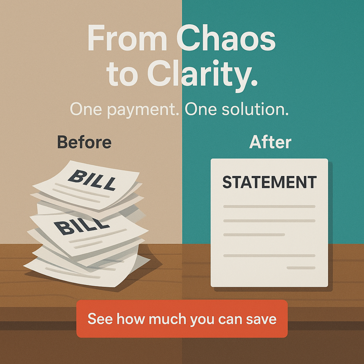
- Format: Split-screen before/after illustration contrasting many bills with one statement.
- Best for: Debt consolidation lenders, loan comparison sites and personal finance apps.
- Hook: 'From Chaos to Clarity' promises instant emotional relief from bill overload.
- Reuse it: Swap the bills for any messy 'before' and show your product as the single tidy 'after'.
Available sizes
What is a before and after ad?
A before and after ad shows the same subject in two states side by side, so the result of using the product is visible at a glance. It's common in skincare, cleaning, fitness and home improvement, but claims shown must be realistic and typical to stay within ad platform policies.
See all before / after ads →Why this before / after ad works
- 01
Instant visual contrast
The split screen communicates the whole value proposition before a word is read. Many papers versus one sheet equals complexity versus simplicity.
- 02
Colour carries the emotion
Dull beige on the 'before' side and calm teal on the 'after' side make the shift from stress to relief feel tangible.
- 03
Benefit-led CTA
'See how much you can save' sells an outcome rather than a loan application, lowering the commitment of the click.
- 04
Non-threatening illustration
A flat illustrated style avoids shaming the viewer and keeps a sensitive money topic feeling friendly and safe to engage with.
Full creative breakdown
Who this ad targets
The ad targets US adults aged roughly 25–55 who carry several debts at once, such as credit cards, personal loans and store cards, and feel overwhelmed by multiple due dates. They are not necessarily in crisis but are frustrated by admin and interest. They respond to simplicity and control more than to aggressive savings claims. This audience is reachable through interest targeting around personal finance, budgeting and credit, and through search intent like 'consolidate credit card debt'.
Copywriting analysis
The copy is short and rhythmic. 'From Chaos to Clarity.' uses alliteration and a clear transformation arc, so the headline does the job of the whole ad. The subline 'One payment. One solution.' repeats 'one' to hammer home simplicity, the core product benefit, and the full stops create a confident, calm tone. The 'Before' and 'After' labels remove any ambiguity about how to read the visual. The CTA 'See how much you can save' is curiosity-driven and benefit-led, implying a personalised result without making a specific savings claim, which also keeps it safer for financial ad policies. There is no brand name on the creative, so in a live campaign the brand would rely on the page name and primary text for recognition and trust.
Visual design
A vertical split divides the frame into beige and teal halves, with a shared wooden desk anchoring both scenes. The white headline spans the divide, symbolically bridging chaos and clarity. Typography is a clean geometric sans serif, bold for the headline and lighter for the subline. Grey placeholder lines on the documents suggest text without clutter. The orange-red CTA button is the strongest accent and the last thing the eye lands on. Flat shading and soft shadows give an editorial, trustworthy look.
How to adapt this template for your brand
- Define the messy 'before' state your audience lives with (bills, apps, spreadsheets, subscriptions).
- Pick two contrasting background colours: a dull or warm one for 'before' and a calm brand colour for 'after'.
- Illustrate many cluttered items on the left and one clean item representing your product on the right.
- Write a short transformation headline (From X to Y) plus a subline that repeats your core benefit.
- Add a high-contrast CTA button with a benefit-led line such as 'See how much you can save'.
Tips for finance & fintech ads on Meta
On Meta, run this in Feed and Explore at 1:1, and create a 4:5 version with extra headroom for the headline. Financial products must follow Meta's financial services policies, so avoid guaranteed savings or approval claims and make sure the landing page shows APR ranges and lender details. In the US, credit ads fall under Meta's special ad category, which limits age, gender and zip-code targeting. On Google Display, keep the CTA text inside the image legible at small sizes.
About this creative
This square ad for a debt consolidation loan is built around a vertical split screen. The left half has a warm beige background with the label 'Before' above a messy, overflowing stack of papers stamped 'BILL'. The right half switches to a calm teal with the label 'After' above a single, neatly placed sheet titled 'STATEMENT'. Both sides sit on the same wooden desk, which ties the two states together and makes the comparison feel like the same person's life, just reorganised. The headline 'From Chaos to Clarity.' runs across both halves in large white type, followed by the subline 'One payment. One solution.' At the bottom, a bright orange-red button reads 'See how much you can save', the only saturated warm colour in the frame, which pulls the eye straight to the call to action. The flat, editorial illustration style keeps a stressful topic feeling approachable and trustworthy rather than alarming.
Meta ad · 1200 × 1200 · Finance & Fintech
Debt Consolidation Before & After Ad: From Chaos to Clarity
This debt consolidation ad uses a classic before/after split screen: a chaotic stack of bills on the left and one tidy statement on the right. It is a square image ad built for Meta and Google Display, ideal for lenders and loan comparison sites promoting a single monthly payment.
Added
All brand names and logos are property of their owners. Adplaylist is not affiliated with or endorsed by these brands.
Details
Ad copy
Primary text
Juggling a pile of bills, due dates and interest rates? Roll them into one simple monthly payment and see how much you could save with a debt consolidation loan.
Description
Compare consolidation loan offers in minutes.
On-image text
From Chaos to Clarity. | One payment. One solution. | Before | BILL | BILL | After | STATEMENT | See how much you can save
Headline ideas for this template
- 1From Bill Pile to One Payment.
- 2Five Due Dates? Make It One.
- 3Turn Chaos Into One Clear Plan.
- 4Less Paperwork. Less Interest. More Clarity.
- 5Simplify Your Debt in One Step.
Meta image ad specs
| Placement | Ratio | Size (px) |
|---|---|---|
| Feed | 1:1 or 4:5 | 1080×1080 / 1080×1350 |
| Marketplace | 1:1 | 1200×1200 |
| Messenger inbox | 1:1 | 1200×1200 |
| Stories & Reels | 9:16 | 1080×1920 |
This template is 1:1. Request 4:5 or 9:16 to cover all placements.