Key takeaways
- Format: Logo-led brand awareness square
- Best for: Reach and retargeting campaigns for well-known SaaS brands
- Hook: The word forever positions Deel as a lifelong platform, not a single tool
- Reuse it: Swap logo, colour and tagline to create a brand reminder for any company
Available sizes
What is a product shot ad?
A product shot ad puts the product itself at the centre of the frame, usually on a clean or styled background with little text. It works best when the packaging or product is distinctive enough to stop the scroll and the viewer already understands what it does.
See all product shot ads →Why this product shot ad works
- 01
Logo as hero
A large wordmark on empty space is instantly recognisable and builds brand recall with every impression.
- 02
One idea only
A five-word tagline is read in under a second, which suits fast-scrolling feeds.
- 03
Calm colour stands out
Soft blue contrasts with busy, photo-heavy feeds and feels trustworthy for an HR and payroll brand.
- 04
Clear single action
The black pill button gives one obvious next step without competing elements.
Full creative breakdown
Who this ad targets
This ad targets founders, HR leaders and finance managers at startups and mid-sized companies that employ, or plan to employ, people in more than one country. They juggle separate payroll vendors, local contracts and compliance rules, and feel the admin drag of growth. The creative speaks to decision-makers evaluating an all-in-one HR and payroll platform, and to team leads who influence the purchase and want a simpler way to hire, manage and pay a distributed team.
Copywriting analysis
The copy is just five words, but they carry the whole positioning. “Your” makes it personal and ownership-oriented, while “people platform” is a broader category than payroll software, signalling that Deel covers hiring, HR, compliance and pay. “Forever” is the emotional lever: it promises that customers will never outgrow the product, which speaks to a key fear for scaling companies that have had to switch tools as they grow. The Learn more CTA is soft and low-commitment, matching the awareness goal. There is no feature list, price or urgency, which is appropriate for a creative whose job is recognition rather than conversion.
Visual design
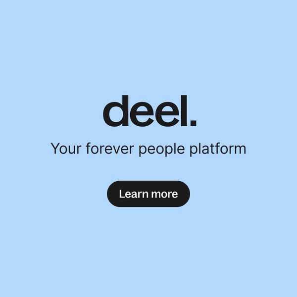
The layout is centred and symmetrical, with the logo occupying the upper middle and the tagline and button stacked below, creating a clean vertical reading line. The light blue background is soft and calm, while black type and the black button give strong contrast. The large amount of empty space makes the creative feel premium and confident. The rounded pill button echoes modern app interfaces and hints at software without showing any UI.
How to adapt this template for your brand
- Start with a solid brand-colour background and make your logo the hero.
- Add a tagline that sums up your positioning in five words or fewer.
- Place a single pill-shaped CTA button below the tagline.
- Keep generous empty space so the logo dominates the feed.
- Use it for reach or retargeting and rotate the tagline to test positioning.
Tips for hr software ads on Meta
On Meta, square 1:1 works across Feed placements; keep critical text inside the centre 80% so nothing gets cropped. On LinkedIn, square single-image ads perform well with B2B audiences; pair them with job-title and company-size targeting and a short, benefit-led intro text. Keep on-image copy under 20 words, use Learn more for cold audiences and switch to Book a demo or Sign up when retargeting warm visitors.
About this creative
This creative is as stripped back as an ad gets. A flat, light blue background fills the square, with the black Deel wordmark, complete with its signature full stop, placed large in the upper centre. Directly beneath sits the tagline “Your forever people platform” in a clean, thin sans-serif, and below that a black pill-shaped button reading Learn more. There is no photography, no product UI and no secondary copy. The design relies entirely on brand recognition, colour and positioning. The word forever is the hook: it suggests Deel is not a point tool for one task but a long-term home for everything people-related, from hiring to payroll to HR. This kind of ad usually runs as a reach or retargeting creative, reminding people who have already seen Deel's richer ads of the brand and its positioning. It is cheap to produce, easy to localise and instantly recognisable in a busy feed.
Meta ad · 338 × 600 · HR Software
Deel Brand Awareness Ad: Your Forever People Platform
This minimal Deel ad puts the logo front and centre on a soft blue background with the tagline “Your forever people platform” and a single Learn more button. It is a clean brand awareness square for Meta and LinkedIn that any B2B SaaS brand can adapt in minutes.
Added
All brand names and logos are property of their owners. Adplaylist is not affiliated with or endorsed by these brands.
Details
Ad copy
Primary text
One platform to hire, manage and pay your global team. Deel brings payroll, HR, compliance and onboarding together, for every employee, anywhere.
Description
All-in-one global HR and payroll
On-image text
deel. | Your forever people platform | Learn more
Headline ideas for this template
- 1The people platform you'll never outgrow
- 2Hire, manage and pay. Forever.
- 3One platform for every hire, everywhere
- 4HR and payroll, built to grow with you
- 5Your team's home, from day one to forever
Meta image ad specs
| Placement | Ratio | Size (px) |
|---|---|---|
| Feed | 1:1 or 4:5 | 1080×1080 / 1080×1350 |
| Marketplace | 1:1 | 1200×1200 |
| Messenger inbox | 1:1 | 1200×1200 |
| Stories & Reels | 9:16 | 1080×1920 |
This template is 1:1. Request 4:5 or 9:16 to cover all placements.
Browse similar by tag