Key takeaways
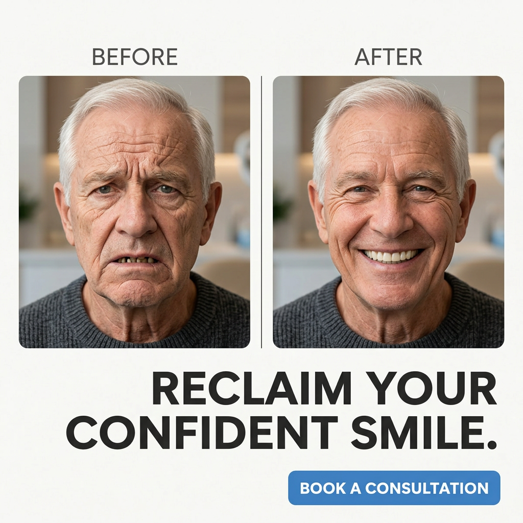
- Format: Labelled side-by-side before/after with a single headline and CTA button.
- Best for: Denture, implant and family dental clinics running local lead-generation campaigns.
- Hook: A visible gap-toothed frown turned into a full, beaming smile.
- Reuse it: Label both photos clearly, keep the same person and setting, and add one bold benefit headline plus a button.
Available sizes
What is a before and after ad?
A before and after ad shows the same subject in two states side by side, so the result of using the product is visible at a glance. It's common in skincare, cleaning, fitness and home improvement, but claims shown must be realistic and typical to stay within ad platform policies.
See all before / after ads →Why this before / after ad works
- 01
Clear labels
'Before' and 'After' remove any doubt about what the viewer is looking at. Fast scrollers get it instantly.
- 02
Emotional and physical change
The teeth change, but so does his whole expression. The ad sells confidence as much as dental work.
- 03
Action-led headline
'Reclaim' implies getting back something you lost. It speaks to people who remember smiling freely.
- 04
Visible CTA button
A coloured button on a neutral background draws the eye to the next step. It makes booking feel easy.
Full creative breakdown
Who this ad targets
The ad targets older adults, especially men aged roughly 60–80, with missing, damaged or failing teeth who have avoided the dentist or feel self-conscious when talking and smiling. It may also reach spouses and adult children encouraging a parent to get treatment. Local radius targeting around a clinic, combined with broad age targeting, works well. Messaging should stay respectful and focus on confidence, not on shame about the 'before'.
Copywriting analysis
The copy is minimal and effective: two labels, one headline and one CTA. 'Reclaim Your Confident Smile' is benefit-led and emotional, and the verb 'reclaim' suggests restoring something lost rather than changing who you are. 'Book a Consultation' is a clear, low-commitment action. What is missing is the brand name and any trust signal, such as years of experience, a free consultation or financing. Adding one short proof point near the button could raise conversion. The ad avoids medical claims, which helps compliance.
Visual design
A clean, symmetrical grid with two equal rounded photo frames gives the comparison a professional, clinical feel. The off-white background keeps the design light and trustworthy. Photos share the same crop, lighting and clothing, so the change is easy to see. The heavy black uppercase headline is right-aligned and paired with a bright blue button, the only strong colour, which pulls the eye to the CTA. Some empty space on the bottom left could hold a logo.
How to adapt this template for your brand
- Use a real patient's before and after photos with the same crop, light and clothing.
- Place them in two rounded frames side by side with 'Before' and 'After' labels.
- Write a short headline using a 'reclaim' or 'restore' benefit.
- Add a single coloured CTA button as the only bright element.
- Include your logo and one trust signal, such as 'Free consultation' or '20 years' experience'.
Tips for health & fitness ads on Meta
On Meta, use genuine patient photos with written consent and avoid unrealistic results, as health ads are reviewed carefully. Do not use copy that implies the viewer has missing teeth. This creative suits Facebook Feed for older audiences and works well with a lead form for consultations. For Stories and Reels, stack the before and after vertically or use a quick swipe transition.
About this creative
The creative uses a light, off-white background with two rounded photo frames placed side by side, separated by a thin vertical line. Above them, the labels 'Before' and 'After' are set in a thin grey uppercase sans-serif. Both photos show the same white-haired man in his seventies, wearing a dark grey sweater, in a bright, softly blurred clinic or home interior. In the before photo, he looks unhappy and tired, with a downturned mouth revealing several missing and damaged teeth. In the after photo, he smiles widely with a full, even set of white teeth, and his face looks more relaxed and younger. Below the photos, a large bold black headline reads 'Reclaim Your Confident Smile.' across two lines, aligned to the right. A blue rounded button in the bottom right says 'Book a Consultation'. There is no brand logo visible, which is a missed opportunity for brand recall.
Meta ad · 1200 × 1200 · Health & Fitness
Dental Before / After Ad Template: Reclaim Your Confident Smile
This square before/after ad shows the same older man twice, first frowning with missing teeth, then smiling broadly with a full set. Clear labels, a bold headline and a blue booking button make it a straightforward reference for denture, implant and general dental clinics that want a direct, conversion-focused creative.
Added
All brand names and logos are property of their owners. Adplaylist is not affiliated with or endorsed by these brands.
Details
Ad copy
Primary text
Missing teeth can make you stop smiling without even noticing. Our patients tell us the biggest change isn't how their teeth look, it's how often they laugh again. Book a free consultation and find out which option suits you.
Description
Free consultation available
On-image text
BEFORE | AFTER | RECLAIM YOUR CONFIDENT SMILE. | BOOK A CONSULTATION
Headline ideas for this template
- 1Smile Like You Used To
- 2Your Confident Smile Is One Visit Away
- 3Stop Hiding Missing Teeth
- 4Bring Back the Smile You Remember
- 5Natural-Looking Teeth, Real Confidence
Meta image ad specs
| Placement | Ratio | Size (px) |
|---|---|---|
| Feed | 1:1 or 4:5 | 1080×1080 / 1080×1350 |
| Marketplace | 1:1 | 1200×1200 |
| Messenger inbox | 1:1 | 1200×1200 |
| Stories & Reels | 9:16 | 1080×1920 |
This template is 1:1. Request 4:5 or 9:16 to cover all placements.