Key takeaways
- Format: Co-branded food and drink product shot with a pairing headline and arrow.
- Best for: Restaurant and QSR menu launches, LTOs and brand collaborations.
- Hook: A familiar cereal brand appearing in an unexpected coffee drink.
- Reuse it: Pair two products, use an arrow to connect the claim to the hero item, and feature the partner logo.
Available sizes
What is a product shot ad?
A product shot ad puts the product itself at the centre of the frame, usually on a clean or styled background with little text. It works best when the packaging or product is distinctive enough to stop the scroll and the viewer already understands what it does.
See all product shot ads →Why this product shot ad works
- 01
Borrowed brand equity
Cinnamon Toast Crunch is a beloved flavour, so the collab sparks instant curiosity. The partner logo does a lot of the persuading.
- 02
Pairing drives basket size
The headline suggests ordering the coffee with Donut Bites. It sells two items with one message.
- 03
Arrow guides the eye
The hand-drawn arrow leads from the headline to the drink. It adds a casual, human touch and sets clear priorities.
- 04
Appetite appeal
Close-up sugar-coated bites and swirling coffee look indulgent. The food photography makes the offer tempting.
Full creative breakdown
Who this ad targets
This ad targets QSR customers in Bojangles' regions, mainly in the US Southeast, who are open to sweet treats and specialty coffee drinks. It appeals to young adults and Gen Z, who enjoy novelty flavours and brand collabs, and to morning commuters looking for a coffee-and-snack combo. Cereal nostalgia also draws in millennials. Location-based targeting around restaurants and delivery-app users makes it effective for driving in-store visits and orders.
Copywriting analysis
The headline "Donut Bites go better with" is deliberately unfinished; the arrow and the Cinnamon Toast Crunch Iced Coffee logo complete the sentence. That structure makes the viewer's eye do the work, which increases attention. It positions the drink as the perfect partner rather than a standalone product, encouraging an add-on purchase. The lowercase script "with" contrasts with the heavy capitals, adding personality. The copy is short, playful and focused on the pairing, while the logos handle naming and credibility.
Visual design
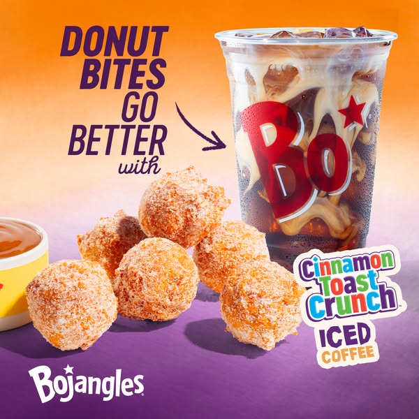
The orange-to-purple gradient creates a warm, vibrant backdrop and lets both the gold bites and the clear cup stand out. The cup sits on the right and takes up most of the height, making it the hero. Donut Bites fill the lower-left foreground and balance the composition. Heavy purple type in the upper-left leads into the arrow, which curves toward the cup. Logos are placed in the lower corners, and the sharp, well-lit food photography gives a premium, appetising look.
How to adapt this template for your brand
- Choose a hero product and a natural pairing item to feature together.
- Write a headline that finishes with the partner product, using an arrow to connect them.
- Use a gradient background that blends both brands' colours.
- Shoot the food in sharp close-up for maximum appetite appeal.
- Place both brand logos clearly and add 'limited time' in the ad copy.
Tips for fast food ads on Meta
On Meta, run this square creative in Feed and use a 9:16 version with extra space at the top for Stories and Reels. Use location targeting around restaurants and an Order Now CTA linking to the app or delivery partner. Collab ads benefit from short flights with heavy frequency at launch. Test this static against a short video showing the coffee pour to see which drives more orders, and highlight the limited-time angle in the primary text.
About this creative
This square ad from Bojangles promotes a limited-time collaboration with Cinnamon Toast Crunch. On the right, a tall clear cup of iced coffee is filled with ice and swirls of creamy milk, with the bold red Bojangles 'Bo' logo printed across it. In the bottom-left foreground, five golden Donut Bites coated in cinnamon sugar are arranged in a loose cluster, with a small dipping cup partly visible at the edge. The background is a smooth gradient from warm orange at the top to deep purple at the bottom, a colour pairing that nods to both brands. The headline, in heavy purple capitals, says that Donut Bites go better with, and a hand-drawn arrow curves from "with" toward the cup. Below the cup, the colourful Cinnamon Toast Crunch logo and the words "Iced Coffee" name the drink, and the white Bojangles logo sits in the lower-left corner. The design turns a beverage launch into an appealing food-and-drink pairing.
Meta ad · 338 × 600 · Fast Food
Co-Branded Ad Example: Bojangles Cinnamon Toast Crunch Iced Coffee
This Bojangles ad promotes a co-branded Cinnamon Toast Crunch iced coffee alongside sugar-dusted Donut Bites. A hand-drawn arrow connects the headline to the drink, making it a square product shot built for restaurant menu launches, limited-time offers and brand collaborations.
Added
All brand names and logos are property of their owners. Adplaylist is not affiliated with or endorsed by these brands.
Details
Ad copy
Primary text
Sweet, cinnamony and ice-cold ☕✨ Try the new Cinnamon Toast Crunch Iced Coffee at Bojangles – the perfect partner for Donut Bites. Limited time only!
Description
New limited-time iced coffee at Bojangles
On-image text
DONUT BITES GO BETTER with | Bo' (cup) | Cinnamon Toast Crunch ICED COFFEE | Bojangles
Headline ideas for this template
- 1Donut Bites Go Better With This
- 2Cinnamon Toast Crunch, Now in Iced Coffee
- 3Your New Favourite Coffee Pairing
- 4Sip the Cereal You Love
- 5Limited Time: Cinnamon Toast Crunch Iced Coffee
Meta image ad specs
| Placement | Ratio | Size (px) |
|---|---|---|
| Feed | 1:1 or 4:5 | 1080×1080 / 1080×1350 |
| Marketplace | 1:1 | 1200×1200 |
| Messenger inbox | 1:1 | 1200×1200 |
| Stories & Reels | 9:16 | 1080×1920 |
This template is 1:1. Request 4:5 or 9:16 to cover all placements.