Key takeaways
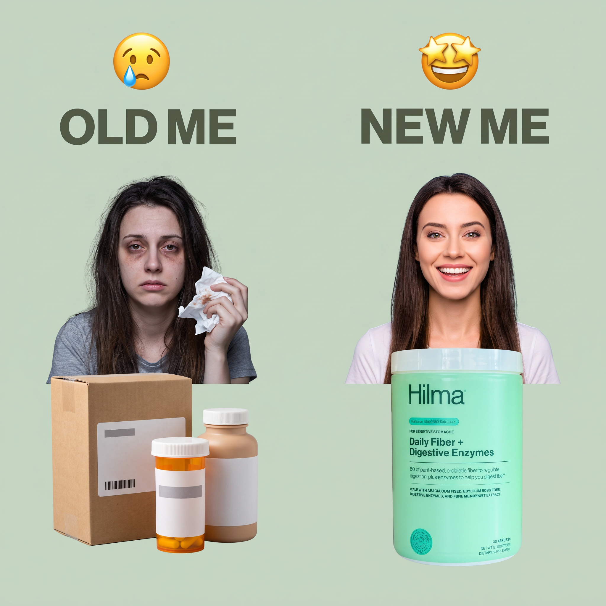
- Format: Before / after split in Old Me vs New Me meme style
- Best for: Supplements and wellness products with a clear feel-better story
- Hook: The relatable Old Me vs New Me meme
- Reuse it: Swap the people and products, keep the emojis and split layout
Available sizes
What is a before and after ad?
A before and after ad shows the same subject in two states side by side, so the result of using the product is visible at a glance. It's common in skincare, cleaning, fitness and home improvement, but claims shown must be realistic and typical to stay within ad platform policies.
See all before / after ads →Why this before / after ad works
- 01
Meme format people know
Old Me vs New Me is a familiar social format, so the ad feels native and is understood in a second.
- 02
Emotion before features
Emojis and facial expressions show the transformation without any claims text.
- 03
Competitors shown as clutter
Generic bottles and a box on the left suggest past products that did not work.
- 04
Product as the turning point
The bright Hilma tub is the largest object on the right, so the brand is clearly linked to the happy result.
Full creative breakdown
Who this ad targets
This ad targets adults, mainly women aged 25 to 50, who deal with digestive discomfort, bloating or irregularity and have already tried other supplements without success. They are frustrated with taking many pills and want one simple, gentle solution. The meme style also reaches younger social media users who respond to humour and relatable content rather than clinical messaging or medical promises.
Copywriting analysis
The on-image copy is just four words: Old Me and New Me. The emojis do the emotional work, sad versus delighted. This lets the visuals tell the story and avoids explicit health claims, which helps with platform rules. The packaging carries the product details: daily fiber plus digestive enzymes for sensitive stomachs. The real persuasion has to come from the primary text, which should name the pain point and explain the switch. Simple wording keeps the ad light and shareable.
Visual design
The split layout gives both sides equal size, inviting a direct comparison. The flat sage background ties the brand color to the mint green tub. Big bold headings and large emojis are readable even as a thumbnail. The left side uses dull browns and a grey t-shirt, while the right uses white and mint, so the mood shift is visible. Cut-out photos keep it feeling like a meme rather than a polished studio ad.
How to adapt this template for your brand
- Split your square into two equal halves with a single background color.
- Add an emoji and the words Old Me and New Me at the top of each side.
- Show the problem on the left with a frustrated person and generic alternatives.
- Show the happy result on the right with your product large and clearly branded.
- Use the primary text to explain the pain point and why your product is different.
Tips for health & fitness ads on Meta
This format thrives on Meta and TikTok, where meme-style content blends into feeds. Meta restricts before and after images that imply health or body changes, so keep the focus on mood rather than physical results. On TikTok, turn it into a short transition video with a trending sound. Test both a woman and a man version to see which audience responds better.
About this creative
This square ad for Hilma uses a split-screen before and after layout on a sage green background. On the left, a crying emoji sits above the words OLD ME in heavy dark green type. Below, a tired woman with messy hair and dark circles holds a crumpled tissue, with a cardboard box and two plain pill bottles in front of her. The scene suggests trying lots of products that did not help. On the right, a star-eyed emoji sits above NEW ME. Here, a smiling woman with smooth hair stands behind a large mint green tub of Hilma Daily Fiber plus Digestive Enzymes, labelled for sensitive stomachs. Both women are cut out and placed on the same background, so the only difference is mood and product. The ad borrows the familiar meme format, so viewers understand the story instantly: switching to Hilma makes you feel better.
Meta ad · 1200 × 1200 · Health & Fitness
Fiber Supplement Ad Template: Hilma Old Me vs New Me
This Hilma ad uses the popular Old Me vs New Me meme to compare a tired woman with pill bottles to a smiling woman holding Hilma Daily Fiber. It is an easy before and after template for supplement and wellness brands that want a relatable, scroll-stopping transformation story.
Added
All brand names and logos are property of their owners. Adplaylist is not affiliated with or endorsed by these brands.
Details
Ad copy
Primary text
Old me: a cabinet full of pills that never quite worked. New me: one daily scoop of Hilma Daily Fiber + Digestive Enzymes, made for sensitive stomachs. Gentle, plant-based and easy to stick with.
Description
Daily fiber + digestive enzymes for sensitive stomachs.
On-image text
😢 OLD ME | 🤩 NEW ME | Pack: Hilma – FOR SENSITIVE STOMACHS – Daily Fiber + Digestive Enzymes – DIETARY SUPPLEMENT
Headline ideas for this template
- 1From bloated to back to yourself
- 2One scoop instead of five bottles
- 3Gentle fiber for sensitive stomachs
- 4The gut health switch you'll feel
- 5Your new daily fiber routine
Meta image ad specs
| Placement | Ratio | Size (px) |
|---|---|---|
| Feed | 1:1 or 4:5 | 1080×1080 / 1080×1350 |
| Marketplace | 1:1 | 1200×1200 |
| Messenger inbox | 1:1 | 1200×1200 |
| Stories & Reels | 9:16 | 1080×1920 |
This template is 1:1. Request 4:5 or 9:16 to cover all placements.
Browse similar by tag