Key takeaways
- Format: Lifestyle image with a single text overlay
- Best for: Insurance, comparison sites and end-of-life planning in awareness or consideration
- Hook: Open question that invites reflection
- Reuse it: Swap the image for any calm, symbolic scene and keep one short line of copy
Available sizes
What is a lifestyle ad?
A lifestyle ad shows the product being used in a real setting by the kind of person who buys it. Instead of listing features, it sells the feeling or outcome of owning the product, which makes it a strong fit for fashion, home, travel and wellness brands.
See all lifestyle ads →Why this lifestyle ad works
- 01
Emotion without fear
The visual evokes family and care without showing death or grief, so viewers engage instead of scrolling away.
- 02
Question hook
A question creates curiosity and lets the viewer reach the answer themselves.
- 03
Native feel
No logo, badges or prices make it look like organic content in the feed, lowering ad resistance.
- 04
Readable at a glance
One text block on a clean area of the image is legible on mobile in under two seconds.
Full creative breakdown
Who this ad targets
Dutch adults roughly 40–75, homeowners and parents or grandparents who are starting to think about what they leave behind. Many have no funeral insurance yet or have an old policy from their parents' time and wonder whether it still fits. They want to spare their children financial stress and practical worries, value clarity and trust, and are sensitive to pushy sales. The ad meets them in a reflective moment and offers an easy, low-commitment next step.
Copywriting analysis
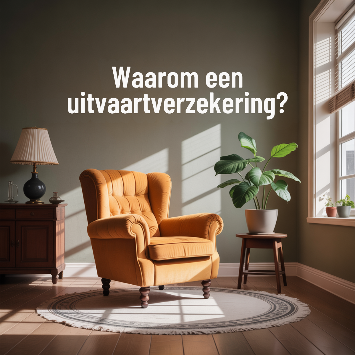
The copy is one short question: 'Waarom een uitvaartverzekering?' It contains the main keyword, which helps relevance, and frames the topic as something to learn about rather than buy. That lowers the threshold on an uncomfortable subject. The weakness is that there is no benefit or reason to click on the image itself, so the primary text and headline must deliver the payoff, for example the cost of a funeral or relief for loved ones. The formal 'een' with no pronoun keeps it neutral and suitable for all ages. Pairing it with a symbolic image lets the viewer fill in the emotional answer.
Visual design
Large cream serif question across the top; the candle is a classic remembrance symbol, rendered dreamlike and gentle. The image shows a single lit white candle rising out of soft glowing clouds against a blue-grey gradient background. The palette is soft and calm, keeping a respectful tone for the category. Text sits in an area of negative space so it never fights with the subject, and the square crop is optimised for Meta feed placements. No logo, price or CTA button appears on the creative, which keeps it clean but relies on the ad unit for conversion.
How to adapt this template for your brand
- Pick one calm, symbolic image that relates to family, care or absence (stock or AI-generated).
- Leave clear negative space for one text block, top or bottom third.
- Write one line: either a 'why' question or a 'compare and find the best' promise with your main keyword.
- Choose a font that matches the mood (serif for warmth and trust, sans-serif for clarity) and bold the key words.
- Add your logo subtly and test question vs. comparison hooks against each other.
Tips for finance & fintech ads on Meta
On Meta, run this in 1:1 for feed and make a 4:5 and 9:16 version for more screen space in feed and Stories/Reels. Insurance is a regulated financial category, so avoid fear-based claims and check special ad category rules for your market. Target by age and life events rather than sensitive interests, and pair the image with a longer primary text that explains the benefit. Test several visuals with the same copy to find which mood performs, then refresh creatives every few weeks to avoid fatigue.
About this creative
This square 1200×1200 Dutch-language ad for funeral insurance (uitvaartverzekering) shows a single lit white candle rising out of soft glowing clouds against a blue-grey gradient background. Large cream serif question across the top; the candle is a classic remembrance symbol, rendered dreamlike and gentle. There is no logo or brand name visible, which suggests a comparison website or affiliate advertiser. The on-image copy asks the question 'Waarom een uitvaartverzekering?' (Why funeral insurance?). The question invites reflection instead of pushing a sale, which suits a sensitive topic where hard selling backfires. It works as a top-of-funnel awareness ad that sends viewers to an explainer page or comparison tool. The visual carries the emotion while the text keeps it practical, a balance that matters for a category tied to loss and family. Colours are soft and restrained, avoiding dark or morbid imagery, so the ad feels reassuring in a social feed. It is easy to reproduce with a stock image and one text layer.
Meta ad · 1200 × 1200 · Finance & Fintech
Funeral Insurance Ad Template: Candle In Clouds
This Dutch funeral insurance ad pairs candle in clouds imagery with a simple 'why' question in a square format. Use it as a template for insurance, finance or end-of-life planning campaigns on Meta, where a calm, emotional visual and short copy earn attention without feeling pushy.
Added
All brand names and logos are property of their owners. Adplaylist is not affiliated with or endorsed by these brands.
Details
Ad copy
Primary text
NL: Een uitvaart kost al snel €8.000 of meer. Met een uitvaartverzekering zorgt u dat uw nabestaanden niet met de kosten blijven zitten. Lees waarom het verstandig is. | EN: A funeral can easily cost €8,000 or more. Funeral insurance makes sure your loved ones aren't left with the costs. Read why it makes sense.
Description
NL: Ontzorg uw nabestaanden | EN: Take the worry off your loved ones
On-image text
NL: Waarom een uitvaartverzekering? | EN: Why funeral insurance?
Headline ideas for this template
- 1Ontzorg uw nabestaanden (Take the worry off your loved ones)
- 2Vergelijk en bespaar op uw uitvaartverzekering (Compare and save on your funeral insurance)
- 3Uw uitvaart, uw wensen (Your funeral, your wishes)
- 4Binnen 2 minuten de beste premie (The best premium within 2 minutes)
- 5Is uw oude polis nog wel genoeg? (Is your old policy still enough?)
Meta image ad specs
| Placement | Ratio | Size (px) |
|---|---|---|
| Feed | 1:1 or 4:5 | 1080×1080 / 1080×1350 |
| Marketplace | 1:1 | 1200×1200 |
| Messenger inbox | 1:1 | 1200×1200 |
| Stories & Reels | 9:16 | 1080×1920 |
This template is 1:1. Request 4:5 or 9:16 to cover all placements.