Key takeaways
- Format: Lifestyle photo with breakout UI callouts
- Best for: No-code website builders and design tools
- Hook: A real-looking domain name in a giant pill
- Reuse it: Overlay two product UI elements on a photo of someone using it
Available sizes
What is a lifestyle ad?
A lifestyle ad shows the product being used in a real setting by the kind of person who buys it. Instead of listing features, it sells the feeling or outcome of owning the product, which makes it a strong fit for fashion, home, travel and wellness brands.
See all lifestyle ads →Why this lifestyle ad works
- 01
Shows, not tells
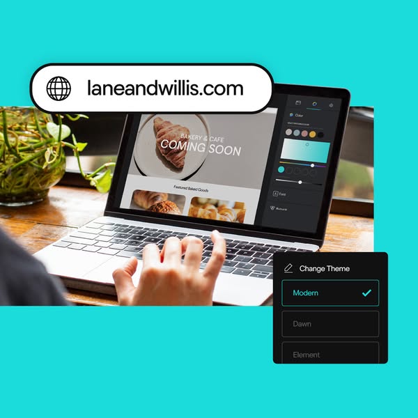
The editor on screen proves how easy building looks without a single feature claim.
- 02
Breakout callouts
UI elements spilling over the photo frame create depth and highlight key features.
- 03
Relatable niche
A local bakery is a dream business many owners can picture as their own.
- 04
Bold background
Turquoise stands out in feeds dominated by white and blue.
Full creative breakdown
Who this ad targets
Small business owners and side-hustlers – bakers, café owners, makers – who want a professional-looking site but have no design or coding skills. Often launching something new, so 'coming soon' resonates. They care about looking good, fast, and want domain and site from one provider. Typically 25–50, mobile-first and responsive to warm, relatable imagery over technical claims. Many are launching their first business.
Copywriting analysis
The image carries almost no marketing copy, which is the point: the product UI speaks. The domain pill presents a personal-sounding business name, inviting viewers to imagine theirs. 'Change Theme' and the theme names imply choice and flexibility. 'Coming soon' on the bakery site is a subtle storytelling cue: this person is about to launch. The ad relies on the primary text and headline fields to deliver the offer and CTA. This makes it flexible: the same image can carry different offers, from free domains to trial periods, simply by changing the text fields.
Visual design
Turquoise frames the photo and makes the white and black UI callouts pop. The lifestyle photo uses warm wood, greenery and natural light for approachability. The diagonal placement of the two callouts – top left and bottom right – creates a balanced Z-pattern. The dark theme panel contrasts with the bright scene and sits close to the editor's own panel, linking them visually. No logo keeps it feeling native.
How to adapt this template for your brand
- Photograph a real person using your product in a warm, relatable setting
- Choose a charming niche example and show it on screen
- Pull out the two most important UI elements as oversized callouts
- Let callouts overlap the photo frame for depth
- Use one bold, unusual background colour to stand out in the feed
Tips for website builders ads on Meta
Fits Meta feed, Instagram and Google Display/Discovery as a square asset. Since the image has no logo, put the brand name in the headline and the offer in primary text. Create niche variants (salon, florist, gym) by swapping the on-screen site and domain. For Reels, animate the theme switching between Modern, Dawn and Element to show customisation. Keep the domain pill large enough to read.
About this creative
A square ad on a bright turquoise background. A photo of hands typing on a silver laptop at a wooden table, next to a potted plant, is framed in the centre. The laptop screen shows a website builder editor: a bakery and café homepage with a croissant hero image and 'COMING SOON' text, plus a 'Featured Baked Goods' section, and a right-hand style panel with colour swatches and font options. Two UI callouts break out of the photo frame: at the top left, a large white pill with a globe icon displays the domain laneandwillis.com; at the bottom right, a dark 'Change Theme' dropdown lists Modern (selected with a tick), Dawn and Element. There is no headline or logo on the image, so the brand would sit in the ad copy. The composition says three things at once: you get a domain, you edit visually, and you can switch styles instantly. The warm bakery imagery makes it feel personal and local.
Meta ad · 338 × 600 · Website Builders
Website Builder Lifestyle Ad: Bakery Site With Theme Switcher
This square ad shows someone building a bakery website on a laptop, with an oversized domain pill and a 'Change Theme' panel layered on top. Likely from GoDaddy's website builder campaigns. Use it as a template for no-code builders that want to show ease of customisation.
Added
All brand names and logos are property of their owners. Adplaylist is not affiliated with or endorsed by these brands.
Details
Ad copy
Primary text
From a name to a beautiful site in minutes. Grab your domain, pick a theme and make it yours – no coding needed.
Description
Pick a theme and launch in minutes
On-image text
laneandwillis.com | BAKERY & CAFE | COMING SOON | Featured Baked Goods | Change Theme | Modern | Dawn | Element | Color | Font
Headline ideas for this template
- 1Your bakery deserves a beautiful website
- 2Pick a theme. Add your name. Launch.
- 3Build your site in minutes, no code
- 4Change your whole look in one click
- 5From domain to done, all in one place
Meta image ad specs
| Placement | Ratio | Size (px) |
|---|---|---|
| Feed | 1:1 or 4:5 | 1080×1080 / 1080×1350 |
| Marketplace | 1:1 | 1200×1200 |
| Messenger inbox | 1:1 | 1200×1200 |
| Stories & Reels | 9:16 | 1080×1920 |
This template is 1:1. Request 4:5 or 9:16 to cover all placements.
Browse similar by tag