Key takeaways
- Format: Split-face before/after in a single portrait.
- Best for: Hair, skin and cosmetic products with dramatic visible results.
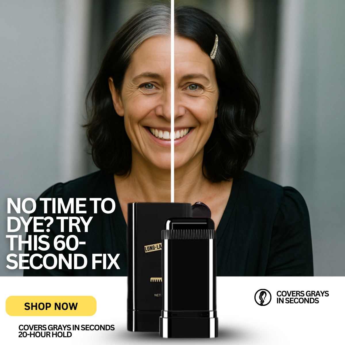
- Hook: The jarring half-gray, half-dark face that stops the scroll.
- Reuse it: Split your subject down the middle to show both states at once.
Available sizes
What is a before and after ad?
A before and after ad shows the same subject in two states side by side, so the result of using the product is visible at a glance. It's common in skincare, cleaning, fitness and home improvement, but claims shown must be realistic and typical to stay within ad platform policies.
See all before / after ads →Why this before / after ad works
- 01
Pattern interrupt
A face that is half one colour and half another is unusual enough to stop thumbs mid-scroll.
- 02
Controlled comparison
Same smile, same outfit, same light: the only difference is the hair, which makes the result credible.
- 03
Two proof claims
'Covers grays in seconds' and '20-hour hold' answer both speed and durability doubts.
- 04
Product bridges the layout
Placing the stick across the photo and info band visually links the result to its cause.
Full creative breakdown
Who this ad targets
Women aged 45 to 65 with noticeable gray who still prefer a darker look, especially those who find salon visits time-consuming or expensive. The happy, natural model with visible smile lines is relatable for this age group rather than aspirational in an unreachable way. It also reaches women considering going gray who want a flexible, non-permanent option. Lookalike audiences built from past buyers, plus interests around hair color, salons and beauty, are a natural fit.
Copywriting analysis
The headline merges the question and the answer into one line, 'No time to dye? Try this 60-second fix', a classic curiosity-plus-solution formula. 'Try this' feels like a friend's recommendation rather than a hard sell. Supporting claims are short and functional. The duplicated 'Covers grays in seconds' on both sides of the white band is redundant; replacing one with a different benefit, such as 'No smell', would use the space better. CTA 'Shop now' is placed prominently in high-contrast yellow.
Visual design
The split-face composition is the star, with the thin white line creating a strong central axis. The bottom white band provides a clean area for claims and CTA, separating information from emotion. The yellow button is the brightest element and pulls attention after the face. The product shot is glossy and studio-lit, contrasting with the natural portrait. Typography is tight, bold and condensed for readability at small sizes.
How to adapt this template for your brand
- Photograph one model and digitally create two states down the midline.
- Keep expression, clothing and lighting identical on both halves.
- Add a short question-and-answer headline in the lower third.
- Reserve a clean bottom band for two claims and a bright CTA button.
- Overlap the product between the photo and band to connect them.
Tips for beauty & skincare ads on Meta
Split-face images stop the scroll on Meta Feed and Instagram, but they can be flagged as manipulated before/after imagery, so make sure the result is achievable. Test an alternative with less digital editing. For Reels and TikTok, reveal the split with a swipe transition. Keep the CTA button out of the bottom 20% in 9:16 versions so it is not covered by platform UI.
About this creative
A smiling middle-aged woman with shoulder-length hair faces the camera, and the image is divided by a thin vertical white line through the centre of her face. On the left, her hair is silver-gray; on the right, it is deep black with a jewelled hair clip. Her smile and outfit stay identical, making the hair the only variable. In the lower left, large white sans-serif capitals read 'NO TIME TO DYE? TRY THIS 60-SECOND FIX'. The bottom quarter switches to a white band containing a yellow rounded 'SHOP NOW' button, a small two-line claim 'Covers grays in seconds / 20-hour hold', and on the right a hair icon next to 'Covers grays in seconds'. In the centre, overlapping the photo and the white band, a glossy black root stick with a comb applicator stands in front of its cap, bridging the image and the information area.
Meta ad · 1200 × 1200 · Beauty & Skincare
No Time to Dye? Split-Face Gray Hair Cover Ad Example
This ad uses a dramatic split-face portrait, gray hair on one side and dark hair on the other, to show the effect of a root touch-up stick in one image. A bold 60-second hook, a 20-hour hold claim and a yellow Shop Now button complete the direct-response layout. Ideal for transformation products.
Added
All brand names and logos are property of their owners. Adplaylist is not affiliated with or endorsed by these brands.
Details
Ad copy
Primary text
Half gray, half fresh: that's the difference one swipe makes. ✨ Our root touch-up stick covers grays in seconds and holds for up to 20 hours. No dye, no appointment.
Description
Covers grays, 20-hour hold
On-image text
NO TIME TO DYE? TRY THIS 60-SECOND FIX / SHOP NOW / COVERS GRAYS IN SECONDS / 20-HOUR HOLD / COVERS GRAYS IN SECONDS
Headline ideas for this template
- 1Half Gray? Not for Long
- 2See the 60-Second Difference
- 3Gray to Glossy in One Swipe
- 4Covers Grays, Lasts 20 Hours
- 5The Fastest Way to Hide Grays
Meta image ad specs
| Placement | Ratio | Size (px) |
|---|---|---|
| Feed | 1:1 or 4:5 | 1080×1080 / 1080×1350 |
| Marketplace | 1:1 | 1200×1200 |
| Messenger inbox | 1:1 | 1200×1200 |
| Stories & Reels | 9:16 | 1080×1920 |
This template is 1:1. Request 4:5 or 9:16 to cover all placements.
Browse similar by tag