Key takeaways
- Format: Product shot: mobile UI screenshot under a short benefit headline.
- Best for: Showing ease of use to owners comparing payroll tools.
- Hook: "Payroll just got easier" backed by a visibly simple screen.
- Reuse it: Show the one screen where your core task happens, with realistic data and a progress indicator.
Available sizes
What is a product shot ad?
A product shot ad puts the product itself at the centre of the frame, usually on a clean or styled background with little text. It works best when the packaging or product is distinctive enough to stop the scroll and the viewer already understands what it does.
See all product shot ads →Why this product shot ad works
- 01
Shows, doesn't tell
The real interface lets viewers judge simplicity for themselves, which is more convincing than adjectives.
- 02
Realistic, relatable data
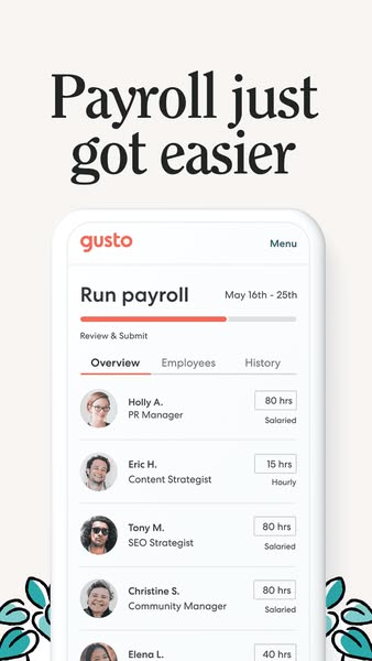
Named employees with photos, job titles and hours make it easy for owners to imagine their own team in the app.
- 03
Progress bar signals speed
A partly filled bar and a Review & Submit step imply that payroll is almost done in a few steps.
- 04
Mobile frame fits the placement
Showing a phone screen inside a vertical Story ad feels native and highlights that payroll can be run on the go.
Full creative breakdown
Who this ad targets
The ad targets US small business owners and managers with a small team of mixed salaried and hourly employees, such as agencies, studios, shops and service businesses. They find their current payroll process slow, confusing or tied to a desktop and want something they can run quickly from their phone. They're likely comparing payroll providers and want visual proof that the tool is genuinely simple before signing up.
Copywriting analysis
"Payroll just got easier" is a four-word benefit statement. "Just" adds a sense of news or recent change, as if something new has been released, which creates a mild reason to look now. "Easier" is a comparative, implying that payroll was hard before, without needing to criticise competitors. The headline is deliberately general so the screenshot can supply the proof. The UI copy, like Run payroll, Review & Submit and Salaried/Hourly, works as secondary copy that shows the product's clarity.
Visual design
The headline fills the top third in a heavy black serif. Below, a rounded phone frame displays the Gusto UI in white with coral accents, a progress bar and clean list rows with circular profile photos. Teal illustrated leaves peek from the bottom corners, softening the tech feel. The off-white background and generous margins keep focus on the interface. The phone extends past the bottom edge, suggesting more content.
How to adapt this template for your brand
- Pick the single screen where your product's core task happens.
- Fill it with realistic demo data, including names, photos and varied values.
- Place the screenshot in a device frame that matches the placement, such as a phone for Stories.
- Write a four- or five-word headline that states the main benefit.
- Add one small brand illustration element to soften the layout.
Tips for payroll ads on Meta
Use this format in Instagram and Facebook Stories and Reels; animate the progress bar or scroll the employee list for extra motion. Create a 4:5 feed version with the phone cropped tighter. Target small business owners and admin roles, and retarget pricing-page visitors, since product shots work well mid-funnel. Make sure demo data looks real but uses fictional names and figures.
About this creative
This 9:16 Gusto ad leads with a large black serif headline: "Payroll just got easier". Below it, a phone-shaped frame displays the Gusto mobile interface on the Run payroll screen for the pay period May 16th–25th. A coral progress bar shows the user partway through the process, with the step "Review & Submit" and tabs for Overview, Employees and History. A list of employees follows, each with a friendly profile photo, name, job title and hours: Holly A., PR Manager, 80 hours salaried; Eric H., Content Strategist, 15 hours hourly; Tony M., SEO Strategist, 80 hours salaried; Christine S., Community Manager; and Elena L. The mix of salaried and hourly staff shows that Gusto handles both. Stylised teal leaves peek in from the bottom corners, adding warmth to an otherwise clean, off-white layout. The ad's promise is simple: the interface is clear enough that payroll becomes a quick review-and-submit task.
Meta ad · 338 × 600 · Payroll
Gusto "Payroll Just Got Easier" App Screenshot Ad
This vertical Gusto ad pairs a four-word headline with a real screenshot of its Run payroll screen on mobile, listing salaried and hourly employees. It's a 9:16 product-shot Story ad that proves ease of use by showing the interface, a reliable template for SaaS brands that want their product to speak for itself.
Added
All brand names and logos are property of their owners. Adplaylist is not affiliated with or endorsed by these brands.
Details
Ad copy
Primary text
Run payroll in minutes, from anywhere. Gusto handles salaried and hourly employees, calculates taxes automatically and lets you review and submit in a few taps. Payroll just got easier.
Description
Salaried and hourly payroll in one app
On-image text
Payroll just got easier | gusto | Menu | Run payroll | May 16th – 25th | Review & Submit | Overview | Employees | History | Holly A. PR Manager 80 hrs Salaried | Eric H. Content Strategist 15 hrs Hourly | Tony M. SEO Strategist 80 hrs Salaried | Christine S. Community Manager 80 hrs Salaried | Elena L. 40 hrs
Headline ideas for this template
- 1Run payroll from your phone
- 2Payroll in minutes, not hours
- 3Salaried and hourly payroll in one place
- 4Review, submit, done
- 5The easiest way to pay your team
Meta image ad specs
| Placement | Ratio | Size (px) |
|---|---|---|
| Feed | 1:1 or 4:5 | 1080×1080 / 1080×1350 |
| Marketplace | 1:1 | 1200×1200 |
| Messenger inbox | 1:1 | 1200×1200 |
| Stories & Reels | 9:16 | 1080×1920 |
This template is 1:1. Request 4:5 or 9:16 to cover all placements.