Key takeaways
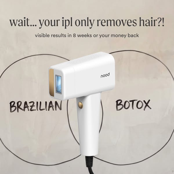
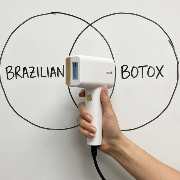
- Format: Lo-fi UGC photo of a hand-drawn Venn diagram with the product held in the overlap.
- Best for: Testing native, creator-style executions of a proven concept.
- Hook: Marker-drawn 'BRAZILIAN' and 'BOTOX' feel like an honest, quick explainer.
- Reuse it: Draw your two benefits on a whiteboard and hold your product in the middle.
Available sizes
What is a UGC ad?
A UGC (user-generated content) ad looks like something a real customer posted: phone-quality photos, casual wording and a personal point of view. Because it blends into the feed and reads as genuine experience, it often earns more trust than a polished brand ad.
See all ugc ads →Why this ugc ad works
- 01
Native look
It looks like organic content, so it avoids the instant 'this is an ad' reaction.
- 02
Human hand
A real hand holding the device adds scale, trust and a personal touch.
- 03
Same proven concept
It reuses the clear dual-benefit Venn idea with a fresh execution.
- 04
Cheap to produce
A whiteboard and a phone camera are enough, so it is easy to iterate.
Full creative breakdown
Who this ad targets
This ad targets women aged around 25 to 50 who scroll Instagram and TikTok and respond better to creator-style, unpolished content than glossy brand ads. They pay for waxing or are curious about anti-aging treatments, and like smart, money-saving beauty hacks. The informal look also suits audiences who have grown sceptical of polished beauty-device advertising.
Copywriting analysis
With only two words on the image, the copy relies entirely on the contrast between 'BRAZILIAN' and 'BOTOX'. Capital letters in handwriting feel energetic and casual, like someone sketching an idea in a meeting. The lack of a headline invites curiosity and makes viewers read the primary text to understand the claim. That means the primary text must work harder: it should spell out the dual benefit and include the guarantee, since there is no trust line on the image.
Visual design
The white board fills the frame, with the two marker circles spanning edge to edge. The hand and device enter from the lower right and break the symmetry, creating a natural, candid feel. The product's blue window is the only colour accent. Slightly imperfect circles and handwriting signal authenticity. The composition is simple enough to read at thumbnail size.
How to adapt this template for your brand
- Grab a whiteboard or paper and draw a two-circle Venn diagram by hand.
- Write the two things your product replaces in each circle.
- Hold your product in the overlap and shoot with natural light on a phone.
- Skip heavy design; let the photo look like organic content.
- Put the explanation and offer in the primary text.
Tips for hair removal ads on Meta
UGC-style images often outperform polished creatives on Meta and TikTok-style placements, so test this against the designed version with the same copy. Use it in Reels and Stories as a short video of the marker drawing the circles. Keep claims about Botox-like results careful in the primary text. On Meta, add the guarantee to the headline field since it is missing from the image.
About this creative
This square creative is shot as a simple real-life photo rather than a designed graphic. Two overlapping circles are drawn freehand in black marker on a white whiteboard, with 'BRAZILIAN' written in the left circle and 'BOTOX' in the right, both in casual capital letters. A woman's hand with a nude manicure enters from the bottom-right and holds the white Nood Flasher Pro so its blue treatment window sits right in the overlap. The lighting is flat and natural, with slight reflections on the board, adding authenticity. There is no logo overlay, headline or guarantee text on the image; only the product's own branding identifies Nood. This lo-fi approach makes the ad blend into feeds like a creator's post or a quick explainer, lowering ad-blindness. It is the scrappy sibling of the polished Venn creative and ideal for testing whether authenticity outperforms polish with the same message.
Meta ad · 338 × 600 · Hair Removal
Nood Whiteboard Venn Diagram UGC Ad
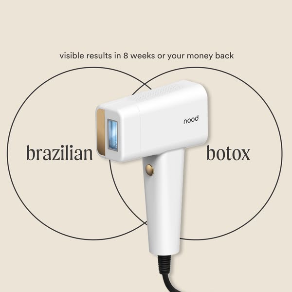
This Nood ad recreates the Brazilian-plus-Botox Venn concept in a raw, lo-fi style. Two circles are drawn in black marker on a whiteboard, and a hand with a neat manicure holds the white Flasher Pro in the overlap. The handmade look reads like organic content and is a strong template for native-feeling social ads.
Added
All brand names and logos are property of their owners. Adplaylist is not affiliated with or endorsed by these brands.
Details
Ad copy
Primary text
Brazilian or Botox? Why not both. The Nood Flasher Pro is the at-home IPL that removes hair and smooths fine lines. One device, two salon treatments, visible results in 8 weeks or your money back.
Description
Hair removal + smoother skin
On-image text
BRAZILIAN | BOTOX
Headline ideas for this template
- 1Brazilian or Botox? Both.
- 2I drew my beauty routine. It's one device.
- 3The whiteboard math of smooth skin
- 4Cancel two salon bookings
- 5One gadget, two glow-ups
Meta image ad specs
| Placement | Ratio | Size (px) |
|---|---|---|
| Feed | 1:1 or 4:5 | 1080×1080 / 1080×1350 |
| Marketplace | 1:1 | 1200×1200 |
| Messenger inbox | 1:1 | 1200×1200 |
| Stories & Reels | 9:16 | 1080×1920 |
This template is 1:1. Request 4:5 or 9:16 to cover all placements.
Browse similar by tag