Key takeaways
- Format: Split-face before and after illustration
- Best for: Apps launching a new category or niche learning product
- Hook: Like Duolingo, but for a surprising new subject
- Reuse it: Borrow a famous brand as a reference point and show old vs new
Available sizes
What is a before and after ad?
A before and after ad shows the same subject in two states side by side, so the result of using the product is visible at a glance. It's common in skincare, cleaning, fitness and home improvement, but claims shown must be realistic and typical to stay within ad platform policies.
See all before / after ads →Why this before / after ad works
- 01
Instant category explanation
Comparing to Duolingo tells viewers exactly how the app works in four words.
- 02
Visual metaphor
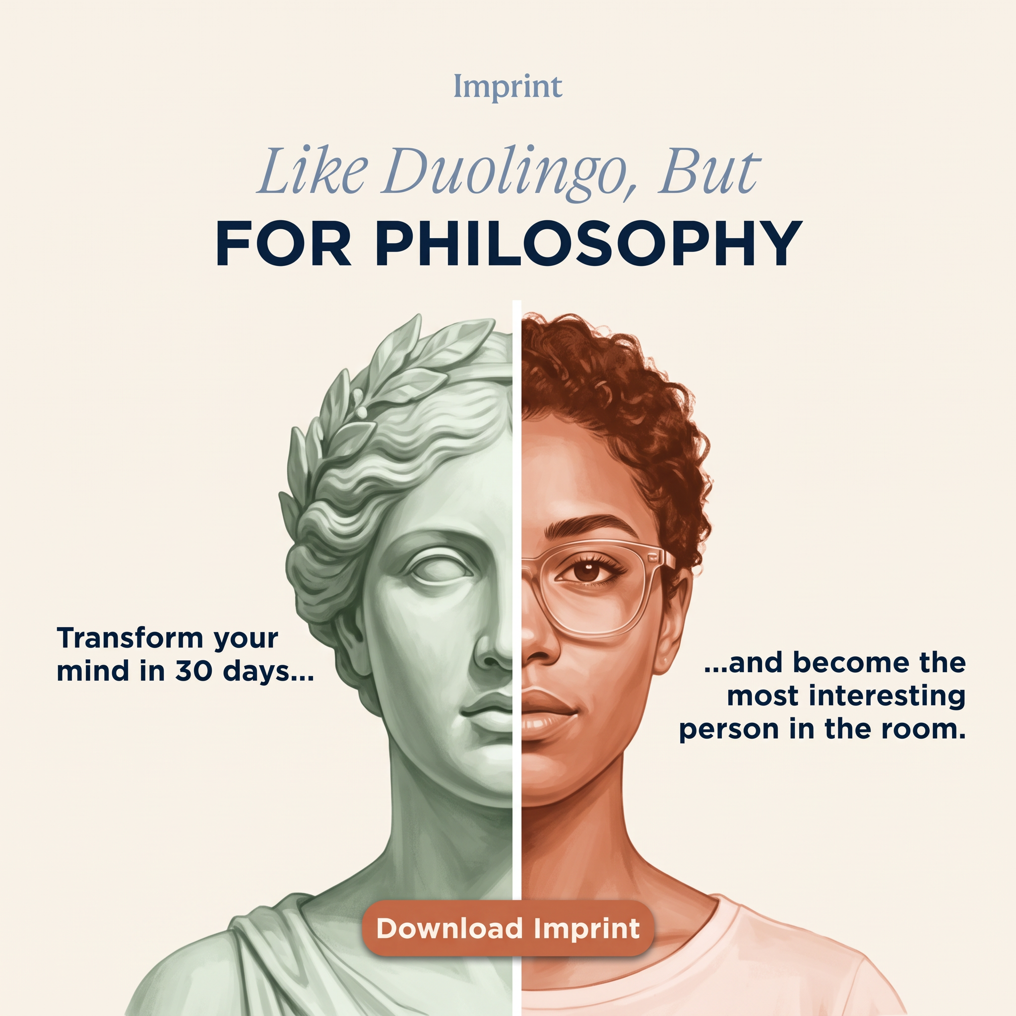
The statue-to-human split shows ancient ideas becoming part of a modern life, without explanation.
- 03
Aspirational payoff
Becoming the most interesting person in the room is a social reward, not just a learning goal.
- 04
Time-bound promise
Thirty days feels achievable and gives a clear frame for the transformation.
Full creative breakdown
Who this ad targets
The ad targets curious adults aged 20 to 40 who enjoy self-improvement, podcasts and nonfiction but lack time to read dense philosophy books. Many already use Duolingo or other habit-forming apps and like gamified progress. They want to feel smarter, think more clearly and have interesting things to say in conversation, making personal growth and social confidence the core motivations.
Copywriting analysis
The headline uses the like X but for Y formula, which instantly borrows Duolingo's familiarity and habit-forming reputation. Mixing an italic serif with bold caps adds drama to the twist, FOR PHILOSOPHY. The two flanking lines read as one sentence split across the face, mirroring the visual before and after. Transform your mind in 30 days sets an achievable promise, while most interesting person in the room sells social status. Download Imprint is direct. Using a competitor's name may carry trademark risk and ad policy issues.
Visual design
The painterly split-face is the hero, placed centrally so the dividing line draws the eye down to the CTA. A cream background and muted palette of sage, terracotta and navy feel intellectual and calm. Serif typography signals literature and classics, while bold sans-serif keeps key phrases readable. Captions are aligned left and right of the face, creating symmetry. The terracotta button echoes the warm human side, linking action to the transformed self.
How to adapt this template for your brand
- Pick a famous brand your audience knows to anchor your category
- Write a like X but for Y headline with the twist in bold caps
- Commission a split image showing the old state and the new state
- Add two short captions on either side to form one sentence
- Place a rounded download button at the bottom centre
Tips for education & e-learning ads on Meta
On Meta, run this as an app install campaign targeting interests in philosophy, Stoicism, self-improvement, podcasts and Duolingo users. The illustration stands out in feed, and a 9:16 crop works for Reels and Stories. On TikTok, animate the split so the statue morphs into the woman. Check competitor-name rules on each platform and prepare a backup headline without Duolingo in case it is rejected.
About this creative
This square Imprint creative uses a striking split-face illustration. On a warm cream background, the small Imprint wordmark sits at the top centre in muted blue serif. Below it, the headline reads Like Duolingo, But in elegant italic serif, followed by FOR PHILOSOPHY in heavy navy capitals. The centre of the frame is a painted portrait divided by a thin white vertical line. The left half is a sage green classical Greek or Roman statue with a laurel wreath and blank eye, representing ancient philosophy. The right half is a modern young woman with curly auburn hair, clear-framed glasses and a soft pink tee, rendered in warm terracotta tones. Two bold navy captions flank the face: Transform your mind in 30 days on the left, and become the most interesting person in the room on the right, joined by ellipses. A rounded terracotta Download Imprint button sits at the bottom, overlapping the portrait.
Meta ad · 1200 × 1200 · Education & E-learning
Imprint “Duolingo for Philosophy”: Split-Face App Ad Example
This Imprint ad sells a philosophy learning app by comparing it to Duolingo and splitting a face into a classical statue and a modern woman. It is a square before and after style ad, a great template for apps that need to explain a new category quickly through a familiar reference.
Added
All brand names and logos are property of their owners. Adplaylist is not affiliated with or endorsed by these brands.
Details
Ad copy
Primary text
What if you learned Stoicism the way you learned Spanish? Imprint turns the big ideas of philosophy into bite-sized, visual lessons you can finish in minutes a day. Transform your mind in 30 days.
Description
Bite-sized lessons on big ideas
On-image text
Imprint | Like Duolingo, But FOR PHILOSOPHY | Transform your mind in 30 days... | ...and become the most interesting person in the room. | Download Imprint
Headline ideas for this template
- 1Learn philosophy in 5 minutes a day
- 2Stoicism, made snackable
- 3Big ideas, bite-sized lessons
- 4Think like the great philosophers
- 5Upgrade your mind in 30 days
Meta image ad specs
| Placement | Ratio | Size (px) |
|---|---|---|
| Feed | 1:1 or 4:5 | 1080×1080 / 1080×1350 |
| Marketplace | 1:1 | 1200×1200 |
| Messenger inbox | 1:1 | 1200×1200 |
| Stories & Reels | 9:16 | 1080×1920 |
This template is 1:1. Request 4:5 or 9:16 to cover all placements.
Browse similar by tag