Key takeaways
- Format: Text-only statement ad, white condensed type on black.
- Best for: Free comparison platforms competing with fee-charging brokers.
- Hook: Calls out a fee the viewer already paid, then removes it.
- Reuse it: Name a competitor's cost, claim parity, then end with 'For free.'
Available sizes
What is a comparison ad?
A comparison ad sets the product against an alternative, such as a competitor, the old way of doing things or a cheaper option, usually in a two-column layout or table. It helps buyers who are already weighing options see quickly why this one is the better choice.
See all comparison ads →Why this comparison ad works
- 01
Names a real pain
Broker fees are concrete and annoying. Opening with something the viewer may have paid creates instant recognition.
- 02
Parity before price
'We do the same thing' removes the worry that free means worse before the price claim arrives.
- 03
Punchline structure
Short, full-stopped sentences build rhythm and the two-word ending lands like a joke's punchline.
- 04
Thumb-stopping contrast
Maximum black-and-white contrast with oversized type is legible at any size and stands out from photo-heavy feeds.
Full creative breakdown
Who this ad targets
Homeowners and borrowers who have used a mortgage or loan broker before, or are about to, and feel the fee is a hidden tax on an already expensive process. It also reaches price-sensitive shoppers who compare everything and want reassurance that a free option is just as thorough. The confrontational tone suits savvy, slightly sceptical adults who appreciate being told something blunt rather than sold to.
Copywriting analysis
The copy is a tight comparison in three moves. 'Your broker charged you a fee' is written in the past tense, implying the viewer has already been overcharged, which stings more than a hypothetical. 'We do the same thing' is deliberately plain; it avoids superlatives and simply claims equal value, which makes it more believable. 'For free.' is isolated on its own line, giving it maximum emphasis and turning the ad into a punchline. The use of 'your broker' rather than 'brokers' makes it personal. Every word is monosyllabic or close to it, keeping reading time under two seconds.
Visual design
A solid near-black background with tightly leaded, condensed white sans-serif type set in four centred lines. The type is scaled to fill roughly two-thirds of the canvas, creating a poster-like presence. No accent colour, logo or imagery competes for attention, so contrast and line breaks do all the design work. Each line break falls on a natural reading pause, which reinforces the rhythm of the copy.
How to adapt this template for your brand
- Identify the fee, delay or hassle your competitor imposes and phrase it as something the viewer experienced.
- Write a plain parity line that claims you deliver the same result.
- End with a two- or three-word benefit line such as 'For free.' or 'In minutes.'
- Set it in a heavy condensed sans-serif, white on black, filling most of the frame.
- Break lines on natural pauses and check legibility at thumbnail size before launching.
Tips for finance & fintech ads on Meta
On Meta, credit and loan ads must run under the Financial Products and Services special ad category, which removes age, gender and postcode targeting, so the creative has to qualify the audience itself. Comparative claims like 'the same thing' must be substantiated, so keep the landing page clear about what is and isn't included. Text-heavy images are fine on Meta now, but test a version with your logo small in a corner for recall. This style also works well as a Story with the lines revealed one by one.
About this creative
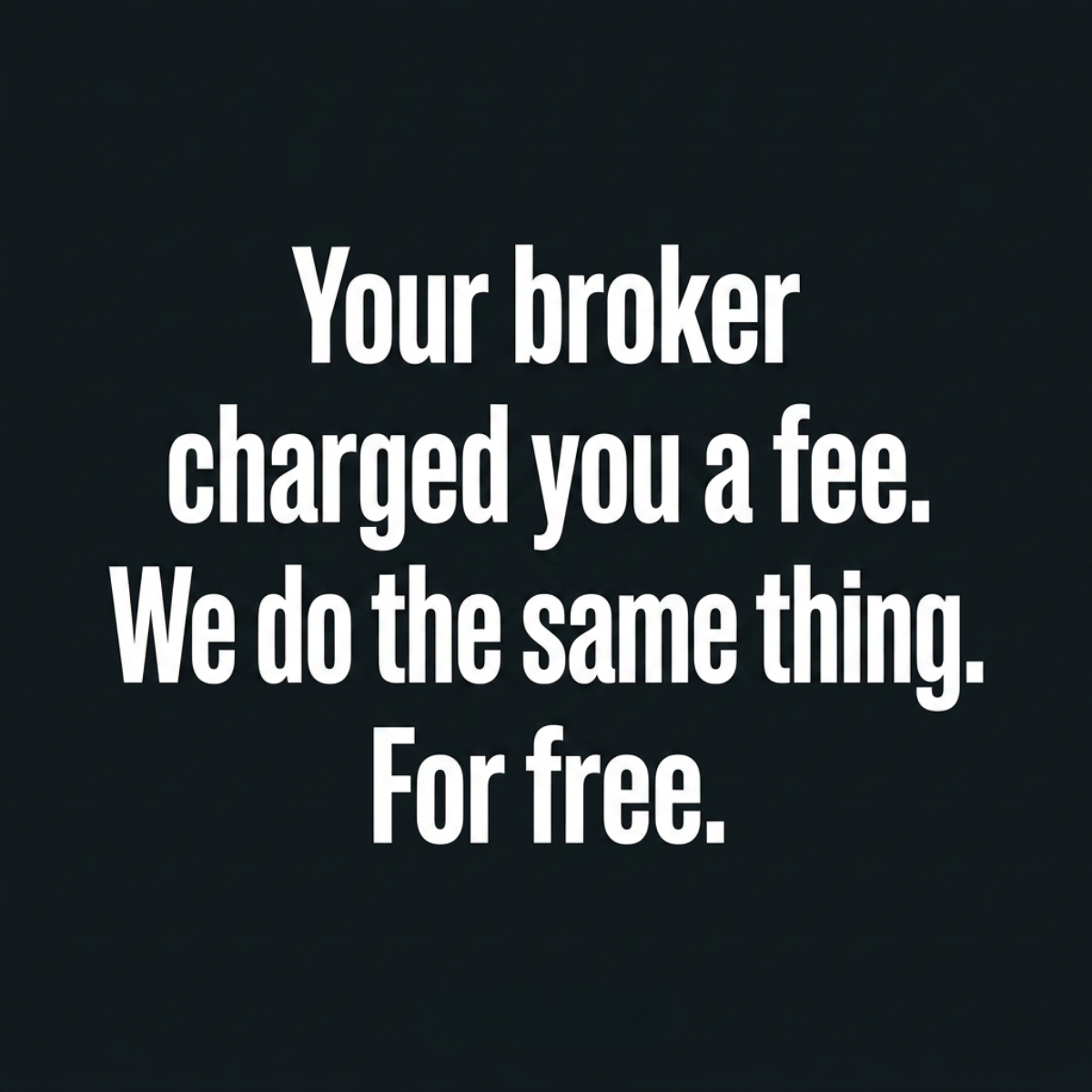
This is a pure typographic creative: a flat black square with four lines of tall, condensed white sans-serif type centred in the frame. It reads: "Your broker charged you a fee. We do the same thing. For free." There are no images, icons, logos or colour accents, so the full weight of the ad sits on the words. The structure is a classic three-beat argument. The first sentence names a cost the viewer may have already paid and quietly resents. The second claims equivalence, removing the fear that a free service is worse. The final two-word sentence lands the punchline with a full stop that feels like a mic drop. Because the type fills most of the canvas, the message is readable even as a small thumbnail. The tone is confident and slightly provocative, picking a fight with intermediaries rather than banks, which makes it a sharp challenger-brand ad for loan or mortgage comparison services.
Meta ad · 1200 × 1200 · Finance & Fintech
Loan Broker Ad Template: "Your Broker Charged You a Fee"
This text-only finance ad puts white condensed type on a solid black square to challenge paid brokers head-on. It is a direct comparison format built on one concrete pain point, fees, and works well for loan and mortgage comparison platforms running bold, scroll-stopping Meta campaigns.
Added
All brand names and logos are property of their owners. Adplaylist is not affiliated with or endorsed by these brands.
Details
Ad copy
Primary text
A broker shops lenders for you and takes a cut. We compare the same lenders, show you the offers side by side and never charge you a fee. Same job, more money left in your pocket.
Description
Compare lenders free
On-image text
Your broker charged you a fee. We do the same thing. For free.
Headline ideas for this template
- 1Brokers charge. We don't.
- 2Same lenders. No broker fee.
- 3Keep the fee. Get the rate.
- 4Why pay someone to compare?
- 5Free comparison, same result.
Meta image ad specs
| Placement | Ratio | Size (px) |
|---|---|---|
| Feed | 1:1 or 4:5 | 1080×1080 / 1080×1350 |
| Marketplace | 1:1 | 1200×1200 |
| Messenger inbox | 1:1 | 1200×1200 |
| Stories & Reels | 9:16 | 1080×1920 |
This template is 1:1. Request 4:5 or 9:16 to cover all placements.