Key takeaways
- Format: Two-panel split pairing nutrition and training.
- Best for: Programmes or gyms that combine diet and exercise.
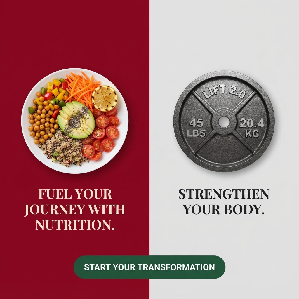
- Hook: A colourful bowl next to an iron weight plate.
- Reuse it: Swap the two images and colours; keep the matching headlines.
Available sizes
What is a product shot ad?
A product shot ad puts the product itself at the centre of the frame, usually on a clean or styled background with little text. It works best when the packaging or product is distinctive enough to stop the scroll and the viewer already understands what it does.
See all product shot ads →Why this product shot ad works
- 01
Two pillars, two panels
Splitting nutrition and strength into separate panels makes the dual approach easy to grasp.
- 02
Strong colour contrast
Burgundy and grey create a bold, magazine-like look that stands out.
- 03
Food looks appetising
A vibrant bowl suggests healthy eating can be tasty, not restrictive.
- 04
Parallel headlines
Two short imperative headlines read like a simple instruction set.
Full creative breakdown
Who this ad targets
This ad targets adults aged around 25 to 50 who want to lose weight by combining healthy eating with strength training rather than crash dieting. They are open to lifting weights and interested in plant-forward meals. The bold, design-led look appeals to people who follow fitness and food content on Instagram and want a programme that feels modern and balanced.
Copywriting analysis
The two headlines use parallel imperatives: 'Fuel Your Journey with Nutrition.' and 'Strengthen Your Body.' Together they form a simple two-step philosophy. 'Fuel' reframes food as energy rather than something to restrict, which is a healthier message. 'Start Your Transformation' is a motivating CTA, though 'transformation' is a common phrase in this category. No brand name or specific offer appears, so the primary text must explain what the programme includes and who runs it. Adding a logo and one benefit line would make it more complete.
Visual design
The vertical split creates a clean, symmetrical layout. Burgundy on the left and pale grey on the right give strong contrast. Both images are shot from directly above and centred in their panels. Serif capitals in cream and black mirror each other. The green button straddles both panels, visually linking the two halves into one programme. Plenty of space around each image keeps it clean.
How to adapt this template for your brand
- Split your frame into two equal panels with contrasting colours.
- Place one image representing each pillar of your offer.
- Write two short, parallel imperative headlines.
- Add a CTA button that spans both panels.
- Include your logo so the ad builds recognition.
Tips for weight loss ads on Meta
On Meta, add a brand logo before running. Weight loss and fitness ads must target 18+. Test this as a two-card carousel, one card per pillar. Use primary text to explain programme details and pricing. This works well for gyms, coaching apps and meal plan services targeting fitness and healthy eating interests. Retarget engaged viewers with a free trial week.
About this creative
The creative is divided vertically into two equal panels. The left panel has a deep burgundy background and shows an overhead view of a white plate filled with a colourful Buddha bowl: roasted chickpeas, diced peppers, grated carrot, quinoa, halved cherry tomatoes, sliced avocado sprinkled with chia seeds and a grilled lemon half. Beneath it, cream serif capitals read 'Fuel Your Journey with Nutrition.' The right panel has a light grey background and shows a dark cast-iron weight plate embossed with 'Lift 2.0', '45 lbs' and '20.4 kg'. Below it, black serif capitals read 'Strengthen Your Body.' A dark green pill button spans the centre line at the bottom and says 'Start Your Transformation' in white. There is no visible brand name. The overall look is bold and graphic, with the rich burgundy and bright food colours contrasting against the cool, minimal grey of the gym equipment.
Meta ad · 1200 × 1200 · Weight Loss
Nutrition and Strength Ad: Two-Panel Split
This ad splits the frame into two panels: a colourful Buddha bowl on a burgundy background and an iron 45 lb weight plate on light grey. Matching serif headlines about fuelling with nutrition and strengthening the body, plus a green CTA, make it a bold two-part template for fitness and nutrition offers.
Added
All brand names and logos are property of their owners. Adplaylist is not affiliated with or endorsed by these brands.
Details
Ad copy
Primary text
Lasting results need two things: fuel and strength. Nourish your body with colourful, balanced meals and build strength with smart training. Start your transformation today.
Description
Nutrition and strength training, together.
On-image text
FUEL YOUR JOURNEY WITH NUTRITION. | LIFT 2.0 | 45 LBS | 20.4 KG | STRENGTHEN YOUR BODY. | START YOUR TRANSFORMATION
Headline ideas for this template
- 1Eat to fuel, lift to strengthen
- 2Two pillars of lasting weight loss
- 3Food and fitness, working together
- 4Build strength, eat colour
- 5Your plan: fuel plus strength
Meta image ad specs
| Placement | Ratio | Size (px) |
|---|---|---|
| Feed | 1:1 or 4:5 | 1080×1080 / 1080×1350 |
| Marketplace | 1:1 | 1200×1200 |
| Messenger inbox | 1:1 | 1200×1200 |
| Stories & Reels | 9:16 | 1080×1920 |
This template is 1:1. Request 4:5 or 9:16 to cover all placements.
Browse similar by tag