Key takeaways
- Format: Vertical product shot with a pattern-matched backdrop and a one-line scarcity hook.
- Best for: Limited editions, brand collaborations and drops with a short sales window.
- Hook: "This will probably sell out." – confident, understated urgency.
- Reuse it: Pull a motif from your packaging into the set design and pair it with one scarcity line.
Available sizes
What is a product shot ad?
A product shot ad puts the product itself at the centre of the frame, usually on a clean or styled background with little text. It works best when the packaging or product is distinctive enough to stop the scroll and the viewer already understands what it does.
See all product shot ads →Why this product shot ad works
- 01
Understated urgency
"Probably" sounds confident and honest rather than pushy, which suits a premium brand and still triggers fear of missing out.
- 02
Design is the product
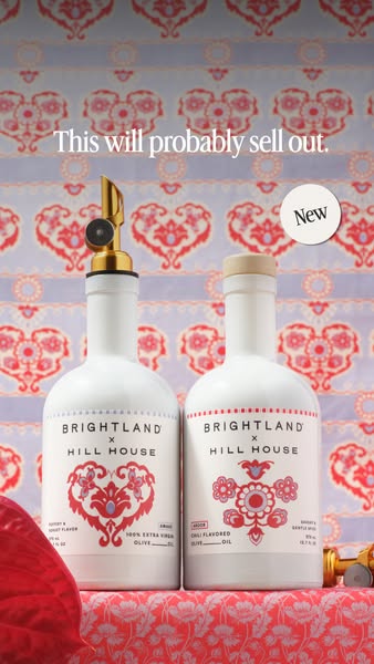
The folk-art pattern runs from bottle to backdrop, turning the collab artwork into the main selling point.
- 03
Collab credibility
Showing both brand names on the bottle borrows Hill House's fashion audience and signals a special release.
- 04
Clear 'New' signal
The small badge tells returning customers this is fresh, without cluttering the frame.
Full creative breakdown
Who this ad targets
This ad targets design-conscious food lovers and gift shoppers, mostly women aged 25–45 who follow lifestyle, fashion and home brands. It speaks to existing Brightland customers who collect limited editions and to Hill House fans who may not yet buy premium olive oil. People who buy pretty kitchen staples as hostess gifts or for their own open shelving are a strong fit. Targeting could combine interests in Hill House, home decor, gourmet cooking and gifting with retargeting of past site visitors and buyers.
Copywriting analysis
The copy is one sentence: "This will probably sell out." It works because it skips the usual product description and goes straight to the outcome a buyer fears, missing the drop. The word "probably" softens the claim, making it believable and witty rather than a hard countdown. It also implies past sell-outs without stating them, nudging the viewer to act now. The "New" badge adds novelty, and the collab names on the bottles do the rest of the explaining. For a premium brand, this restraint signals confidence: the product is desirable enough that the brand doesn't need to oversell it.
Visual design
The palette is tightly controlled: white bottles, red folk-art motifs and a lilac-and-red backdrop that repeats the bottle print. This creates a cohesive, editorial look that feels like a fashion campaign. The bottles are centred and shot slightly from below, giving them presence. A large serif headline sits in the top third with plenty of breathing room, and the small "New" circle balances the composition on the right. The red leaf at the edge adds depth and a natural touch.
How to adapt this template for your brand
- Choose a limited edition, collab or seasonal product with a strong visual motif.
- Source or print a backdrop that repeats the packaging pattern or colours.
- Shoot the product centred, slightly low angle, with soft even lighting.
- Add one short scarcity line in a serif font in the top third.
- Add a small 'New' or 'Limited' badge and run it at launch while stock lasts.
Tips for food ads on Meta
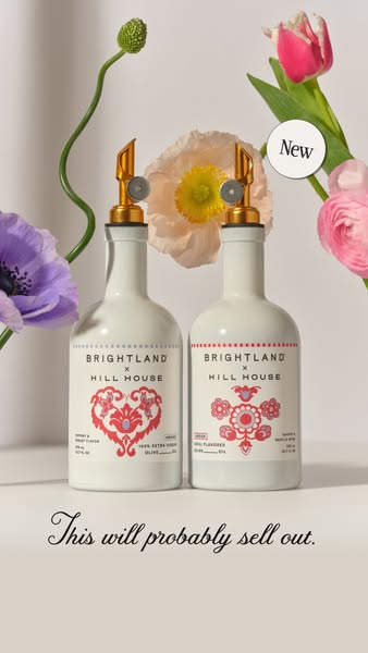
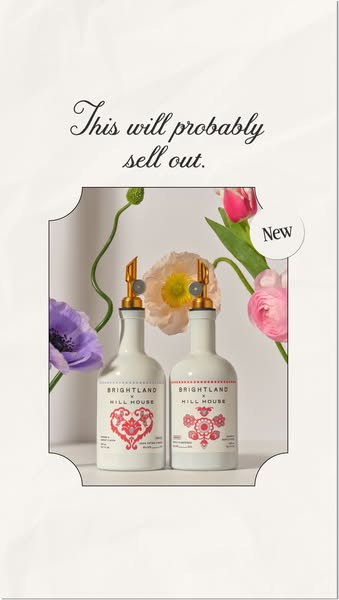
Use this on Meta Stories and Reels with launch-week budgets, then pause once stock runs low. Retarget site visitors and past buyers first, they convert fastest on scarcity messages. Keep the headline inside the safe zone below the top 14% of the frame. On Pinterest the pattern-led look also performs well as a static pin. Test it against the flower-styled variant to see which mood your audience prefers.
About this creative
This vertical creative announces a collaboration between Brightland and fashion brand Hill House. Two white ceramic-look bottles stand side by side on a red patterned surface. The left one has a gold pour spout and a red folk-art heart, labelled as a peppery extra virgin olive oil; the right one has a cork cap and a red floral motif, labelled as a chili-flavoured olive oil. Behind them is a lilac and red fabric repeating the same heart pattern, so the whole frame feels like one designed world. A serif line at the top reads "This will probably sell out," and a small round "New" badge sits at the top right. A red anthurium leaf peeks in at the bottom left. There is no price or discount: the ad sells on scarcity, novelty and the appeal of a limited, collectible design that works as a gift or a kitchen statement piece.
Meta ad · 338 × 600 · Food
Brightland x Hill House Limited Edition Story Ad
This vertical product shot promotes the Brightland x Hill House collaboration: two white olive oil bottles printed with red folk-art hearts against a matching patterned backdrop. A single line, "This will probably sell out," creates urgency. Use it as a template for limited drops, brand collabs and seasonal editions.
Added
All brand names and logos are property of their owners. Adplaylist is not affiliated with or endorsed by these brands.
Details
Ad copy
Primary text
New: Brightland x Hill House. Two limited-edition olive oils in hand-drawn folk-art bottles. This will probably sell out.
Description
Limited-edition olive oils. Get them before they're gone.
On-image text
This will probably sell out. | New | Brightland x Hill House
Headline ideas for this template
- 1This Will Probably Sell Out
- 2Limited Edition, Limited Time
- 3The Collab Your Kitchen Needs
- 4Folk Art, Meet Olive Oil
- 5Get It Before It's Gone
Meta image ad specs
| Placement | Ratio | Size (px) |
|---|---|---|
| Feed | 1:1 or 4:5 | 1080×1080 / 1080×1350 |
| Marketplace | 1:1 | 1200×1200 |
| Messenger inbox | 1:1 | 1200×1200 |
| Stories & Reels | 9:16 | 1080×1920 |
This template is 1:1. Request 4:5 or 9:16 to cover all placements.