Key takeaways
- Format: Poster-style text ad with bold-weight emphasis on two numbers.
- Best for: Online lenders and marketplaces whose main advantage is speed.
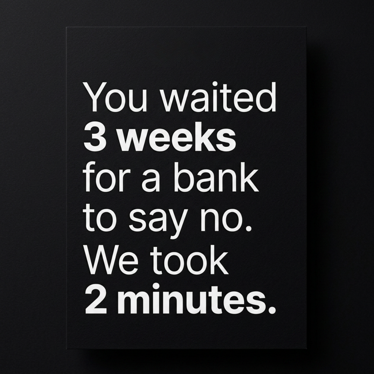
- Hook: Contrasts a 3-week bank rejection with a 2-minute result.
- Reuse it: Bold only the two numbers in a 'they took X, we took Y' sentence.
Available sizes
What is a before and after ad?
A before and after ad shows the same subject in two states side by side, so the result of using the product is visible at a glance. It's common in skincare, cleaning, fitness and home improvement, but claims shown must be realistic and typical to stay within ad platform policies.
See all before / after ads →Why this before / after ad works
- 01
Numbers carry the story
Bolding '3 weeks' and '2 minutes' lets skimmers grasp the whole message from two phrases.
- 02
Double pain in the before
Waiting and then being rejected stacks two frustrations, making the alternative far more attractive.
- 03
Huge, concrete gap
Weeks versus minutes is a difference of orders of magnitude that needs no explanation.
- 04
Editorial restraint
Light type, black poster and no branding feel premium and confident, which builds trust in finance.
Full creative breakdown
Who this ad targets
People who need funds relatively quickly, for a car repair, home project or consolidating bills, and who have either experienced or fear a slow bank process. Many have already applied to their bank and are waiting or were declined. The speed message also appeals to busy professionals and self-employed borrowers who do not have time for branch appointments and long paperwork.
Copywriting analysis
The copy is one long sentence followed by a short one, which mirrors the contrast it describes: slow, then fast. 'You waited' puts the reader in the position of having lost time, and 'for a bank to say no' adds insult to injury. The short reply 'We took 2 minutes.' feels decisive by comparison. The specific numbers are believable and easy to remember. Note the copy says 'we took 2 minutes' without promising approval, which keeps the claim about speed rather than outcomes.
Visual design
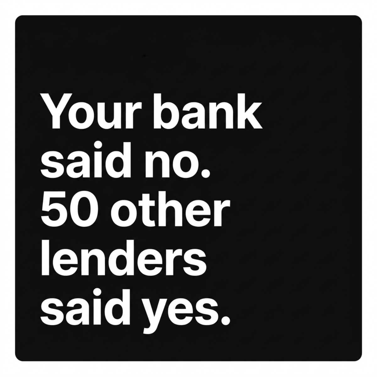
A vertical black poster card on a dark background with a soft shadow creates a physical, printed effect. White sans-serif type is set in mixed weights, light for narrative and extra bold for the two time frames, giving clear hierarchy without colour. Text is left-aligned in short lines with generous leading. The poster occupies the centre of the square, framed by dark negative space for focus.
How to adapt this template for your brand
- Find the slowest part of your competitor's process and quantify it in days or weeks.
- Quantify your own process in minutes or seconds.
- Write 'You waited [X] for [competitor] to [bad outcome]. We took [Y].'
- Set narrative text in light weight and the two time frames in heavy bold.
- Place the text on a dark poster mockup and keep branding to the ad copy.
Tips for finance & fintech ads on Meta
On Meta, credit and loan ads must run under the Financial Products and Services special ad category, which removes age, gender and postcode targeting, so the creative has to qualify the audience itself. Make sure '2 minutes' reflects the real form-completion time, as speed claims are often checked by reviewers. The vertical poster layout adapts well to 9:16 Stories and Reels; animate the bold numbers popping in for extra stopping power. Retarget people who started but did not finish an application with this message.
About this creative
A portrait-format black poster card sits centred on a slightly darker textured background with a soft shadow, giving it a printed, gallery-like look. Six lines of left-aligned white sans-serif type read: "You waited 3 weeks for a bank to say no. We took 2 minutes." Most of the text is set in a light weight, while "3 weeks" and "2 minutes" are set in heavy bold, so the eye jumps straight to the two time frames. That typographic choice makes the before/after comparison readable in a glance even if the rest of the sentence is skipped. The copy layers two frustrations into the 'before' state, a long wait and a rejection, which makes the 'after' feel even faster and more rewarding. There is no logo or colour, keeping the focus entirely on the contrast. The understated, editorial styling feels confident and calm rather than salesy, which suits a high-trust financial category.
Meta ad · 1200 × 1200 · Finance & Fintech
Personal Loan Ad Template: "You Waited 3 Weeks"
This personal loan ad sets white type on a black poster card, contrasting a three-week wait for a bank rejection with a two-minute result. The before/after time comparison makes speed the hero benefit, ideal for online lenders and loan marketplaces competing with slow traditional banks.
Added
All brand names and logos are property of their owners. Adplaylist is not affiliated with or endorsed by these brands.
Details
Ad copy
Primary text
Banks can take weeks to get back to you, and sometimes the answer is still no. Our form takes about 2 minutes and shows you which lenders are ready to make an offer.
Description
Fast lender matching
On-image text
You waited 3 weeks for a bank to say no. We took 2 minutes.
Headline ideas for this template
- 1Weeks with your bank. Minutes with us.
- 2Stop waiting for a no.
- 3Loan offers in 2 minutes.
- 4Faster than your bank's hold music.
- 53 weeks or 2 minutes? Your choice.
Meta image ad specs
| Placement | Ratio | Size (px) |
|---|---|---|
| Feed | 1:1 or 4:5 | 1080×1080 / 1080×1350 |
| Marketplace | 1:1 | 1200×1200 |
| Messenger inbox | 1:1 | 1200×1200 |
| Stories & Reels | 9:16 | 1080×1920 |
This template is 1:1. Request 4:5 or 9:16 to cover all placements.