Key takeaways
- Format: Before and after concept built from two toggle switches
- Best for: Local Pilates studios selling stress relief to busy professionals
- Hook: Stress Off, Pilates On shown as physical switches
- Reuse it: Use a familiar on and off control to show your service replacing a pain point
Available sizes
What is a before and after ad?
A before and after ad shows the same subject in two states side by side, so the result of using the product is visible at a glance. It's common in skincare, cleaning, fitness and home improvement, but claims shown must be realistic and typical to stay within ad platform policies.
See all before / after ads →Why this before / after ad works
- 01
Familiar UI makes it instant
Everyone knows what a toggle switch means, so the message lands without explanation.
- 02
Equipment becomes the button
Turning the Pilates ring into the on knob ties the product to the outcome in a clever, memorable way.
- 03
Contrast in two lines
Stress Off and Pilates On mirror each other, creating a crisp before and after in four words.
- 04
Minimal space feels calm
The empty cream background reflects the calm the studio promises, matching the stress-relief angle.
Full creative breakdown
Who this ad targets
This ad targets stressed professionals and busy parents aged 25 to 50 who live near the studio and are looking for a mindful way to unwind after work. They may not see themselves as gym people but are drawn to calm, design-led wellness experiences. The minimal, premium look appeals to people who value boutique studios and are willing to pay for smaller classes and quality instruction close to home.
Copywriting analysis
The copy is built on a parallel structure: Stress Off and Pilates On. Each line is two words, and together they tell the full story of swapping stress for movement. The tagline, Move, Strengthen, Elevate, adds three physical and emotional outcomes in a rhythmic triplet. There is no formal CTA button; instead, the phone number acts as the action. That works for local studios but may limit clicks online, so adding a short Book now button would help. Placeholder location and phone details must be replaced with real studio information before running.
Visual design
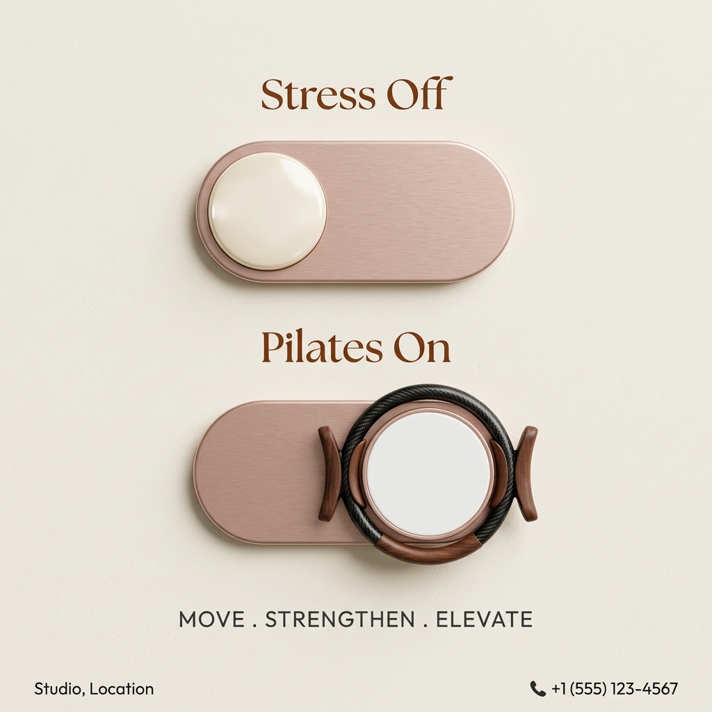
The layout is vertical and symmetrical, with the two switches stacked in the center and text above each. Brushed rose gold, cream and walnut brown create a warm, luxurious palette. Soft shadows make the switches look like real objects mounted on a wall. Serif headlines feel elegant, while the uppercase sans-serif tagline adds modern structure. Footer details sit in small type in the corners, keeping the focus on the concept.
How to adapt this template for your brand
- Pick an everyday interface that shows change, such as a toggle, slider or dial.
- Label the off state with your audience's pain point and the on state with your service.
- Integrate a piece of your equipment or product into the on state.
- Add a three-word tagline describing the outcomes.
- Include your real location, phone number and ideally a booking button.
Tips for pilates ads on Meta
On Meta, this concept works well for local awareness campaigns with a radius around the studio; use primary text for the booking link and intro offer. Animate it for Reels by sliding the switch from off to on with a click sound. In Stories, stack the switches vertically with space for a link sticker. On Google Display, the switches scale well. Replace placeholder details before launch and test a version with a CTA button.
About this creative
This square ad uses a warm cream wall texture with two large, realistic toggle switches in brushed rose gold. Above the top switch, a brown serif headline reads Stress Off, and the switch sits in the off position with a cream knob on the left. Below, the second headline reads Pilates On, and its knob has slid to the right. That knob is cleverly built into a Pilates magic circle, with a black carbon ring and walnut-toned pads, so the equipment itself becomes the on button. Under the switches, a dark grey sans-serif tagline spells out Move, Strengthen, Elevate, separated by dots. The bottom corners hold placeholder text: Studio, Location on the left and a phone icon with +1 (555) 123-4567 on the right. There are no people, no photos of a studio and no button, so the concept relies entirely on the metaphor. The result is minimal, tactile, premium and instantly understood.
Meta ad · 1200 × 1200 · Pilates
Pilates Studio Ad Template with a Stress Off Toggle Concept
This square Pilates studio ad uses two rose-gold toggle switches: one switched off under the words Stress Off, the other switched on and wrapped in a Pilates ring under Pilates On. It is a before and after concept that turns a familiar interface into a simple, memorable message.
Added
All brand names and logos are property of their owners. Adplaylist is not affiliated with or endorsed by these brands.
Details
Ad copy
Primary text
Flip the switch on a stressful week. Stress off, Pilates on: our studio classes help you move, strengthen and elevate, so you leave lighter than you arrived. Call us to book your first session.
Description
Move, strengthen, elevate
On-image text
Stress Off | Pilates On | MOVE . STRENGTHEN . ELEVATE | Studio, Location | +1 (555) 123-4567
Headline ideas for this template
- 1Switch Off Stress, Switch On Pilates
- 2Turn Your Week Around
- 3Flip the Switch Tonight
- 4From Stressed to Strong
- 5Pilates Mode: On
Meta image ad specs
| Placement | Ratio | Size (px) |
|---|---|---|
| Feed | 1:1 or 4:5 | 1080×1080 / 1080×1350 |
| Marketplace | 1:1 | 1200×1200 |
| Messenger inbox | 1:1 | 1200×1200 |
| Stories & Reels | 9:16 | 1080×1920 |
This template is 1:1. Request 4:5 or 9:16 to cover all placements.