Key takeaways
- Format: Outdoor lifestyle photo with a bold headline and a branded wave footer
- Best for: Selling freedom and quality of life rather than product specs
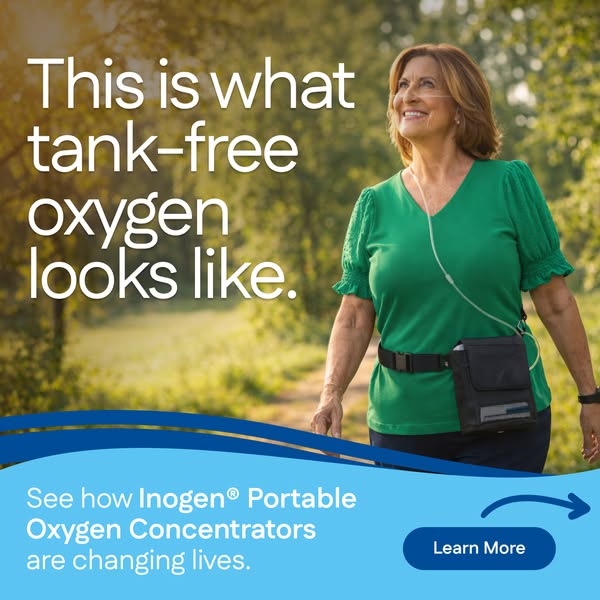
- Hook: "This is what tank-free oxygen looks like" – the image proves the claim
- Reuse it: Show your customer happily doing the thing your product makes possible
Available sizes
What is a lifestyle ad?
A lifestyle ad shows the product being used in a real setting by the kind of person who buys it. Instead of listing features, it sells the feeling or outcome of owning the product, which makes it a strong fit for fashion, home, travel and wellness brands.
See all lifestyle ads →Why this lifestyle ad works
- 01
Shows the outcome
Instead of explaining the device, the ad shows a person enjoying a walk, which is what the buyer really wants.
- 02
Relatable model
An older woman who looks healthy and happy makes the target audience see themselves in the scene.
- 03
Headline points to the image
"This is what … looks like" invites the viewer to look closely, linking the copy and photo tightly.
- 04
Clear CTA zone
The blue wave band separates the message and button from the photo, making the next step obvious.
Full creative breakdown
Who this ad targets
The ad speaks to active older adults, typically 60–80, who use supplemental oxygen and feel limited by tanks. It also reaches people recently prescribed oxygen who fear losing their independence. The outdoor setting appeals to those who miss walking, gardening or spending time with family outside. Caregivers and adult children are a secondary audience, since the image reassures them that a loved one can stay active and safe.
Copywriting analysis
The headline is demonstrative: "This is what tank-free oxygen looks like" lets the photo do the persuading. "Tank-free" is the key differentiator and names the old solution as the problem without criticising it directly. The footer copy uses social proof language – "changing lives" – to suggest a wider community of satisfied users. Brand and product names are set in bold for recognition. The CTA "Learn More" is low-pressure, fitting a considered purchase where viewers need information before contacting sales. Sentences are short and easy to read, matching an older audience.
Visual design
A warm, backlit outdoor photo fills most of the frame, with the model placed on the right and empty foliage on the left for the headline. White headline text stands out against the darker green background. The light-blue wave footer matches Inogen's brand system and adds a sense of air and movement. The device is visible but not dominant, keeping the focus on the person. A dark-blue rounded button and curved arrow create a clear path to the CTA.
How to adapt this template for your brand
- Choose a photo of a relatable customer doing an activity your product enables.
- Leave negative space on one side of the photo for a short headline.
- Write a "This is what … looks like" headline tied to your key benefit.
- Add a branded color band at the bottom with a supporting line and the product name.
- Finish with a single, clear button such as Learn More.
Tips for medical devices ads on Meta
This creative works well in Meta feeds for reach and consideration campaigns. Pair it with a landing page that shows customer stories to match the "changing lives" promise. Run it alongside the testimonial version to see whether lifestyle imagery or quotes drive more leads. Keep targeting broad by age and interests, as Meta limits health-related targeting. Video versions of the same walk scene can perform even better in Reels.
About this creative
This square Inogen ad shows an older woman with shoulder-length auburn hair walking along a sunlit forest path. She wears a green blouse, a nasal cannula and a compact portable oxygen concentrator in a black carry pouch strapped around her waist. She looks up and smiles, relaxed and active. Warm golden light and soft green foliage create an optimistic, natural atmosphere. Large white headline text on the left reads "This is what tank-free oxygen looks like." The bottom third features a light-blue wave band with the line "See how Inogen® Portable Oxygen Concentrators are changing lives," with the brand and product name in bold. A dark-blue pill button labeled "Learn More" and a curved arrow pull the eye to the call to action. The creative shows the device as a natural part of an active life rather than a medical burden, and it focuses on the feeling of freedom.
Meta ad · 338 × 600 · Medical Devices
Inogen Lifestyle Ad: This Is What Tank-Free Oxygen Looks Like
This Inogen lifestyle ad shows a smiling older woman walking on a sunny forest path while wearing a portable oxygen concentrator on her hip. The square creative turns a medical device into a symbol of freedom, making it a useful template for health brands that want to sell the outcome rather than the product.
Added
All brand names and logos are property of their owners. Adplaylist is not affiliated with or endorsed by these brands.
Details
Ad copy
Primary text
Life doesn't have to slow down because you need oxygen. With an Inogen Portable Oxygen Concentrator, there are no tanks to haul and no refills to schedule – just lightweight, wearable oxygen that goes where you go. See how Inogen is helping people get back outdoors.
Description
See how Inogen Portable Oxygen Concentrators are changing lives
On-image text
This is what tank-free oxygen looks like. | See how Inogen® Portable Oxygen Concentrators are changing lives. | Learn More
Headline ideas for this template
- 1Freedom looks like this
- 2Your walk, your way – no tanks required
- 3Oxygen that keeps up with you
- 4Leave the tanks at home
- 5Get back to the things you love
Meta image ad specs
| Placement | Ratio | Size (px) |
|---|---|---|
| Feed | 1:1 or 4:5 | 1080×1080 / 1080×1350 |
| Marketplace | 1:1 | 1200×1200 |
| Messenger inbox | 1:1 | 1200×1200 |
| Stories & Reels | 9:16 | 1080×1920 |
This template is 1:1. Request 4:5 or 9:16 to cover all placements.