Key takeaways
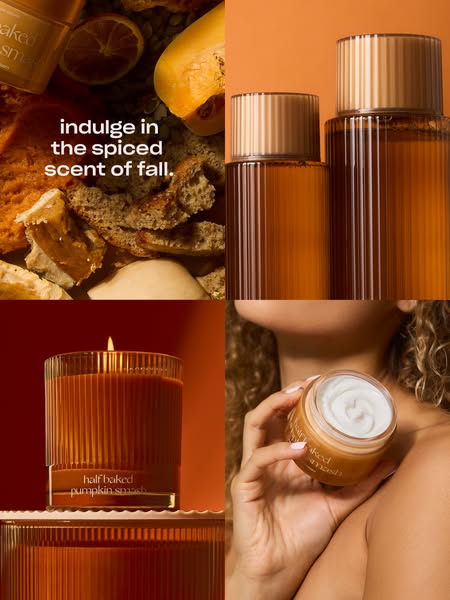
- Format: Four-panel grid showing one scent across several formats
- Best for: Product collections and cross-selling a hero scent
- Hook: 'Indulge in the spiced scent of fall' – a seasonal invitation
- Reuse it: Mix ingredient, product and lifestyle shots in one grid
Available sizes
What is a product shot ad?
A product shot ad puts the product itself at the centre of the frame, usually on a clean or styled background with little text. It works best when the packaging or product is distinctive enough to stop the scroll and the viewer already understands what it does.
See all product shot ads →Why this product shot ad works
- 01
Whole collection at once
The grid shows candle, laundry and body care, encouraging people to buy more than one item.
- 02
Ingredients first
Starting with pumpkin and spice sets the scent before showing products.
- 03
Human touch
The hand-and-jar panel adds skin and warmth, making the collection feel personal.
- 04
Unified colour grade
Orange and amber across all four panels make different shots read as one campaign.
Full creative breakdown
Who this ad targets
The ad targets fall-scent fans, mainly women 22–45, who love pumpkin spice season and like to theme their home, laundry and body care around it. It is ideal for existing Snif customers who own one Pumpkin Smash product and might add another, as well as new shoppers who discover the scent through social media. Gift buyers looking for a themed set are a secondary audience.
Copywriting analysis
The headline – indulge in the spiced scent of fall – is a warm invitation rather than a feature list. 'Indulge' frames the products as a treat and fits the dessert-like scent. 'Spiced' gives a quick scent description, and 'of fall' anchors it in the season, adding timeliness. The copy sits only in the ingredients panel, which keeps product panels clean and links words with ingredients. Product names appear on labels, so the headline does not need to explain the range. It is short enough to read in a second, leaving the grid to tell the story.
Visual design
The 2×2 grid is easy to scan on mobile: top row is ingredients and laundry, bottom row is candle and body. Each panel has a different background shade – earthy, bright orange, deep red, skin tones – but all sit in one warm family. Product panels use clean studio backgrounds, while the ingredient and lifestyle panels add texture. The headline in the top-left panel is where the eye starts.
How to adapt this template for your brand
- Pick one scent, flavour or theme that runs across several of your products.
- Create four square panels: ingredients, product one, product two, a lifestyle shot.
- Colour-grade every panel in the same warm or cool family.
- Place a short headline over the ingredients panel in the top-left.
- Keep labels visible so product names do the explaining.
Tips for candles ads on Meta
Works well in Meta feed at 3:4 or 4:5; each panel stays recognisable even on small screens. For Stories, rearrange to a 1×4 vertical strip or keep the 2×2 with extra space top and bottom. This creative is a natural carousel cover – follow it with one card per product. Use it for retargeting past buyers of a single Pumpkin Smash product to drive cross-sell.
About this creative
The creative is divided into a two-by-two grid in rich orange and amber tones. The top-left panel is a flat lay of fall ingredients – roasted pumpkin, squash, dried orange slices, bread and spiced cake – with the corner of a Pumpkin Smash product at the top, and the white lowercase headline indulge in the spiced scent of fall. placed over it. The top-right panel shows two ribbed amber bottles, laundry detergent and scent booster, against a bright orange background. The bottom-left shows a lit Pumpkin Smash candle in amber ribbed glass on a deep red-orange background, sitting on a matching base. The bottom-right is a lifestyle close-up of a woman with curly hair holding an open body whip jar near her collarbone, showing the white whipped cream inside. Together, the panels move from ingredients to home, laundry and body, presenting the scent as a full routine rather than a single product. Consistent colour grading unifies four different shoots.
Meta ad · 338 × 600 · Candles
Collection Ad: Snif Pumpkin Smash Four-Panel Fall Grid
This Snif portrait ad uses a four-panel grid to show the full Pumpkin Smash collection: ingredients, laundry bottles, a lit candle and a hand holding body whip. One headline ties it all together. It is a flexible template for brands selling one scent, flavour or theme across several product formats.
Added
All brand names and logos are property of their owners. Adplaylist is not affiliated with or endorsed by these brands.
Details
Ad copy
Primary text
Indulge in the spiced scent of fall. 🍂 Pumpkin Smash now comes as a candle, body whip and laundry duo – smell like fall everywhere.
Description
The Pumpkin Smash collection from Snif
On-image text
indulge in the spiced scent of fall. | Labels: half baked pumpkin smash
Headline ideas for this template
- 1Pumpkin spice, everywhere
- 2Your home, your laundry, your skin – all fall
- 3The complete Pumpkin Smash collection
- 4Smell like fall from candle to cream
- 5Four ways to get your pumpkin fix
Meta image ad specs
| Placement | Ratio | Size (px) |
|---|---|---|
| Feed | 1:1 or 4:5 | 1080×1080 / 1080×1350 |
| Marketplace | 1:1 | 1200×1200 |
| Messenger inbox | 1:1 | 1200×1200 |
| Stories & Reels | 9:16 | 1080×1920 |
This template is 1:1. Request 4:5 or 9:16 to cover all placements.
Browse similar by tag