Key takeaways
- Format: Three-step how-it-works listicle with product flat lay
- Best for: Explaining subscription services and new routines
- Hook: Get a bin – the simplest possible first step
- Reuse it: Replace the three steps with your own onboarding flow
Available sizes
What is a listicle ad?
A listicle ad presents the product's benefits or reasons to buy as a short numbered list, like an article headline ("5 reasons…"). The list format is easy to scan in a feed and lets one creative answer several objections at once.
See all listicle ads →Why this listicle ad works
- 01
Removes friction
Breaking the service into three tiny steps makes signing up feel effortless.
- 02
Sets a rhythm
Every two weeks tells people exactly how often the habit happens.
- 03
Ends on the benefit
The last line delivers the unique promise and gets extra emphasis with the underline.
- 04
Family-friendly visual
Kids' shoes and clothes signal relevance to parents with fast-growing children.
Full creative breakdown
Who this ad targets
This creative targets parents and family households, especially those with young children who outgrow clothes and shoes quickly. They care about waste but are short on time and need a routine that slots into their life. The calm pastel look also appeals to design-conscious millennials. The message suits people in the consideration stage who have heard of recycling services but want to know how it actually works before committing.
Copywriting analysis
The copy follows a classic three-beat structure: action, routine, payoff. Get a bin is a deliberately tiny first step. Fill it up every two weeks introduces cadence and sets expectations about the subscription without saying the word subscription. The final line, We recycle what curbside recycling can't, positions the service against a familiar alternative and states the unique value. Short sentences ending in full stops slow the reader down and make each step land. The exclamation mark on the last line adds a cheerful payoff, while the primary text layers on emotional benefits like community impact.
Visual design
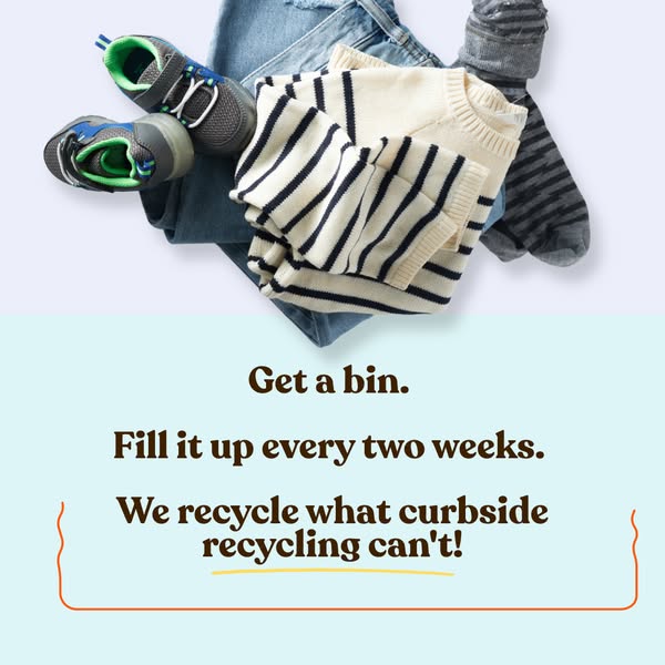
The image splits horizontally into a product flat lay and a text panel, using two pastel tones that feel calm and modern. Overhead styling with soft shadows looks premium yet homely. The dark-brown rounded serif is consistent across the brand's ads. A wavy orange bracket and yellow underline work as hand-drawn accents that guide the eye to the key benefit. Plenty of breathing room around each line keeps it legible at small sizes.
How to adapt this template for your brand
- Reduce your onboarding to three short, concrete steps
- Shoot a flat lay of the items customers will put in the product
- Stack the steps as separate lines under the photo, one sentence each
- Highlight the final benefit line with a frame or underline
- Test the cadence line with different frequencies or timing
Tips for recycling ads on Meta
Run this square creative in Meta Feed on Facebook and Instagram, where 1:1 fills the screen without cropping. Keep the on-image headline in the top half so it stays readable in the preview. Pair it with a Learn More or Sign Up button and a zip-code-targeted audience, because Ridwell only serves selected US cities. Rotate it with two or three sibling cards from the same set every two weeks to avoid ad fatigue, and test Advantage+ placements against Feed-only.
About this creative
This square ad explains the whole service in three sentences. The top half is a soft lavender flat lay showing folded blue jeans, a cream sweater with navy stripes, grey striped socks and a pair of small grey and green kids' sneakers. These are textiles a household outgrows, hinting at what the service collects. The lower half switches to a pale aqua panel with three centered lines of chunky dark-brown serif text: Get a bin. Fill it up every two weeks. We recycle what curbside recycling can't! A thin wavy orange bracket frames the last line, and a hand-drawn yellow underline sits beneath the words recycling can't for emphasis. The rhythm of short, stacked sentences reads like a mini instruction list. There is no price or logo, so the ad focuses entirely on making the process feel simple and repeatable for a busy household, particularly families with children.
Meta ad · 338 × 600 · Recycling
Get a Bin: How-It-Works Recycling Ad
This square listicle ad from Ridwell explains a recycling subscription in three short lines over a flat lay of kids' clothes and shoes. It turns a new service into an easy routine. Use this format when you need to explain how your subscription works before people sign up.
Added
All brand names and logos are property of their owners. Adplaylist is not affiliated with or endorsed by these brands.
Details
Ad copy
Primary text
Wasting less, made easy. Get pickups from your 🏠 Keep stuff out of the landfill 🌿 Do good in your community ❤️ Save the 🌎
Description
Get a bin. Fill it. We pick it up.
On-image text
Get a bin. / Fill it up every two weeks. / We recycle what curbside recycling can't!
Headline ideas for this template
- 1Get a bin. Fill it. We handle the rest.
- 2Recycling made as easy as 1, 2, 3
- 3Outgrown clothes? Put them in the bin
- 4Every two weeks, less waste
- 5The recycling routine your family will actually stick to
Meta image ad specs
| Placement | Ratio | Size (px) |
|---|---|---|
| Feed | 1:1 or 4:5 | 1080×1080 / 1080×1350 |
| Marketplace | 1:1 | 1200×1200 |
| Messenger inbox | 1:1 | 1200×1200 |
| Stories & Reels | 9:16 | 1080×1920 |
This template is 1:1. Request 4:5 or 9:16 to cover all placements.