Key takeaways
- Format: First-person UGC voice with a calendar event mockup
- Best for: Studios encouraging regular booking and retention
- Hook: It's not a luxury, it's essential
- Reuse it: Mock up your class as a calendar entry in a member's own words
Available sizes
What is a UGC ad?
A UGC (user-generated content) ad looks like something a real customer posted: phone-quality photos, casual wording and a personal point of view. Because it blends into the feed and reads as genuine experience, it often earns more trust than a polished brand ad.
See all ugc ads →Why this ugc ad works
- 01
First person feels authentic
Booking my next session sounds like a real member, which feels more relatable than brand talk.
- 02
Calendar cue builds habit
Seeing a class as an event makes Pilates feel like a scheduled routine, not a one-off.
- 03
Reframes cost as necessity
It's not a luxury, it's essential tackles the belief that studio classes are an indulgence.
- 04
My Sanctuary adds emotion
Naming the location My Sanctuary positions the studio as a personal refuge.
Full creative breakdown
Who this ad targets
This ad targets existing members and warm leads, mostly women aged 28 to 50, who enjoy Pilates but struggle to make it consistent around work and family. They see self-care as important but sometimes feel guilty spending on it. The planner-style design appeals to organized professionals who live by their calendar and respond to messaging about prioritizing themselves and protecting time for wellbeing.
Copywriting analysis
The copy is written in the first person, so viewers read it as their own inner voice. Booking my next session states the action, and It's not a luxury, it's essential reframes the cost objection as a necessity. The calendar details make the class concrete, with a name, time and location. My Sanctuary adds emotional warmth. The closing line, Find Your Balance. Secure Your Time., links the benefit to urgency. Book Your Session reinforces the action. The date shown should be updated to a real upcoming class before running.
Visual design
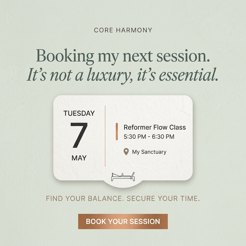
The layout is centered and vertical: brand name, headline, event card, tagline and button. The sage background, white card and copper accents create a soft, premium palette. The card has subtle paper texture and a drop shadow, giving it a tactile, physical feel. A thin copper divider and accent bar echo the button color. The small reformer icon adds an elegant brand cue without clutter.
How to adapt this template for your brand
- Write a first-person line describing your audience booking their next class.
- Add a second line that reframes the main objection.
- Design a calendar-style card with day, date, class name, time and location.
- Give the location an emotional nickname like My Sanctuary.
- Close with a short tagline and a booking button.
Tips for pilates ads on Meta
On Meta, this works best for retargeting website visitors, lapsed members and past bookers; mention your booking app in primary text. In Stories, the card format looks native, so add a link sticker. On Instagram, test a carousel showing a full week of classes. Update the date regularly or use generic days so the ad never looks stale. Refresh the creative every few weeks to avoid ad fatigue with local audiences.
About this creative
This square ad uses a pale sage green textured background. Small grey capitals at the top read Core Harmony. Below, a large dark green serif line says Booking my next session, followed by an italic line, It's not a luxury, it's essential, written as if a member is speaking. In the center sits a white textured card designed like a calendar event. On the left it shows Tuesday, a large 7 and May. A thin copper divider separates the right side, where a copper accent bar sits beside Reformer Flow Class, 5:30 PM to 6:30 PM, and a location pin labeled My Sanctuary. A small line drawing of a reformer hangs from a tab under the card. Beneath, spaced copper capitals read Find Your Balance. Secure Your Time. A gradient copper rectangle with white text, Book Your Session, finishes the layout. The design feels calm, intentional and premium, framing class time as protected personal time.
Meta ad · 1200 × 1200 · Pilates
Reformer Pilates Ad Template Styled as a Calendar Event
Core Harmony's square ad looks like a calendar event card for a Reformer Flow class on Tuesday 7 May, under a first-person line about booking the next session. This UGC-style format mimics a member's own planner, making regular Pilates feel like a self-care commitment.
Added
All brand names and logos are property of their owners. Adplaylist is not affiliated with or endorsed by these brands.
Details
Ad copy
Primary text
Your weekly reset deserves a spot in your calendar. Book your next Reformer Flow class at Core Harmony and protect the hour that keeps you balanced. It's not a luxury, it's essential.
Description
Reserve your Reformer Flow class
On-image text
CORE HARMONY | Booking my next session. It's not a luxury, it's essential. | TUESDAY 7 MAY | Reformer Flow Class | 5:30 PM - 6:30 PM | My Sanctuary | FIND YOUR BALANCE. SECURE YOUR TIME. | BOOK YOUR SESSION
Headline ideas for this template
- 1Book Your Next Session Now
- 2Self-Care Isn't a Luxury
- 3Put Pilates in Your Calendar
- 4Secure Your Sanctuary Time
- 5Your Weekly Reset Awaits
Meta image ad specs
| Placement | Ratio | Size (px) |
|---|---|---|
| Feed | 1:1 or 4:5 | 1080×1080 / 1080×1350 |
| Marketplace | 1:1 | 1200×1200 |
| Messenger inbox | 1:1 | 1200×1200 |
| Stories & Reels | 9:16 | 1080×1920 |
This template is 1:1. Request 4:5 or 9:16 to cover all placements.