Key takeaways
- Format: Minimal graphic with a question-led listicle headline and button.
- Best for: B2B SaaS promoting guides, ebooks, webinars or audits.
- Hook: A specific number and a fear: 8 mistakes costing you conversions.
- Reuse it: Swap in your own number and pain point and keep the minimal layout.
Available sizes
What is a listicle ad?
A listicle ad presents the product's benefits or reasons to buy as a short numbered list, like an article headline ("5 reasons…"). The list format is easy to scan in a feed and lets one creative answer several objections at once.
See all listicle ads →Why this listicle ad works
- 01
Question invites self-diagnosis
Asking 'are these costing you' makes readers wonder about their own site. Curiosity pulls them into the content.
- 02
Specific number builds credibility
'8 mistakes' promises a concrete, scannable list. Numbers signal practical value and set clear expectations.
- 03
Loss aversion in one word
'Costing' frames the problem as money lost. People act faster to stop losses than to chase gains.
- 04
Clean brand-led design
Two colours, bold type and abstract shapes look premium and on-brand. The ad feels like editorial content, not a hard sell.
Full creative breakdown
Who this ad targets
This ad targets marketers, founders, designers and growth leads at startups and small to mid-sized businesses, roughly 25 to 50 years old. They own or influence their company website and care about leads, sign-ups and sales. They are busy, data-aware and sceptical of hard sells, but open to practical guides that help them improve performance. Many are evaluating website platforms or considering a redesign, making them valuable prospects for a no-code builder.
Copywriting analysis
The headline combines three proven copy techniques: a direct question, a specific number and a loss frame. 'Are these 8 website mistakes costing you conversions?' is long but flows naturally and targets a real business metric. Using 'conversions' qualifies the audience; it speaks to marketers rather than casual site owners. The CTA 'Learn more' is low-commitment and fits a content offer. The copy never mentions the product's features, trusting the content to build intent first. Adding a format hint, such as 'free guide', could lift click-through further.
Visual design
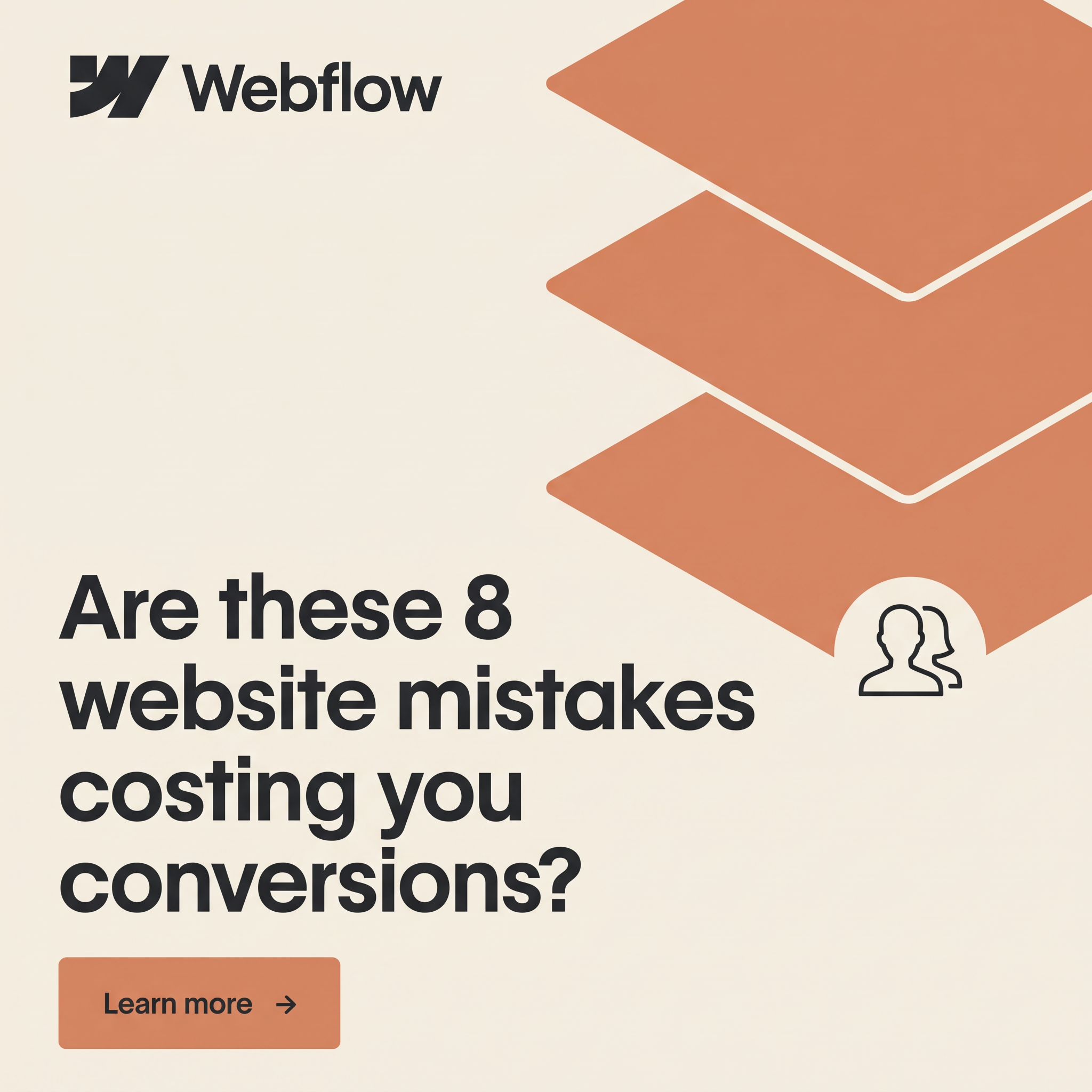
The layout splits the square diagonally: graphic weight on the top right and text on the bottom left. Three stacked terracotta planes create depth and suggest structure, layers and building, which links to web design. The cream background is soft and warm, standing out from the blue and white of most B2B feeds. Bold black type has strong contrast and reads well at small sizes. The terracotta button repeats the shape colour, tying the design together.
How to adapt this template for your brand
- Identify a measurable pain your audience fears, such as lost leads or wasted spend.
- Write a question headline with a specific number of mistakes, tips or reasons.
- Pair it with one or two abstract brand shapes instead of busy screenshots.
- Add a clear button-style CTA in your accent colour.
- Link to a gated or ungated guide and retarget readers with a product offer.
Tips for saas & tech ads on LinkedIn
On LinkedIn, run this as a single image or document ad targeting marketing and founder job titles; lead gen forms work well for a gated guide. Keep the caption under 150 characters with the main benefit first. On Meta, use it for retargeting site visitors and lookalike audiences. Test the question headline against a statement version like '8 mistakes killing your conversion rate'.
About this creative
This square creative uses a warm cream background with the Webflow logo in black at the top left. On the right, three large terracotta isometric layers stack diagonally, separated by thin cream lines, evoking web page layers or a design stack. A semicircle cutout at the bottom of the stack holds a simple outline icon of two people, hinting at users or visitors. In the lower left, the bold black headline asks 'Are these 8 website mistakes costing you conversions?' in a large grotesque typeface across four lines. Beneath it, a terracotta rectangular button reads 'Learn more' with an arrow. The design is minimal and editorial, avoiding screenshots in favour of abstract shapes. It promotes a piece of content, likely a guide or webinar, rather than the product directly. The question and specific number create curiosity and a slight fear of missing out, prompting marketers and founders to check their own sites.
LinkedIn ad · 1200 × 1200 · SaaS & Tech
SaaS Ad Template: 8 Website Mistakes Costing You Conversions
This SaaS ad template uses a question-led listicle headline, '8 website mistakes costing you conversions', paired with minimal stacked layer shapes and a clear Learn more button. It is a square content-led format ideal for B2B software brands promoting guides and webinars on LinkedIn.
Added
All brand names and logos are property of their owners. Adplaylist is not affiliated with or endorsed by these brands.
Details
Ad copy
Primary text
Is your website quietly losing you customers? From slow load times to unclear CTAs, these 8 common mistakes hurt conversions every day. Learn how to spot and fix them with our free guide.
Description
Free guide to a higher-converting site
On-image text
Webflow | Are these 8 website mistakes costing you conversions? | Learn more →
Headline ideas for this template
- 18 website mistakes costing you conversions
- 2Is your website losing you leads?
- 3Fix these 8 mistakes, convert more visitors
- 4The conversion killers hiding on your site
- 5Turn more visitors into customers
Meta image ad specs
| Placement | Ratio | Size (px) |
|---|---|---|
| Feed | 1:1 or 4:5 | 1080×1080 / 1080×1350 |
| Marketplace | 1:1 | 1200×1200 |
| Messenger inbox | 1:1 | 1200×1200 |
| Stories & Reels | 9:16 | 1080×1920 |
This template is 1:1. Request 4:5 or 9:16 to cover all placements.