Key takeaways
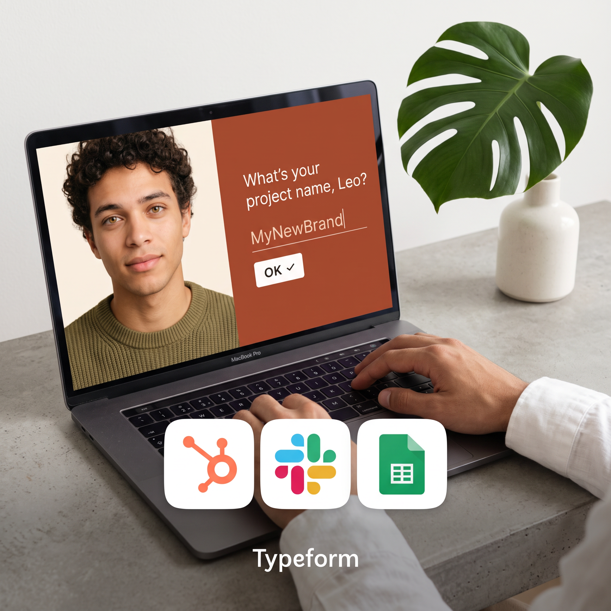
- Format: Lifestyle shot of the product UI on a laptop with integration icons as an overlay.
- Best for: SaaS tools that need to show both ease of use and fit with an existing tech stack.
- Hook: A form that addresses the viewer by name, which feels personal instead of corporate.
- Reuse it: Swap the screen for your own UI and the icons for your top three integrations.
Available sizes
What is a lifestyle ad?
A lifestyle ad shows the product being used in a real setting by the kind of person who buys it. Instead of listing features, it sells the feeling or outcome of owning the product, which makes it a strong fit for fashion, home, travel and wellness brands.
See all lifestyle ads →Why this lifestyle ad works
- 01
Personalization in the UI
The question uses a first name, so the product promise (friendlier forms) is shown, not told.
- 02
Integrations as proof
Recognizable HubSpot, Slack and Sheets icons answer the 'will it work with my stack?' objection instantly.
- 03
Real-world context
Hands on a keyboard and a plant on the desk make the software feel used by real people, not staged.
- 04
One brand color carries the screen
The rust-orange panel pops against the neutral grey desk and draws the eye straight to the question.
Full creative breakdown
Who this ad targets
This ad targets marketers, founders, product managers and operations people at small to mid-sized companies who collect leads, feedback or sign-ups through forms. They already work in tools like HubSpot, Slack and Google Sheets and are frustrated by clunky, low-converting forms. They care about design quality and brand experience, and want something that looks good without needing a developer. The calm workspace styling also appeals to freelancers and agency teams building forms for clients.
Copywriting analysis
The copy is almost entirely inside the product: one conversational question, 'What's your project name, Leo?', and a typed answer. That is a smart move because it demonstrates the tone of voice the product enables rather than describing it. Using a first name creates intimacy, and 'MyNewBrand' hints at a fresh start, which matches the aspirations of founders and marketers. The only other text is the brand name, which keeps the ad clean and lets the integration icons do the explaining. The weakness is that there is no explicit benefit or CTA on the image, so the primary text and headline must carry the value proposition, such as higher completion rates.
Visual design
A neutral palette of concrete grey, white and soft daylight lets the rust-orange screen panel be the clear focal point. The laptop is angled slightly for depth, and the monstera leaf balances the composition on the right. App icons sit in white rounded tiles at the bottom, large enough to read on mobile. The Typeform wordmark is small and centered, so the brand is present without dominating. Lighting is soft and natural, giving a premium editorial feel.
How to adapt this template for your brand
- Replace the laptop screen with your own product's most human-looking moment, ideally one question or one action.
- Personalize the on-screen text with a first name or the viewer's use case.
- Swap the three icons for the integrations your customers ask about most.
- Use your brand color as a solid block on screen so it stands out against a neutral desk scene.
- Keep your logo small at the bottom and put the benefit and CTA in the primary text.
Tips for saas & tech ads on Meta
On Meta, run this in feed and test a version with a short benefit line on the image, such as 'Up to 3x more completions', because the creative has no explicit claim. On LinkedIn, this format works well for B2B audiences targeted by job title (marketing, ops, product); pair it with a headline about integrations and a 'Sign up' CTA. Crop a 4:5 version for mobile feeds and keep the icons inside the safe zone so they are not covered by UI.
About this creative
The creative is a warm, top-down lifestyle shot of a MacBook on a concrete desk, with a monstera leaf in a white vase on the right and a person's hands typing on the keyboard. The laptop screen shows a split layout: on the left a portrait of a young man in an olive sweater, on the right a rust-orange panel with a single question, 'What's your project name, Leo?', an input line with 'MyNewBrand' typed in, and a white OK button. Overlapping the bottom of the laptop are three large app icons: HubSpot, Slack and Google Sheets, signalling that the form connects with tools teams already use. The Typeform wordmark sits centered at the bottom in white. The composition puts the product UI in the middle, the integrations as proof in the foreground, and the brand as a quiet sign-off. The overall feel is calm, premium and human, more like a workspace photo than a software ad.
Meta ad · 1200 × 1200 · SaaS & Tech
SaaS Form Builder Ad Template: Personalized Form on a Laptop
This SaaS lifestyle ad shows a Typeform-style form on a laptop that greets the user by name, with HubSpot, Slack and Google Sheets icons underneath. Use it as a template for any software product that wants to show its interface in a real setting and prove it fits into an existing tool stack.
Added
All brand names and logos are property of their owners. Adplaylist is not affiliated with or endorsed by these brands.
Details
Ad copy
Primary text
Forms people actually enjoy filling in. Ask one question at a time, call people by name, and send every answer straight to HubSpot, Slack or Google Sheets. No code needed.
Description
Connect to the tools you already use
On-image text
What's your project name, Leo? | MyNewBrand | OK ✓ | Typeform
Headline ideas for this template
- 1Forms that feel like a conversation
- 2Your form, connected to HubSpot, Slack and Sheets
- 3Ask one question at a time. Get more answers.
- 4Stop losing leads to boring forms
- 5Build a beautiful form in minutes, no code
Meta image ad specs
| Placement | Ratio | Size (px) |
|---|---|---|
| Feed | 1:1 or 4:5 | 1080×1080 / 1080×1350 |
| Marketplace | 1:1 | 1200×1200 |
| Messenger inbox | 1:1 | 1200×1200 |
| Stories & Reels | 9:16 | 1080×1920 |
This template is 1:1. Request 4:5 or 9:16 to cover all placements.
Browse similar by tag