Key takeaways
- Format: Data comparison charts displayed on a desktop screen mock-up.
- Best for: B2B SaaS lead magnets, reports, webinars and analytics tools.
- Hook: A counterintuitive claim that challenges a metric marketers love.
- Reuse it: Pick one surprising stat from your report and visualise it as two contrasting charts.
Available sizes
What is a comparison ad?
A comparison ad sets the product against an alternative, such as a competitor, the old way of doing things or a cheaper option, usually in a two-column layout or table. It helps buyers who are already weighing options see quickly why this one is the better choice.
See all comparison ads →Why this comparison ad works
- 01
Challenges a common belief
Telling growth teams that user spikes don't equal revenue creates instant curiosity and a reason to learn more.
- 02
Visual proof in two charts
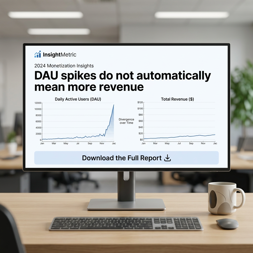
The steep DAU line next to the flat revenue line proves the point in a glance, no reading required.
- 03
Realistic screen context
Showing the insight on a monitor in an office makes it feel like a genuine tool or report, increasing credibility.
- 04
Clear, low-friction CTA
A large download button makes the offer obvious and frames it as free value rather than a sales pitch.
Full creative breakdown
Who this ad targets
This ad targets product managers, growth marketers, app founders, data analysts and monetization leads at mobile apps, games and SaaS companies. They track DAU and revenue daily and are under pressure to show that growth turns into income. Seniority ranges from manager to C-level. On LinkedIn it fits job title and function targeting (product, growth, analytics) at companies of 10–1,000 employees in tech, plus retargeting of website visitors and webinar attendees.
Copywriting analysis
The headline is a contrarian insight stated as a fact, which positions InsightMetric as a thought leader rather than a vendor. Using the jargon “DAU” signals that the report is written for practitioners, filtering out irrelevant clicks. The small “2024 Monetization Insights” label adds timeliness and implies research depth. Copy on the creative is minimal, letting the charts carry the evidence. The CTA “Download the Full Report” promises more than the ad shows, creating an information gap. To improve, add a quantified teaser, for example “+900% users, +12% revenue”, and fix the “Jac” axis label typo.
Visual design
The office background is softly blurred with greys, whites and natural plants, keeping focus on the bright monitor. The screen uses a white background, navy charts and black bold sans-serif headline, a classic SaaS palette that reads as trustworthy and clean. The two charts are aligned side by side for direct comparison, with the dramatic DAU curve creating the strongest visual movement. A wide pale blue button anchors the bottom of the screen. Desk props add realism without distracting.
How to adapt this template for your brand
- Pick the most surprising single finding from your report or data.
- Turn it into a one-line contrarian headline.
- Show two charts that visually contrast the expected vs actual outcome.
- Place the screen in a realistic workspace to add credibility.
- Add a clear download or register button and gate the report behind a form.
Tips for saas & tech ads on LinkedIn
On LinkedIn, run this as a Single Image ad with a Lead Gen Form so users can download without leaving the platform, which typically lowers cost per lead. Keep the intro text under 150 characters and lead with the stat. Test a 1.91:1 version for desktop feed. On Meta, use it for retargeting site visitors only. For Google Display or Demand Gen, crop tightly to the charts and headline, since the office background shrinks poorly at small sizes.
About this creative
This InsightMetric creative promotes a gated research report with a single, counterintuitive insight: “DAU spikes do not automatically mean more revenue.” The message appears on a desktop monitor set in a bright, softly blurred modern office, with a keyboard, mouse and ceramic mug on a light wooden desk. On screen, the InsightMetric logo and a small “2024 Monetization Insights” label sit above the bold headline. Two side-by-side line charts provide the proof: daily active users rocket from near zero to over 10,000 by year end, while total revenue barely creeps upward. A small “Divergence over Time” label sits between them. Beneath the charts, a full-width pale blue button reads “Download the Full Report” with a download icon. The screen-within-a-scene framing makes the ad feel like real software or a report preview rather than a banner, which suits LinkedIn's professional context and data-minded audience.
LinkedIn ad · 1200 × 1200 · SaaS & Tech
SaaS Report Ad Template: DAU vs Revenue Chart
This square LinkedIn-style ad for InsightMetric promotes a downloadable 2024 Monetization Insights report using two contrasting charts on an office monitor. Use the format for B2B lead magnets, analytics tools and research reports where one surprising data point earns the click.
Added
All brand names and logos are property of their owners. Adplaylist is not affiliated with or endorsed by these brands.
Details
Ad copy
Primary text
Your users are growing. Is your revenue? Our 2024 Monetization Insights report shows why DAU spikes rarely translate into income, and what top apps do differently. Download the full report free.
Description
Free 2024 Monetization Insights report.
On-image text
InsightMetric | 2024 Monetization Insights | DAU spikes do not automatically mean more revenue | Daily Active Users (DAU) | Total Revenue ($) | Divergence over Time | Download the Full Report
Headline ideas for this template
- 1Your DAU Is Up. Why Isn't Your Revenue?
- 210x More Users, Same Revenue: Here's Why
- 3The 2024 Monetization Report Every PM Needs
- 4Stop Celebrating DAU Spikes Too Early
- 5What Top Apps Do to Turn Users Into Revenue
Browse similar by tag