Key takeaways
- Format: Three-step comparison infographic built from one illustrated animal.
- Best for: Loan comparison sites and brokers showing the value of shopping around.
- Hook: A zebra that gets more colourful as the loan gets better.
- Reuse it: Split one image into tiers that improve visibly from top to bottom.
Available sizes
What is a comparison ad?
A comparison ad sets the product against an alternative, such as a competitor, the old way of doing things or a cheaper option, usually in a two-column layout or table. It helps buyers who are already weighing options see quickly why this one is the better choice.
See all comparison ads →Why this comparison ad works
- 01
Progress you can see
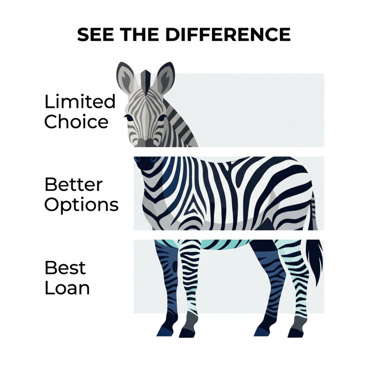
The colours move from grey to rich navy and mint. Viewers feel the improvement before they read the labels.
- 02
Simple three-step story
Limited, better, best is an intuitive ladder. It explains the value of comparison in seconds.
- 03
Clean infographic style
Flat illustration and white space feel rational and trustworthy. That suits a decision-focused finance audience.
- 04
Memorable mascot
Using one striking animal ties the steps together. The zebra's stripes make the banded effect feel natural.
Full creative breakdown
Who this ad targets
This ad targets adults aged 25 to 55 who are already considering a loan and want to be sure they get a good deal. They are rational, research-minded shoppers who compare prices on other big purchases too. They may have had a limited offer from their own bank and suspect they could do better. It suits consideration audiences and people who engage with comparison or calculator content.
Copywriting analysis
The copy is short and structural. See the difference is an invitation that frames the ad as a demonstration rather than a pitch, encouraging the viewer to judge for themselves. The three labels form a comparative ladder, Limited Choice, Better Options, Best Loan, using a familiar good-better-best pattern. Limited Choice names the pain of going to a single lender, while Best Loan is the aspirational end point. The labels are nouns, not promises, which keeps the tone factual. Primary text should add the mechanism, such as comparing several lenders in one application, to explain how the viewer gets from the top band to the bottom.
Visual design
The layout is vertical and orderly, with labels on the left and the zebra and panels on the right. Light grey rectangles behind each band create clear separation. The colour shift from grey to classic black-and-white to navy and mint carries the story. A geometric sans-serif font keeps everything modern and readable. Ample white space makes the ad feel calm and credible.
How to adapt this template for your brand
- Choose a single subject that can be split into three visual tiers.
- Define three labels that move from your customer's pain to the ideal outcome.
- Make each tier visibly better, using colour, detail or brightness.
- Add a short headline that invites viewers to compare.
- Explain how your service delivers the final tier in the primary text.
Tips for finance & fintech ads on Meta
On Meta, this infographic style works well in Feed and can be turned into a three-card carousel, one band per card. For Stories, the vertical structure adapts naturally to 9:16 with more spacing between bands. Make sure labels stay legible on small screens. Use it in consideration campaigns and pair it with a Get quote or Learn more button. On LinkedIn, it can support B2B lending comparisons.
About this creative
This square ad uses a clean, flat illustration of a zebra standing in profile with its head turned towards the viewer. The animal is divided into three horizontal bands set against light grey panels. The top band, showing the head and neck, is drawn in muted greys and labelled Limited Choice. The middle band, covering the body, uses crisp black-and-white stripes and is labelled Better Options. The bottom band, with the legs and tail, adds navy and mint-teal stripes and is labelled Best Loan. Each label sits on the left in a clean black sans-serif. The headline SEE THE DIFFERENCE runs across the top in bold capitals. The white background and generous spacing give the design an orderly, infographic feel. There is no logo or button. The visual progression from dull to vibrant makes the benefit of shopping around obvious at a glance, without any numbers.
Meta ad · 1200 × 1200 · Finance & Fintech
See the Difference: Zebra Loan Comparison Ad Template
This square comparison ad slices an illustrated zebra into three horizontal bands labelled Limited Choice, Better Options and Best Loan, each with richer colour than the last. The progression visualises the benefit of comparing lenders, making it an ideal template for loan comparison sites.
Added
All brand names and logos are property of their owners. Adplaylist is not affiliated with or endorsed by these brands.
Details
Ad copy
Primary text
Why settle for limited choice? Compare lenders side by side and see how much better your loan could be.
Description
From limited choice to the best loan.
On-image text
SEE THE DIFFERENCE. Limited Choice. Better Options. Best Loan
Headline ideas for this template
- 1Don't settle for limited choice
- 2Compare and upgrade your loan
- 3Good, better, best loan
- 4Your best loan is a comparison away
- 5Same need, better deal
Meta image ad specs
| Placement | Ratio | Size (px) |
|---|---|---|
| Feed | 1:1 or 4:5 | 1080×1080 / 1080×1350 |
| Marketplace | 1:1 | 1200×1200 |
| Messenger inbox | 1:1 | 1200×1200 |
| Stories & Reels | 9:16 | 1080×1920 |
This template is 1:1. Request 4:5 or 9:16 to cover all placements.