Key takeaways
- Format: Energetic group lifestyle photo inside a bold geometric brand frame.
- Best for: Annual or multi-trip plans aimed at young, social travellers.
- Hook: 'One trip just isn't enough' flatters the travel-addicted viewer.
- Reuse it: Pair any annual or subscription product with an 'never enough' headline.
Available sizes
What is a lifestyle ad?
A lifestyle ad shows the product being used in a real setting by the kind of person who buys it. Instead of listing features, it sells the feeling or outcome of owning the product, which makes it a strong fit for fashion, home, travel and wellness brands.
See all lifestyle ads →Why this lifestyle ad works
- 01
Infectious energy
Laughing friends and a trolley ride create movement and joy that stand out in a static feed.
- 02
Identity-based headline
The line speaks to people who see themselves as frequent travellers, making the annual plan feel made for them.
- 03
Colour-coded emphasis
Yellow italic 'isn't enough' highlights the emotional punch and ties to the yellow CTA.
- 04
Clear brand and CTA
The logo top-left and button bottom-left create a clean reading path from brand to action.
Full creative breakdown
Who this ad targets
This ad targets young adults and social travellers, roughly 22 to 40, who travel often with friends, take city breaks, festivals and group trips, and identify as having a travel addiction. They are likely US-based, digitally native and responsive to playful, upbeat brands. The annual-plan angle suits people who already have several trips planned or who travel spontaneously and want cover ready without buying a new policy each time.
Copywriting analysis
'One trip just isn't enough' is a short, conversational line that sounds like something a friend would say after a great holiday. It doesn't mention insurance at all, instead validating the viewer's desire to travel more, which makes the product the natural solution. The italic stress on 'isn't' mimics spoken emphasis and adds personality. Colouring 'isn't enough' yellow connects the emotion to the CTA. The brand line beneath the logo handles the category, while 'GET QUOTE' gives a clear, low-friction next step. The copy implies annual cover without stating it, so the landing page needs to confirm the offer.
Visual design
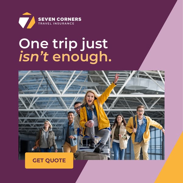
A rich plum background with diagonal lilac and yellow blocks gives the ad a modern, geometric brand identity. The photo is placed as a wide strip across the centre, slightly bleeding toward the right shapes, which adds dynamism. Yellow is used sparingly for the logo accent, headline emphasis and button, creating a consistent visual thread. The cool blue-grey terminal makes the yellow jacket of the central subject pop as the focal point.
How to adapt this template for your brand
- Find a high-energy group photo with movement, laughter and a clear focal subject.
- Write a short identity-based headline that celebrates your audience's habit.
- Highlight the emotional phrase in your accent colour.
- Frame the photo with bold geometric brand shapes.
- Repeat the accent colour on a rectangular CTA button near the photo.
Tips for travel insurance ads on Meta
This square format is a strong default for Meta Feed and works on Google Display as a responsive image. For Reels and Stories, extend the plum background above and below to 9:16. Target interests like travel deals, festivals and group travel, and lookalikes of past multi-trip buyers. Test the primary text with and without explicit 'annual plan' wording. Pair it with a carousel showing different trips in one year to reinforce the multi-trip idea.
About this creative
The creative is a square 1:1 ad with a deep plum background split by diagonal lilac and yellow shapes on the right edge. The Seven Corners logo, a stylised seven inside a shield shape in white and yellow, sits top-left above 'SEVEN CORNERS TRAVEL INSURANCE'. Below it, a large white headline reads 'One trip just isn't enough.' with 'isn't enough' in yellow and 'isn't' italicised for emphasis. The centre of the ad is a wide photo inside a modern airport terminal with a steel truss ceiling. A blonde woman in a yellow rain jacket and headphones sits on a luggage trolley, arm raised in celebration, while a group of diverse friends in casual jackets run behind and beside her, laughing. A yellow rectangular 'GET QUOTE' button overlaps the bottom-left of the photo. The energy is playful and spontaneous, positioning travel as addictive and insurance as the enabler.
Meta ad · 338 × 600 · Travel Insurance
Seven Corners Ad: One Trip Just Isn't Enough
This Seven Corners square ad shows a group of excited friends racing through an airport, one riding a luggage trolley. The headline 'One trip just isn't enough' sells annual multi-trip cover with energy and humour. It is a lifestyle format for Meta feeds, framed by bold plum, lilac and yellow brand shapes.
Added
All brand names and logos are property of their owners. Adplaylist is not affiliated with or endorsed by these brands.
Details
Ad copy
Primary text
Got the travel bug? Seven Corners annual plans cover every trip you take this year – one plan, unlimited adventures.
Description
Annual multi-trip travel insurance from Seven Corners
On-image text
SEVEN CORNERS TRAVEL INSURANCE | One trip just isn't enough. | GET QUOTE
Headline ideas for this template
- 1Can't stop travelling? Neither does our cover
- 2Many trips. One plan.
- 3Insurance for the trip after the next trip
- 4Travel more, stress less, all year
- 5Cover every adventure on your list
Meta image ad specs
| Placement | Ratio | Size (px) |
|---|---|---|
| Feed | 1:1 or 4:5 | 1080×1080 / 1080×1350 |
| Marketplace | 1:1 | 1200×1200 |
| Messenger inbox | 1:1 | 1200×1200 |
| Stories & Reels | 9:16 | 1080×1920 |
This template is 1:1. Request 4:5 or 9:16 to cover all placements.
Browse similar by tag