Key takeaways
- Format: Meme-based before/after comparison of order value
- Best for: Gift-with-purchase, bundle and free-sample promotions
- Hook: Flipping a familiar meme from disappointment to delight
- Reuse it: Swap in your hero products and bonus items, keep the two-tier layout
Available sizes
What is a comparison ad?
A comparison ad sets the product against an alternative, such as a competitor, the old way of doing things or a cheaper option, usually in a two-column layout or table. It helps buyers who are already weighing options see quickly why this one is the better choice.
See all comparison ads →Why this comparison ad works
- 01
Familiar meme, new twist
People know the format as a complaint, so a positive reversal is surprising and memorable.
- 02
Value shown, not told
Seeing the extra items makes the bonus feel tangible without any price claims.
- 03
Clean visual comparison
Identical top and bottom rows make the added gifts jump out instantly.
- 04
Low-pressure tone
It reads like a happy customer post rather than a hard-sell promotion.
Full creative breakdown
Who this ad targets
Women aged 20 to 45 interested in sustainable, plastic-free hair care and solid shampoo bars, plus deal-seekers who respond to free-gift offers. It suits cold audiences on Instagram and TikTok-style placements who recognise the meme, as well as warm audiences who viewed the bars but did not buy. The extras (towel, clip, drain catcher) appeal to shoppers building a full shower routine.
Copywriting analysis
The only copy is the meme itself: 'What I ordered' and 'What I got'. That restraint is the strength. Viewers instantly understand the structure and fill in the meaning, which feels more authentic than a 'Free gifts with purchase' banner. Because the meme normally signals disappointment, the expectation is subverted when the bottom row shows more, not less. The downside is that the offer terms are not explained on the image, so the primary text and headline must spell out what qualifies for the free gifts.
Visual design
The layout is a simple two-tier grid with matching headings, giving an immediate side-by-side read. Soft pink keeps the frame calm and on-brand, letting the colourful orange clip and textured towel draw the eye to the bonus row. Products are cut out with gentle shadows on a seamless background, which makes the comparison clean and easy to scan on a phone.
How to adapt this template for your brand
- Pick the core product a customer orders and photograph it on a plain brand-colour background.
- Photograph the same product again with the free gifts arranged around it.
- Stack both shots vertically with 'What I ordered' and 'What I got' headings.
- Keep the background, lighting and angle identical so only the extras change.
- Explain the offer terms in the primary text and run it during a gift-with-purchase promo.
Tips for haircare ads on Meta
Built as a 9:16 vertical for Instagram and Facebook Stories and Reels; keep key text inside the central safe zone, away from the top 14% and bottom 20% where UI overlays appear, and crop a 1:1 or 4:5 version for feed. Keep both halves visible above the fold of the story, and test a reel version that reveals the second half after a beat. Keep the primary text under 125 characters so it isn't truncated, use the 'Shop Now' button, and refresh the creative every two to three weeks to limit ad fatigue.
About this creative
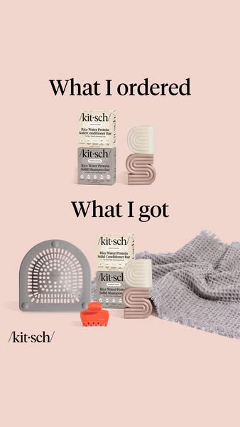
A clean vertical comparison ad on a soft blush-pink background. It is split into two stacked sections with black serif headings. The top section, 'What I ordered', shows two Kitsch Rice Water Protein bars, one shampoo and one conditioner in their boxes, next to two stacked S-shaped bar holders. The bottom section, 'What I got', repeats the same bars and holders but adds a grey shower drain hair catcher, a bright orange-red claw clip and a soft grey waffle-knit towel, all presented as bonus gifts. A small /kit·sch/ logo sits on the left. The meme 'What I ordered vs what I got' is usually used to mock disappointing purchases; here it is inverted to signal surprise and generosity. Products are shot as clean cut-outs with soft shadows, matching the brand's minimal, premium look. The ad communicates a gift-with-purchase offer without a single word of sales copy.
Meta ad · 338 × 600 · Haircare
Kitsch 'What I Ordered vs What I Got' Free Gift Ad
This Kitsch story ad flips a popular internet meme to show a gift-with-purchase offer. The top half shows two shampoo and conditioner bars; the bottom half shows the same bars plus a shower catcher, claw clip and towel. Use this comparison format for free-gift, bundle and bonus-value promotions.
Added
All brand names and logos are property of their owners. Adplaylist is not affiliated with or endorsed by these brands.
Details
Ad copy
Primary text
Ordered the Rice Water shampoo + conditioner bars… and got a whole bundle of free gifts 🎁 Shop now and get free full-size extras with your order while the offer lasts.
Description
Free full-size extras with your shampoo bar order.
On-image text
What I ordered | /kit·sch/ Rice Water Protein Solid Conditioner Bar | /kit·sch/ Rice Water Protein Solid Shampoo Bar | What I got | /kit·sch/
Headline ideas for this template
- 1I only ordered two bars. Look what came.
- 2Order the bars, get the whole routine
- 3The best 'what I got' you'll ever see
- 4Free full-size gifts with your bars
- 5Expectation: two bars. Reality: a gift haul.
Meta image ad specs
| Placement | Ratio | Size (px) |
|---|---|---|
| Feed | 1:1 or 4:5 | 1080×1080 / 1080×1350 |
| Marketplace | 1:1 | 1200×1200 |
| Messenger inbox | 1:1 | 1200×1200 |
| Stories & Reels | 9:16 | 1080×1920 |
This template is 1:1. Request 4:5 or 9:16 to cover all placements.