Key takeaways
- Format: In-use close-up with a question headline and three icons.
- Best for: Wallets, EDC and pocket accessories.
- Hook: A question that turns into an instruction.
- Reuse it: Show the product at the moment it goes into the pocket.
Available sizes
What is a feature callout ad?
A feature callout ad is a static image that shows a single product with short text labels pointing to its key features or benefits, usually joined to the product by thin lines. It explains several selling points at a glance without a long caption, which is why it's common for supplements, skincare, electronics and kitchenware.
See all feature callouts ads →Why this feature callouts ad works
- 01
Moment of use
Showing the wallet entering the pocket proves how slim it is.
- 02
Question-answer headline
The question hooks, and the answer gives a simple first step.
- 03
Denim context
Everyday jeans make the product feel relatable and practical.
- 04
Three clear benefits
Fit, access and capacity cover the main wallet objections.
Full creative breakdown
Who this ad targets
This ad targets men aged 20 to 45 who carry bulky wallets and want a cleaner, more comfortable everyday carry. They value function and simple design and often switch to front-pocket carry for comfort or security. They respond to practical demonstrations more than lifestyle storytelling. Lookalike audiences built from past purchasers are a strong next step once the ad has data.
Copywriting analysis
The headline uses a question to qualify the audience, then gives a clear next step. Each callout pairs a bold label with a short benefit sentence, making the features easy to understand. The question mark after 'carry' is slightly unusual but adds a conversational tone. The headline sets the emotional frame and the callouts handle the rational proof. Short labels are easy to scan in a feed, and each one removes a specific objection a buyer might have before clicking. Together, the words and visuals give the viewer one clear reason to click.
Visual design
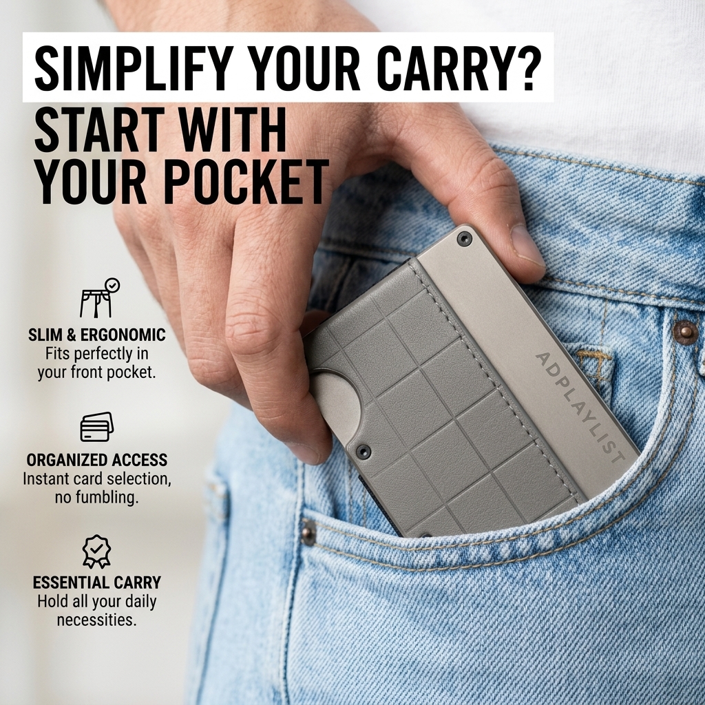
A tight crop on hand, wallet and pocket fills the frame, making the product feel tangible. The headline sits top left in heavy black type, partly on a white bar for contrast. Light denim and grey metal create a cool, casual palette. Icons sit stacked on the left in white space. The square 1:1 format keeps every element readable on mobile, and the clear hierarchy guides the eye from brand to message to product.
How to adapt this template for your brand
- List the features of your slim wallet and keep only the three to six buyers ask about most.
- Rewrite each feature as a two-to-four-word benefit label.
- Pair each label with a simple line icon or place it in a pill or card.
- Arrange the callouts around a clean hero image of the product or a person using it.
- Swap the callout order and test which benefit drives the best click-through rate.
Tips for jewelry ads on Meta
On Meta, run this slim wallet creative in Feed and Explore at 1:1, then crop a 4:5 version to win more mobile screen space. Keep the headline inside the safe zone so it is not covered by the profile name or CTA bar. Use the primary text for details the image leaves out, and test Advantage+ placements alongside a Feed-only ad set. Refresh the visual every three to four weeks to avoid creative fatigue.
About this creative
The creative shows a close-up of a man's hand sliding a grey slim wallet with a raised grid texture and an Adplaylist engraving into the front pocket of light-wash jeans, with a white T-shirt above. A bold condensed headline in black, partly on a white strip, asks simplify your carry and answers start with your pocket. On the left, three line icons with short descriptions list slim and ergonomic, organised access and essential carry, explaining front-pocket fit, instant card selection and room for daily necessities. As a feature callouts ad, it pairs a hero visual with short, scannable benefit labels. Each callout answers a buying question in a few words, so the viewer can grasp the value without reading a paragraph. Icons, pills and cards make the benefits feel concrete and easy to compare, which works well for audiences who are already weighing up options.
Meta ad · 1200 × 1200 · Jewelry
Slim Wallet Ad Template – Feature callouts Example
This slim wallet ad template uses a feature callouts format to show a hand sliding a slim wallet into a front jeans pocket, with three icon benefits. It is a strong reference for wallets, EDC and pocket accessories. Below: the copy, why it works and five steps to adapt it.
Added
All brand names and logos are property of their owners. Adplaylist is not affiliated with or endorsed by these brands.
Details
Ad copy
Primary text
Bulky wallet? Start with your pocket. The Adplaylist slim wallet fits perfectly in your front pocket and gives you instant access to your cards, with no fumbling.
Description
A slim, front-pocket wallet
On-image text
SIMPLIFY YOUR CARRY? START WITH YOUR POCKET | SLIM & ERGONOMIC Fits perfectly in your front pocket. | ORGANIZED ACCESS Instant card selection, no fumbling. | ESSENTIAL CARRY Hold all your daily necessities. | ADPLAYLIST (on wallet)
Headline ideas for this template
- 1Ditch the bulk. Keep the essentials.
- 2Front-pocket carry, made easy.
- 3The wallet that fits like it isn't there.
- 4Cards in a flash, no fumbling.
- 5Slim down your everyday carry.
Meta image ad specs
| Placement | Ratio | Size (px) |
|---|---|---|
| Feed | 1:1 or 4:5 | 1080×1080 / 1080×1350 |
| Marketplace | 1:1 | 1200×1200 |
| Messenger inbox | 1:1 | 1200×1200 |
| Stories & Reels | 9:16 | 1080×1920 |
This template is 1:1. Request 4:5 or 9:16 to cover all placements.
Browse similar by tag