Key takeaways
- Format: Minimal product shot with a scale prop.
- Best for: Hardware launches where size or weight is the main upgrade.
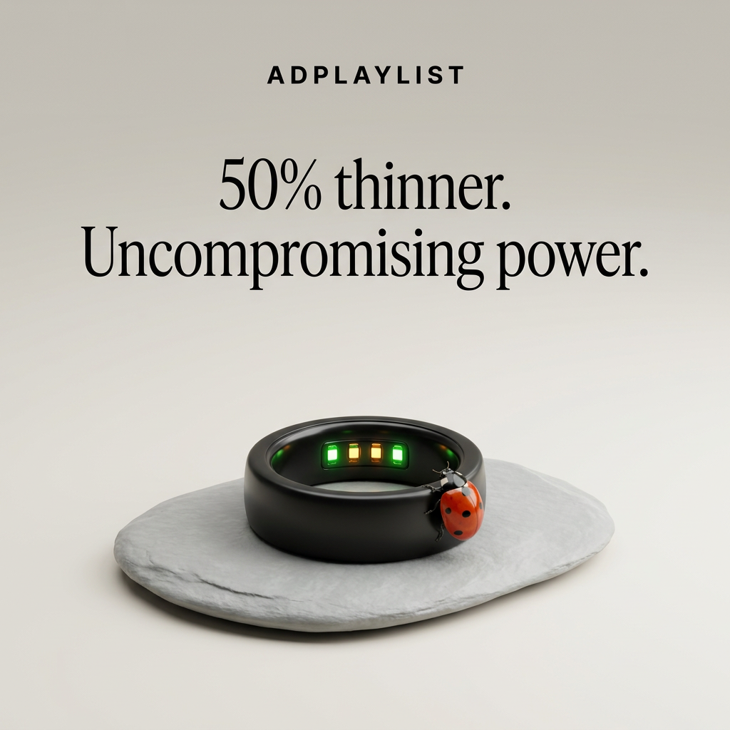
- Hook: A ladybug that makes the product's thinness visible.
- Reuse it: Place your product next to a familiar small object that proves your claim.
Available sizes
What is a product shot ad?
A product shot ad puts the product itself at the centre of the frame, usually on a clean or styled background with little text. It works best when the packaging or product is distinctive enough to stop the scroll and the viewer already understands what it does.
See all product shot ads →Why this product shot ad works
- 01
Visual proof of the claim
The ladybug shows scale instantly, so '50% thinner' feels demonstrated rather than just stated.
- 02
One pop of color
Red is the only saturated hue, so the eye lands on the bug, and therefore the ring, within a second.
- 03
Contrast in the headline
Pairing 'thinner' with 'uncompromising power' preempts the worry that slimmer means weaker.
- 04
Premium restraint
Generous negative space and serif type signal luxury and confidence.
Full creative breakdown
Who this ad targets
Existing and prospective smart ring buyers aged 28–50 who care about sleep, recovery and readiness tracking but dislike bulky wearables. They are design-conscious, often already own a smartwatch or an older ring, and are motivated by upgrades. The elegant, jewelry-like presentation also targets buyers who want health tracking that blends in at work or on formal occasions. Gift buyers looking for a premium, tech-forward present are a strong secondary audience.
Copywriting analysis
The headline uses two short sentences, each ending in a full stop, creating a confident, declarative rhythm. “50% thinner” leads with a concrete number, which is more credible than “slimmer” and quickly signals a new version. “Uncompromising power” immediately handles the obvious objection that a thinner device might lose battery life or sensors. The word “uncompromising” is premium in tone and matches the serif typography. There is no explanation of features, which keeps the focus on a single message. The ad text should carry specifics such as battery life and tracked metrics, plus a clear CTA.
Visual design
The composition stacks brand, headline and product vertically in the center, with large margins on every side. A warm grey gradient and grey stone keep the palette nearly monochrome, so the black ring and red ladybug dominate. The ring is lit softly from above, with the glowing sensors adding a subtle tech cue. The elegant serif headline contrasts with the small, widely spaced sans-serif wordmark, creating a luxury-fashion feel rather than a gadget look.
How to adapt this template for your brand
- Identify your product's single biggest physical upgrade.
- Find a small natural or everyday object that proves it visually.
- Shoot the product on a neutral, textured base with soft light.
- Write a two-sentence headline: the number first, then the objection-buster.
- Keep everything else off the canvas.
Tips for health & fitness ads on Meta
Ideal for Meta Feed and Instagram, where the striking ladybug stops the scroll. For Stories and Reels, use a short video of the ladybug walking across the ring for extra motion. Run it as a launch or upgrade ad to existing customers and lookalike audiences. Since there is no CTA on the image, use a 'Shop Now' button and include battery life and key metrics in the primary text.
About this creative
This square ad for a smart ring is almost entirely negative space. A warm grey gradient background holds a small ADPLAYLIST wordmark at the top and a large two-line serif headline: “50% thinner. Uncompromising power.” Below, a matte black ring rests on a smooth, flat grey stone, angled so the inner sensors are visible, glowing green and amber. The key detail is a bright red ladybug crawling onto the edge of the band. The insect acts as a natural scale reference, instantly showing how slim and small the ring is without a ruler or comparison chart. It also adds the only saturated color in the frame, pulling the eye straight to the product. The stone base suggests calm and nature, softening the technology. With no CTA, price or feature list, the ad relies entirely on one striking visual and a confident claim to communicate the upgrade.
Meta ad · 1200 × 1200 · Health & Fitness
Smart Ring Ad: How a Ladybug Proves '50% Thinner'
This minimalist product-shot ad sells a smart ring's slimmer design with one clever prop: a ladybug resting on the band. The bug shows scale instantly, while a two-line serif headline states the benefit. Use this template for any hardware launch where size, weight or thinness is the key upgrade.
Added
All brand names and logos are property of their owners. Adplaylist is not affiliated with or endorsed by these brands.
Details
Ad copy
Primary text
Half the thickness. None of the compromise. The new ADPLAYLIST ring tracks sleep, heart rate and activity in a band so light you'll forget it's there.
Description
Our slimmest smart ring yet.
On-image text
ADPLAYLIST | 50% thinner. Uncompromising power.
Headline ideas for this template
- 1Half the Thickness. All the Insight.
- 2So Light, a Ladybug Could Wear It
- 3Thinner Ring, Same Power
- 4Meet Our Slimmest Smart Ring Yet
- 5Health Tracking You'll Forget You're Wearing
Meta image ad specs
| Placement | Ratio | Size (px) |
|---|---|---|
| Feed | 1:1 or 4:5 | 1080×1080 / 1080×1350 |
| Marketplace | 1:1 | 1200×1200 |
| Messenger inbox | 1:1 | 1200×1200 |
| Stories & Reels | 9:16 | 1080×1920 |
This template is 1:1. Request 4:5 or 9:16 to cover all placements.
Browse similar by tag