Key takeaways
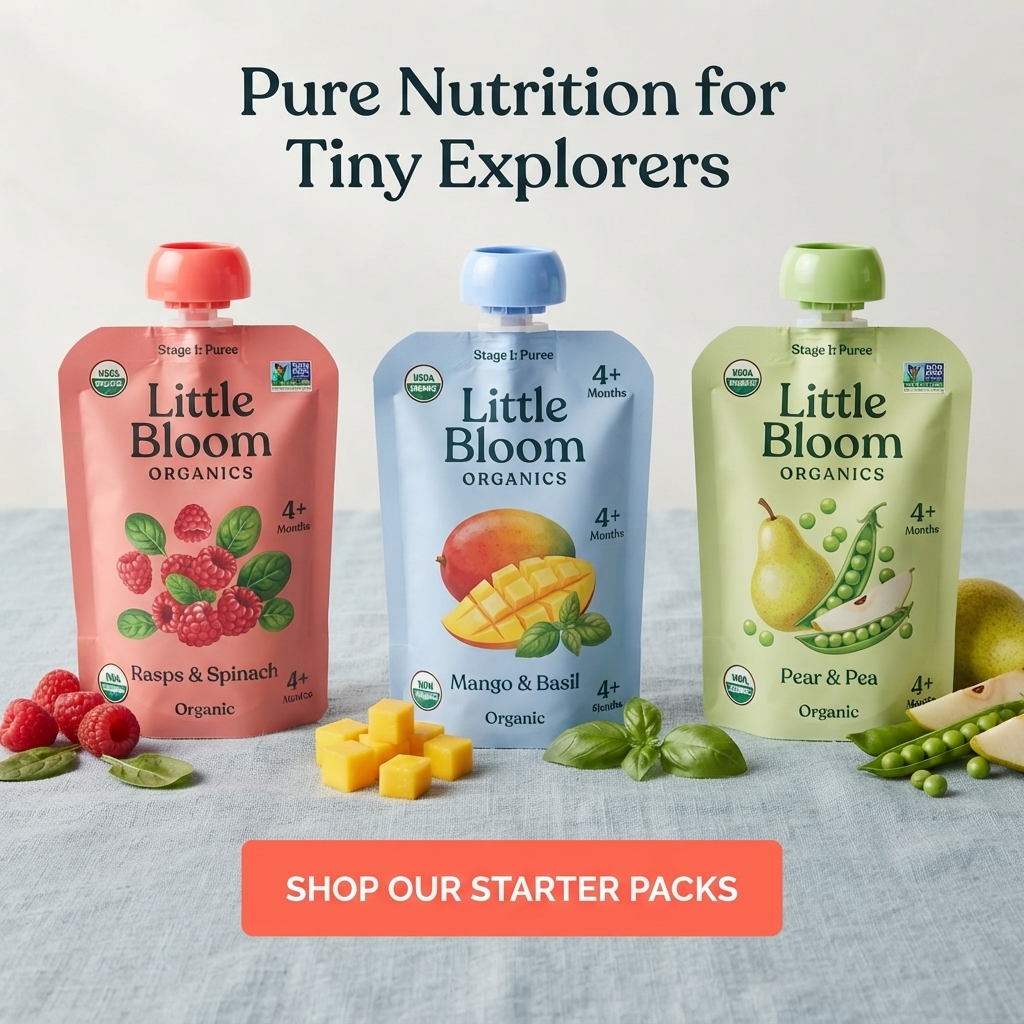
- Format: Straight-on lineup of three colour-coded pouches with matching ingredients.
- Best for: Promoting starter packs, bundles or a new flavor trio.
- Hook: Unexpected pairings like mango and basil that spark curiosity.
- Reuse it: Keep the three-up row and colour coding; swap flavors and CTA.
Available sizes
What is a product shot ad?
A product shot ad puts the product itself at the centre of the frame, usually on a clean or styled background with little text. It works best when the packaging or product is distinctive enough to stop the scroll and the viewer already understands what it does.
See all product shot ads →Why this product shot ad works
- 01
Colour coding speeds choice
Each pouch has its own colour, so parents instantly see three distinct options and can spot their favourite later in store.
- 02
Bundle CTA raises order value
'Shop Our Starter Packs' pushes a multi-pack purchase instead of a single pouch.
- 03
Clear stage and age info
Stage 1 and 4+ months markers make it obvious this is for beginners, reducing hesitation.
- 04
Interesting flavor pairings
Combinations like Mango & Basil feel modern and adventurous, matching the 'explorers' theme.
Full creative breakdown
Who this ad targets
This ad is aimed at first-time parents with babies around four to six months who are just starting purées. They want a simple, organic way to begin and appreciate guidance like stage labels and age markers. A starter pack lowers the risk of choosing wrong. The soft pastel style and creative flavors appeal to design-aware parents who want something a bit more special than mainstream supermarket brands.
Copywriting analysis
The headline 'Pure Nutrition for Tiny Explorers' pairs a purity claim with an aspirational identity, framing the baby as a curious explorer rather than a picky eater. The pouches handle the specifics: stage, age and flavors. 'Shop Our Starter Packs' is specific and commercial, steering parents to a bundle that suits beginners. The copy avoids clutter and lets the product grid explain the offer. One weakness is that no price or bundle benefit is shown, which could be added to boost conversion.
Visual design
The layout is symmetrical and grid-like, with three identical pouch shapes spaced evenly across the frame. Pastel coral, blue and green create a cohesive yet varied palette. The neutral linen surface and wall keep attention on the products. Ingredients are placed low in the frame to add depth. The coral CTA button repeats the first pouch colour and draws the eye to the action at the bottom.
How to adapt this template for your brand
- Line up three products evenly on a simple textured surface.
- Give each product its own colour and place matching ingredients in front.
- Write a headline that gives your audience an aspirational identity.
- Use a bundle-focused CTA like 'Shop Starter Packs'.
- Add a price or saving to the button area to test conversion.
Tips for baby food ads on Meta
On Meta, this layout is ideal for carousel ads where each card zooms in on one flavor. In feed, keep the image 1:1 and use the primary text to explain what is in the starter pack. Test adding a small 'Save 15%' badge for retargeting audiences. For Pinterest-style placements, a taller 2:3 version with the headline above the pouches performs well.
About this creative
The image is a straight-on product lineup on a pale blue linen tablecloth against a soft off-white wall. A dark serif headline at the top reads 'Pure Nutrition for Tiny Explorers'. Three matching spouted pouches stand side by side, each a different pastel colour: coral for Raspberry & Spinach, light blue for Mango & Basil and soft green for Pear & Pea. Each label shows Stage 1: Puree, the Little Bloom Organics wordmark, a 4+ months marker, an illustration of the ingredients and organic and Non-GMO seals. In front of each pouch sit its real ingredients: raspberries and spinach leaves, mango cubes and basil, and pear slices with pea pods. A bright coral rectangular button across the bottom says 'Shop Our Starter Packs'. The overall feel is orderly, gentle and premium, with soft daylight and lots of breathing room that makes the three products easy to compare.
Meta ad · 1200 × 1200 · Baby Food
Stage 1 Purée Pouch Ad: Colour-Coded Product Lineup
This Little Bloom Organics ad lines up three colour-coded Stage 1 pouches on a linen tablecloth, each matched with its fresh ingredients. A calm 'Tiny Explorers' headline and a coral starter pack button make it a simple, high-clarity product shot template for bundles and trial packs.
Added
All brand names and logos are property of their owners. Adplaylist is not affiliated with or endorsed by these brands.
Details
Ad copy
Primary text
Pure nutrition for tiny explorers. Little Bloom Organics Stage 1 purées come in three first-taste combos, Raspberry & Spinach, Mango & Basil and Pear & Pea, all certified organic for 4+ months. Start with a starter pack today.
Description
Stage 1 organic purée pouches for babies 4+ months.
On-image text
Pure Nutrition for Tiny Explorers | Stage 1: Puree | Little Bloom Organics | Rasps & Spinach | Mango & Basil | Pear & Pea | 4+ Months | Organic | USDA Organic | Non-GMO | SHOP OUR STARTER PACKS
Headline ideas for this template
- 1Three first tastes in one starter pack
- 2Start solids with Stage 1 organic purées
- 3Raspberry, mango or pear: let them explore
- 4Organic first foods for 4+ months
- 5The easiest way to begin purées
Meta image ad specs
| Placement | Ratio | Size (px) |
|---|---|---|
| Feed | 1:1 or 4:5 | 1080×1080 / 1080×1350 |
| Marketplace | 1:1 | 1200×1200 |
| Messenger inbox | 1:1 | 1200×1200 |
| Stories & Reels | 9:16 | 1080×1920 |
This template is 1:1. Request 4:5 or 9:16 to cover all placements.
Browse similar by tag