Key takeaways
- Format: Feature callout with a lifestyle photo header and a product UI toggle list below.
- Best for: Payments, SaaS and e-commerce tools that unlock features with simple settings.
- Hook: A parallel cause-and-effect headline: more options equals more revenue.
- Reuse it: Show your key settings as toggles and pair them with a two-line "More X. More Y." headline.
Available sizes
What is a feature callout ad?
A feature callout ad is a static image that shows a single product with short text labels pointing to its key features or benefits, usually joined to the product by thin lines. It explains several selling points at a glance without a long caption, which is why it's common for supplements, skincare, electronics and kitchenware.
See all feature callouts ads →Why this feature callouts ad works
- 01
Parallel benefit headline
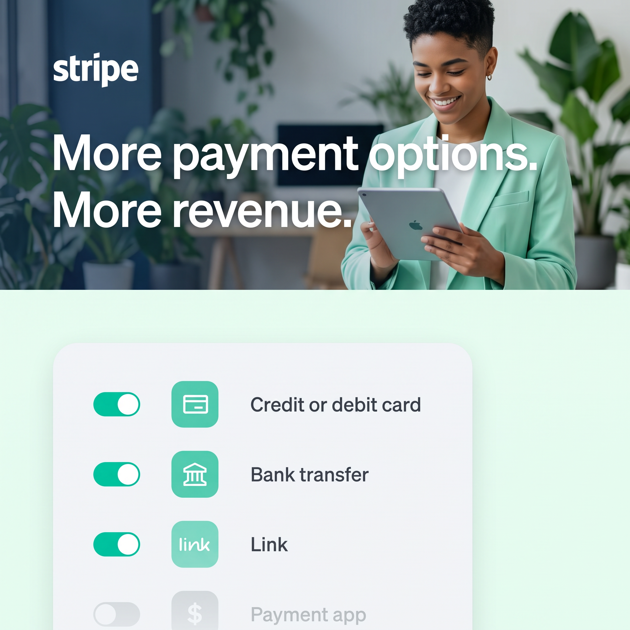
"More payment options. More revenue." uses repetition to link the feature directly to money. It's instantly understood and easy to remember.
- 02
UI as proof of simplicity
Toggle switches show that enabling a method takes one tap. Viewers grasp the ease without reading any explanation.
- 03
Unfinished list invites action
The greyed-out Payment app row hints there's more to switch on. It creates a small curiosity gap and suggests untapped revenue.
- 04
Colour-matched scene
The mint blazer, plants and UI tiles share one palette. The whole ad feels cohesive and on-brand at a glance.
Full creative breakdown
Who this ad targets
The ad targets online business owners, e-commerce managers, SaaS founders and product or finance leads who manage checkout. They want higher conversion and fewer abandoned carts, especially when selling to customers who prefer bank transfers or wallets. Many already use Stripe for cards and may not have switched on other methods, so the ad also works as an upsell to existing users. The friendly lifestyle photo widens the appeal to small-business owners, not just developers.
Copywriting analysis
The copy is just six words split into two parallel fragments. Repeating "More" builds a simple equation: options in, revenue out. There is no jargon, no feature name and no number, which keeps it broad and memorable. The UI labels do the explaining, listing concrete payment methods the reader recognises. The phrase "Payment app" left switched off is a quiet nudge to take the next step. Because there is no on-image CTA, the ad relies on the platform button, which keeps the visual uncluttered.
Visual design
A clear top/bottom split separates emotion (photo) from logic (UI). White type on the darker, softly blurred office background ensures legibility. The bottom panel uses rounded corners, soft shadows and generous spacing, echoing Stripe's real dashboard style. Mint and teal tie both halves together. The cropped final row and fade at the bottom edge suggest the list continues, adding depth and a sense of scale without extra elements.
How to adapt this template for your brand
- List the three or four settings or integrations that most directly drive your customers' results.
- Recreate them as a clean toggle list, with most switched on and one left off.
- Write a parallel headline: "More [feature]. More [outcome]."
- Add a lifestyle photo on top with clothing or props in your brand colour.
- Use the platform CTA button and point to a page explaining how to enable each feature.
Tips for finance & fintech ads on Meta
On Meta, this works well in Feed for prospecting small-business owners and for retargeting existing Stripe users with an upsell message. For Stories, stack the photo and UI vertically with more space between rows. On LinkedIn, target e-commerce, product and finance roles and add a stat about conversion lift in the intro text. On Google Display, upload the headline and UI as separate assets, since the toggle list alone makes a strong standalone image.
About this creative
This square Stripe ad is split into two horizontal zones. The top half is a bright, plant-filled office photo with a smiling woman in a mint-green blazer looking down at a tablet. The white Stripe wordmark sits in the upper left, and a large white headline overlays the image: "More payment options. More revenue." The bottom half switches to a pale mint background with a rounded, light-grey card that mimics a product settings panel. Inside are four rows, each with a toggle switch, a mint icon tile and a label: Credit or debit card, Bank transfer and Link are switched on, while Payment app is greyed out and fading off the bottom edge. The colour palette of mint, teal and white ties the outfit, plants and UI together. The creative clearly shows a product feature while promising a business result, combining lifestyle warmth with UI clarity.
Meta ad · 1200 × 1200 · Finance & Fintech
Stripe Ad: "More payment options. More revenue."
This Stripe feature callout ad links payment methods directly to revenue. A lifestyle photo with a punchy two-line headline sits above a clean toggle-switch UI showing cards, bank transfer and Link. It is a strong template for SaaS and payments brands that want to show a product setting and its business outcome together.
Added
All brand names and logos are property of their owners. Adplaylist is not affiliated with or endorsed by these brands.
Details
Ad copy
Primary text
Let customers pay the way they want. With Stripe you can turn on cards, bank transfers, Link and more from one dashboard, and convert more checkouts into revenue.
Description
Turn on new payment methods in a click
On-image text
stripe / More payment options. More revenue. / Credit or debit card / Bank transfer / Link / Payment app
Headline ideas for this template
- 1Every payment method you add is revenue you keep.
- 2Let customers pay their way. Watch sales grow.
- 3Flip a switch. Unlock new revenue.
- 4Fewer abandoned carts start with more ways to pay.
- 5Cards, bank transfers, wallets: all in one place.
Meta image ad specs
| Placement | Ratio | Size (px) |
|---|---|---|
| Feed | 1:1 or 4:5 | 1080×1080 / 1080×1350 |
| Marketplace | 1:1 | 1200×1200 |
| Messenger inbox | 1:1 | 1200×1200 |
| Stories & Reels | 9:16 | 1080×1920 |
This template is 1:1. Request 4:5 or 9:16 to cover all placements.