Key takeaways
- Format: Side-by-side style comparison with four named options.
- Best for: Swimwear, lingerie and apparel ranges with distinct cuts or fits.
- Hook: Asking the viewer to pick their style makes them engage, not just scroll.
- Reuse it: Line up four variants, give each a personality name and ask the viewer to choose.
Available sizes
What is a comparison ad?
A comparison ad sets the product against an alternative, such as a competitor, the old way of doing things or a cheaper option, usually in a two-column layout or table. It helps buyers who are already weighing options see quickly why this one is the better choice.
See all comparison ads →Why this comparison ad works
- 01
Choice drives engagement
Four clear options turn the ad into a quick quiz. Viewers naturally decide which one they would pick, which builds intent before the click.
- 02
Named styles add personality
Labels like Pattern Play and Statement Cut are easier to remember than product codes. They help shoppers match a style to their self-image.
- 03
Inclusive casting
Different skin tones, hair textures and body shapes signal that the range is for everyone. More viewers see themselves in the ad.
- 04
Handmade texture
Torn paper, handwriting and plaster make the ad feel crafted and personal. It stands out from glossy, studio-only competitors.
Full creative breakdown
Who this ad targets
This ad targets women aged roughly 20 to 45 shopping for new-season swimwear who want a style that fits their body and personality. It suits shoppers who feel overwhelmed by large catalogues and want help narrowing down. The diverse casting reaches a broad, multicultural audience, while the Eco-Chic option speaks to sustainability-minded buyers. It works well for prospecting and for retargeting people who browsed several styles without buying.
Copywriting analysis
The headline Find your perfect shade borrows language from beauty, where finding the right foundation shade is a familiar ritual. Applied to swimwear, it frames shopping as a personal match rather than a generic purchase, and hints at inclusivity. The four style names act as micro-copy: each pairs a style word with a benefit or attitude, such as Sculpt for shaping or Statement for confidence. The side note The one you deserve is here adds self-worth and permission to treat yourself, while Take your pick gives a casual nudge to choose. Shop the New Season adds freshness and seasonality to the CTA.
Visual design
The layout mimics a paper poster on a wall, with soft shadows and torn edges that add depth. Four equal portrait panels form a clean grid across the centre, each with a beige studio background so the swimwear colours stand out. A handwritten marker-style font is used for the headline and side note, contrasting with clean sans-serif labels. The palette stays cream, beige and warm plaster, with teal, coral and black from the products.
How to adapt this template for your brand
- Pick four variants of your product that suit different customer types.
- Give each variant a short, personality-led name instead of a product code.
- Cast or photograph each variant on a different person to show inclusivity.
- Place the grid on a textured, handmade-looking background like paper or a mood board.
- Add a side note that encourages choice, such as Take your pick, and a seasonal CTA.
Tips for swimwear ads on Meta
On Meta, use this as the opening card of a carousel and follow with one card per style linking to each product page. A poll sticker asking which style viewers prefer works well in Stories. On TikTok, film four quick try-on clips with the style name appearing on screen. Test the comparison image against single-style creatives to see whether choice lifts click-through rate for your audience.
About this creative
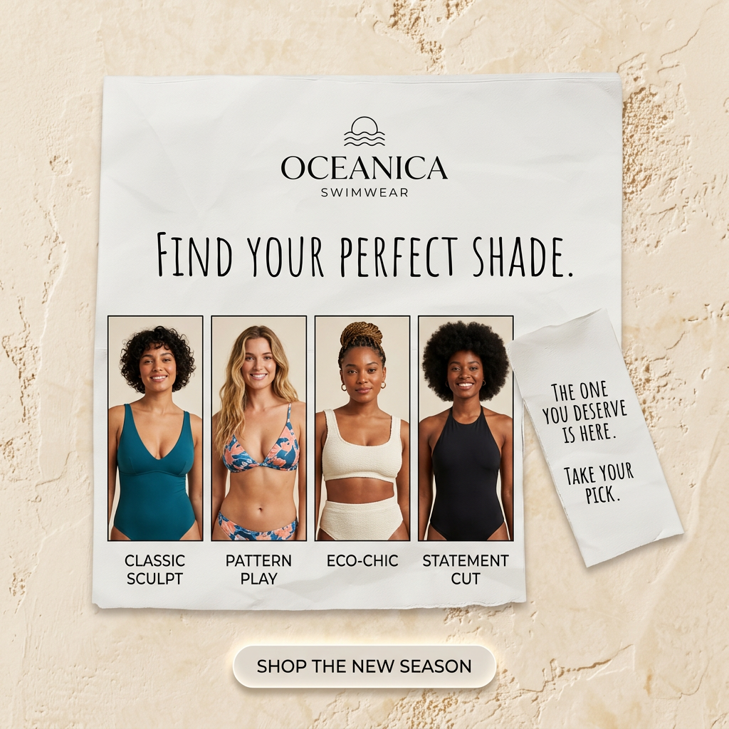
This square ad for Oceanica Swimwear looks like a sheet of paper taped to a sunlit, textured plaster wall. At the top sits the Oceanica logo, a simple sun-over-waves icon above serif capitals and the word SWIMWEAR. A hand-lettered headline reads Find your perfect shade. Below it, four photo panels show four smiling women with different skin tones, hair types and body shapes, each in a different style: a teal plunge one-piece labelled Classic Sculpt, a coral and navy tropical bikini labelled Pattern Play, a textured cream two-piece labelled Eco-Chic and a black halter one-piece labelled Statement Cut. A smaller torn paper note on the right, in the same handwriting, says The one you deserve is here. Take your pick. A soft cream pill button at the bottom reads SHOP THE NEW SEASON. The handmade, mood-board look feels warm, inclusive and personal.
Meta ad · 1200 × 1200 · Swimwear
Swimwear Ad Template: Find Your Perfect Shade
This swimwear ad template from Oceanica uses a comparison format, lining up four models in four named styles on a torn paper poster. It invites shoppers to pick the cut that fits their personality. Use it for swimwear, lingerie, activewear or any range where customers choose between styles or fits.
Added
All brand names and logos are property of their owners. Adplaylist is not affiliated with or endorsed by these brands.
Details
Ad copy
Primary text
Classic Sculpt, Pattern Play, Eco-Chic or Statement Cut? Our new season has a style for every body and every mood. Find the one you deserve and take your pick at Oceanica.
Description
Four swimwear styles. Which one is you?
On-image text
OCEANICA | SWIMWEAR | Find your perfect shade. | CLASSIC SCULPT | PATTERN PLAY | ECO-CHIC | STATEMENT CUT | The one you deserve is here. Take your pick. | SHOP THE NEW SEASON
Headline ideas for this template
- 1Which Swimsuit Style Is You?
- 2Four Cuts. One Is Made for You.
- 3Find Your Perfect Shade This Summer
- 4Sculpt, Pattern, Eco or Statement?
- 5The Swimsuit You Deserve Is Here
Meta image ad specs
| Placement | Ratio | Size (px) |
|---|---|---|
| Feed | 1:1 or 4:5 | 1080×1080 / 1080×1350 |
| Marketplace | 1:1 | 1200×1200 |
| Messenger inbox | 1:1 | 1200×1200 |
| Stories & Reels | 9:16 | 1080×1920 |
This template is 1:1. Request 4:5 or 9:16 to cover all placements.