Key takeaways
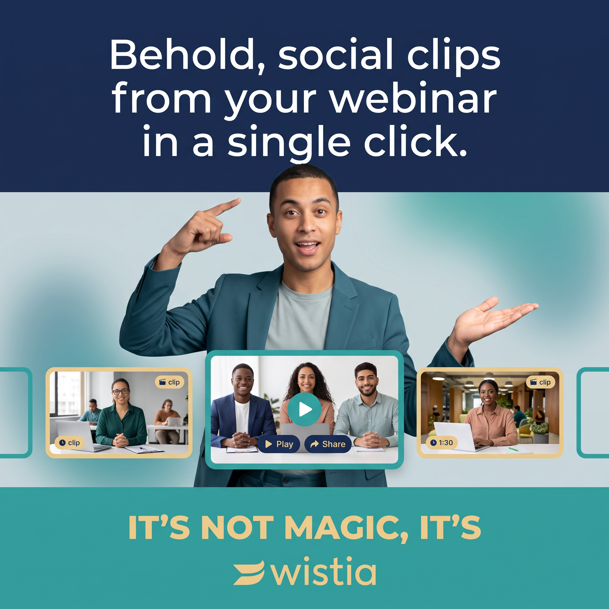
- Format: Presenter + mock product UI feature callout
- Best for: B2B SaaS, video and content tools, single-feature launches
- Hook: “Behold” headline promising a one-click result
- Reuse it: Put a presenter between a benefit headline and a strip showing your product’s output
Available sizes
What is a feature callout ad?
A feature callout ad is a static image that shows a single product with short text labels pointing to its key features or benefits, usually joined to the product by thin lines. It explains several selling points at a glance without a long caption, which is why it's common for supplements, skincare, electronics and kitchenware.
See all feature callouts ads →Why this feature callouts ad works
- 01
One feature, one promise
The ad sells a single, concrete outcome (clips in one click), which is easy to grasp in a two-second scroll.
- 02
Show the output
Clip thumbnails with Play, Share and duration badges make an abstract feature tangible.
- 03
Human presenter
The pointing, magician-like pose directs attention and adds personality to a software ad.
- 04
Witty brand sign-off
“It’s not magic, it’s Wistia” turns the logo into the punchline and makes the brand memorable.
Full creative breakdown
Who this ad targets
The ad targets B2B marketers, content managers and demand-generation teams who already run webinars but struggle to repurpose them. These people are time-poor, measured on pipeline and engagement, and know their recordings hold valuable moments they rarely have time to edit. Typical buyers work at SaaS companies, agencies and mid-size businesses that publish on LinkedIn and other social channels and want more content from the same effort, without hiring a video editor.
Copywriting analysis
The headline opens with “Behold”, a playful, slightly theatrical word that stops the scroll and sets up the magic theme. It then states the outcome plainly, social clips from your webinar, and removes friction with “in a single click”. Using “your webinar” makes it personal and assumes the viewer already has the raw material. The tagline at the bottom, “It’s not magic, it’s Wistia”, pays off the opening and folds the brand name into a memorable line. The copy is short, benefit-led and avoids jargon like AI or repurposing, keeping the message accessible to any marketer.
Visual design
The design uses three horizontal bands: navy for the headline, a soft teal gradient for the presenter and product, and solid teal for the sign-off. This structure makes it easy to read top to bottom. The presenter breaks out of the middle band into the navy area, adding depth. Rounded thumbnail frames with gold and teal borders mimic a real interface. A clean sans-serif font and consistent brand colours keep it professional yet friendly.
How to adapt this template for your brand
- Pick one feature and write its outcome as a one-line headline with a time or effort promise.
- Photograph a presenter pointing at where the product visuals will sit.
- Build a strip of mock UI showing the feature’s output with realistic labels.
- Use three colour bands from your palette to separate headline, demo and sign-off.
- End with a witty line that makes your brand name the punchline.
Tips for saas & tech ads on Meta
On LinkedIn, this square format works well in the feed; pair it with primary text naming a specific use case, like turning a 60-minute webinar into ten clips. On Meta, target marketing job titles and retarget visitors of your webinar pages. Consider a short video version where the clips animate out of the webinar. Keep the headline under ten words so it stays readable on mobile, and use Learn More or Start Free Trial as the CTA.
About this creative
This square ad for Wistia promotes its feature that turns webinar recordings into short social clips. The top third is a deep navy band with a large white headline announcing social clips from your webinar in a single click, opening with the theatrical word “Behold”. In the centre, a smiling young man in a teal blazer and grey T-shirt points up at the headline with one hand and presents the content below with the other, like a magician revealing a trick. Beneath him runs a carousel of video thumbnails: the central frame shows three people at a webinar desk with a teal play button and Play and Share controls, flanked by smaller clips tagged “clip” and “1:30”. The bottom band is teal with bold gold text reading “It’s not magic, it’s” followed by the Wistia wordmark. The palette of navy, teal and gold keeps it on-brand and highly structured.
Meta ad · 1200 × 1200 · SaaS & Tech
Wistia Webinar Clips Feature Ad Example
This square SaaS ad from Wistia promotes one feature: turning a webinar into social clips with one click. A presenter gestures at a carousel of clip thumbnails between a navy headline band and a teal tagline band. It is a useful model for B2B software brands showcasing a single feature on Meta and LinkedIn.
Added
All brand names and logos are property of their owners. Adplaylist is not affiliated with or endorsed by these brands.
Details
Ad copy
Primary text
Your webinar is full of great moments. Wistia turns them into ready-to-share social clips automatically, so your content keeps working long after the live session ends.
Description
Repurpose video content automatically.
On-image text
Behold, social clips from your webinar in a single click. | clip | 1:30 | Play | Share | IT’S NOT MAGIC, IT’S wistia
Headline ideas for this template
- 1Your Webinar, Now 10 Social Clips
- 2One Click. Endless Social Content.
- 3Stop Letting Webinar Gold Go to Waste
- 4Repurpose Webinars Without an Editor
- 5The Fastest Way From Webinar to Social
Meta image ad specs
| Placement | Ratio | Size (px) |
|---|---|---|
| Feed | 1:1 or 4:5 | 1080×1080 / 1080×1350 |
| Marketplace | 1:1 | 1200×1200 |
| Messenger inbox | 1:1 | 1200×1200 |
| Stories & Reels | 9:16 | 1080×1920 |
This template is 1:1. Request 4:5 or 9:16 to cover all placements.
Browse similar by tag