Key takeaways
- Format: Ghost-mannequin apparel shot with an editorial recommendation tag.
- Best for: Sportswear brands pushing a hero product without discounting.
- Hook: SEASON PICK tells riders this is the one to buy right now.
- Reuse it: Replace the tag with STAFF PICK, NEW or BEST SELLER for other hero items.
Available sizes
What is a product shot ad?
A product shot ad puts the product itself at the centre of the frame, usually on a clean or styled background with little text. It works best when the packaging or product is distinctive enough to stop the scroll and the viewer already understands what it does.
See all product shot ads →Why this product shot ad works
- 01
Curation instead of discount
SEASON PICK gives a reason to look without lowering the price. It protects margin and the brand's premium position.
- 02
Strong colour contrast
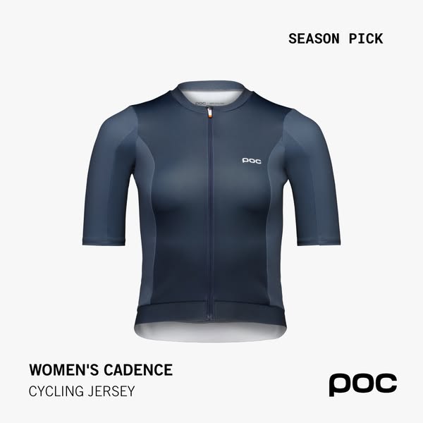
The dark navy jersey on an off-white background is easy to spot in a busy feed. The shape and fit are clear even at thumbnail size.
- 03
Fit is visible without a model
The ghost-mannequin shot shows cut, panels and zip clearly. It also avoids alienating viewers who do not identify with a particular model.
- 04
Gendered naming up front
WOMEN'S in the product name tells the audience instantly that this is designed for them. It helps the ad perform in women-targeted ad sets.
Full creative breakdown
Who this ad targets
The ad targets women road cyclists who ride regularly and care about fit and performance. They are likely 25 to 50, already own some cycling kit and are looking to upgrade to a more premium jersey. The SEASON PICK label suggests the ad runs at the start of the riding season, aimed at both POC customers and cold audiences interested in road cycling, women's sport and premium activewear.
Copywriting analysis
The on-image copy is built from a label, a product name and a category. SEASON PICK is the persuasive element: it borrows the language of editorial curation, as if a trusted shop assistant is recommending the item. It creates timeliness without the pressure of a countdown or a discount. WOMEN'S CADENCE leads with the audience, which signals that the jersey is designed for women rather than simply resized. Cadence is also a cycling term, so the name feels authentic to riders. CYCLING JERSEY clarifies the category for anyone new to POC. The ad leaves benefits such as breathability and fit to the primary text, which keeps the image clean but means the supporting copy has to be specific.
Visual design
The jersey is shown flat and centred with a ghost-mannequin effect, which makes the shape three-dimensional without a person. The navy gradient and the lighter side panels add depth and show the construction. A monospaced font for the label contrasts with the bold grotesque used for the product name, giving the ad a technical, editorial feel. Plenty of white space and the fixed corner layout keep the look calm and premium.
How to adapt this template for your brand
- Photograph your garment on a ghost mannequin, front-facing and centred.
- Use a plain light background that contrasts with the garment colour.
- Add a curation label such as SEASON PICK or EDITOR'S CHOICE in the top right.
- Write the product name with the audience first (WOMEN'S, MEN'S, KIDS') in the bottom left.
- Use the primary text to explain one or two fabric or fit benefits.
Tips for cycling gear ads on Meta
On Meta, run this square format in feed and catalogue ads targeted at women interested in road cycling and endurance sports. Pair it with a carousel showing the back and detail shots, as jersey buyers want to see pockets and fabric. Launch it at the start of the season, when riders are refreshing their kit. Test the SEASON PICK label against NEW to learn which framing your audience responds to better.
About this creative
This square creative shows the POC Women's Cadence cycling jersey laid out as a ghost-mannequin product shot, facing the camera straight on. The jersey is navy with a subtle gradient that fades to a lighter steel blue at the hem, and slightly lighter side and sleeve panels that follow the body shape. A full-length zip runs down the centre, with a small white POC logo on the left chest and a short collar at the top. The background is a soft off-white, which makes the dark jersey stand out strongly. A monospaced label in the top right reads SEASON PICK. Bottom left, WOMEN'S CADENCE is set in bold capitals, with CYCLING JERSEY underneath in a lighter weight. The POC wordmark sits in the bottom right. The ad uses the same grid as POC's other square catalogue creatives, so it reads as part of a consistent range. The message is curation rather than price: this is the jersey POC recommends right now.
Meta ad · 338 × 600 · Cycling Gear
POC Women's Cadence Jersey Season Pick Ad
This POC ad presents the Women's Cadence cycling jersey as a flat, front-facing product shot with a SEASON PICK label. It shows how an apparel brand can promote a hero product without a model or a discount, and it is a handy template for featured-product and new-collection campaigns in cycling and sportswear.
Added
All brand names and logos are property of their owners. Adplaylist is not affiliated with or endorsed by these brands.
Details
Ad copy
Primary text
Our season pick for women who ride. The Cadence jersey combines a close, aerodynamic fit with breathable panels, so you stay cool when the pace goes up.
Description
Race fit. Breathable panels.
On-image text
SEASON PICK | WOMEN'S CADENCE | CYCLING JERSEY | POC
Headline ideas for this template
- 1Our Pick for the Season Ahead
- 2The Jersey Women Riders Choose
- 3Race Fit, All-Day Comfort
- 4Ride Cooler in the Cadence Jersey
- 5Upgrade Your Kit for the New Season
Meta image ad specs
| Placement | Ratio | Size (px) |
|---|---|---|
| Feed | 1:1 or 4:5 | 1080×1080 / 1080×1350 |
| Marketplace | 1:1 | 1200×1200 |
| Messenger inbox | 1:1 | 1200×1200 |
| Stories & Reels | 9:16 | 1080×1920 |
This template is 1:1. Request 4:5 or 9:16 to cover all placements.
Browse similar by tag