Key takeaways
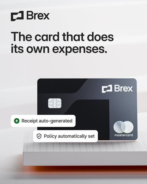
- Format: Product shot with floating UI feature callout chips
- Best for: Showing what software automates without a full screenshot
- Hook: A card that does its own expenses
- Reuse it: Add 2–3 notification-style chips next to your product to prove the claim
Available sizes
What is a feature callout ad?
A feature callout ad is a static image that shows a single product with short text labels pointing to its key features or benefits, usually joined to the product by thin lines. It explains several selling points at a glance without a long caption, which is why it's common for supplements, skincare, electronics and kitchenware.
See all feature callouts ads →Why this feature callouts ad works
- 01
Personified product
The card that does its own expenses makes automation feel effortless and a little magical.
- 02
UI chips as proof
The notification-style labels show real outcomes, turning a claim into a visible result.
- 03
Familiar interface language
Icons and rounded chips mimic app notifications people already trust and understand.
- 04
Clean hierarchy
Headline, card and chips are clearly separated, so the message reads in a logical order.
Full creative breakdown
Who this ad targets
The ad targets finance managers, controllers, accountants and CFOs who spend time chasing receipts, reviewing expense reports and enforcing policies. It also reaches employees and founders who hate filing expenses. The audience is US companies, from startups to mid-market, evaluating expense management or card-plus-software solutions as an alternative to legacy tools like Concur or manual spreadsheets.
Copywriting analysis
The headline personifies the product: The card that does its own expenses. It is playful, specific and instantly understandable, turning a tedious admin task into a benefit the card handles for you. The phrase its own expenses implies that nobody on the team has to do them. The two UI chips carry the supporting copy in product language: Receipt auto-generated and Policy automatically set. They are written like system messages, which adds credibility because they look like what users will actually see. Together, the headline makes the promise and the chips prove it, with fewer than 15 words on the whole creative.
Visual design
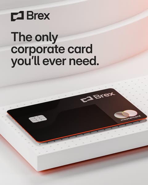
The palette is white and light grey with a subtle orange glow under the podium, keeping the scene premium and calm. The black card stands upright for a confident, front-facing presentation. The two white chips have soft drop shadows and small coloured icons, green for speed and black for security, adding detail without clutter. The dark headline sits in the top third, and the dotted podium surface adds a tech texture. Everything is aligned to create clear visual layers.
How to adapt this template for your brand
- Write a headline that personifies your product doing a tedious task.
- Shoot your product front-facing on a clean podium.
- Create 2–3 UI chips with real system-style messages and icons.
- Float the chips so they overlap the product slightly for depth.
- Use the primary text to explain the workflow behind the chips.
Tips for fintech ads on Meta
On Meta, this creative suits Feed at 4:5 and works well animated, with the chips popping in one by one for Reels. On LinkedIn, target finance and accounting titles and test it as a document or carousel ad with more callouts. For Google Display, keep the chips large enough to read at small sizes or drop to one chip. Test against a version that leads with time saved.
About this creative
This Brex creative explains a software benefit with a physical product and two tiny pieces of interface. The black Brex Mastercard stands upright on a white dotted podium against a soft grey backdrop, with a hint of orange light glowing beneath. Floating in front of the card are two white UI chips styled like app notifications: one with a green lightning icon reading Receipt auto-generated, and one with a shield icon reading Policy automatically set. Above the scene, the Brex logo and headline read The card that does its own expenses. The headline personifies the card as if it handles admin by itself, and the chips act as proof. The ad bridges the gap between a physical card and the software behind it, making Brex's expense automation tangible. It is a clear consideration-stage creative for teams tired of chasing receipts and policing spend.
Meta ad · 338 × 600 · Fintech
Brex Ad: The Card That Does Its Own Expenses
This Brex image ad pairs the black corporate card with two floating UI chips that show automation in action. It is a feature-callout format for Meta and LinkedIn, perfect for SaaS and fintech brands that need to show what software does automatically without a full product screenshot.
Added
All brand names and logos are property of their owners. Adplaylist is not affiliated with or endorsed by these brands.
Details
Ad copy
Primary text
Expense reports, without the reports. Brex auto-generates receipts and applies your spending policy at the moment of purchase, so your team spends and finance closes the books faster.
Description
Automatic receipts and built-in spend policies
On-image text
Brex | The card that does its own expenses. | Receipt auto-generated | Policy automatically set | Brex | mastercard
Headline ideas for this template
- 1Expense reports, without the reports
- 2Receipts that file themselves
- 3Policy built into every swipe
- 4Close the books faster
- 5No more chasing receipts
Meta image ad specs
| Placement | Ratio | Size (px) |
|---|---|---|
| Feed | 1:1 or 4:5 | 1080×1080 / 1080×1350 |
| Marketplace | 1:1 | 1200×1200 |
| Messenger inbox | 1:1 | 1200×1200 |
| Stories & Reels | 9:16 | 1080×1920 |
This template is 1:1. Request 4:5 or 9:16 to cover all placements.