Key takeaways
- Format: Us vs. Them split-screen comparison
- Best for: Challenger brands that beat a known competitor on price or specs
- Hook: US VS. THEM headline with a hollow, weaker-looking THEM
- Reuse it: Keep the split and two stats per side; swap products, colours and numbers
Available sizes
What is a comparison ad?
A comparison ad sets the product against an alternative, such as a competitor, the old way of doing things or a cheaper option, usually in a two-column layout or table. It helps buyers who are already weighing options see quickly why this one is the better choice.
See all comparison ads →Why this comparison ad works
- 01
Hard numbers win
Price and dose are concrete and comparable, so viewers judge the value in under two seconds.
- 02
Blurred competitor
Blurring the rival avoids legal risk and keeps focus on ARRO while still letting pouch users recognise their current habit.
- 03
Visual hierarchy favours us
A solid red US against an outlined THEM and a sharp versus blurred product subtly frames who wins.
- 04
Better on both axes
ARRO is cheaper and has more L-Theanine, so there is no trade-off for the viewer to weigh.
Full creative breakdown
Who this ad targets
This ad targets US nicotine pouch and smokeless tobacco users who already spend money on a daily habit and want to cut back. The green tins hint at pouch brands, so audiences interested in nicotine pouches, vaping, quitting and price-conscious wellness products fit best. It also works for retargeting people who visited ARRO's site but did not buy, since the comparison answers the question of why switch and why now.
Copywriting analysis
There is almost no copy, which is the point. US VS. THEM sets up a contest familiar from countless DTC ads, and the viewer instantly knows to compare left and right. Each side has exactly two data points in the same order, making the comparison effortless. The figures are formatted with the price first in large type and the dose second, reflecting what most shoppers care about first. Omitting a CTA on the image keeps it clean, leaving the action to the Meta CTA button. The risk is that the 50mg vs 40mg claim needs substantiation, and comparative ads should be accurate and current.
Visual design
The torn-paper divider adds a tactile, handmade feel and makes the split more dynamic than a straight line. Pink and red reinforce ARRO's brand; the competitor side fades from cream to a muted green. Heavy condensed red type delivers the headline and stats, while the hollow THEM creates contrast. The sharp pack shot versus the blurred tins is the most persuasive visual device, directing attention entirely to the advertised product.
How to adapt this template for your brand
- Split the canvas into two halves with a distinctive divider such as a torn edge, zigzag or diagonal.
- Put your product sharp and in brand colours on the left; place a generic or blurred competitor on the right.
- Write US VS. THEM in your brand colour, making THEM outlined or faded.
- Choose two metrics where you clearly win and display them in the same order on both sides.
- Verify every comparative claim and keep the competitor unidentifiable to stay within platform and legal rules.
Tips for smoking cessation ads on Meta
On Meta, comparison ads perform well in Feed and as a retargeting creative. Keep the competitor anonymous to avoid ad rejection or legal disputes and make sure numbers are substantiated. Use primary text to state the savings in plain words and a Shop Now CTA. Test a 4:5 version with stats stacked lower and a carousel where card two explains the ingredients. Smoking-related ads may need extra review, so avoid medical claims.
About this creative
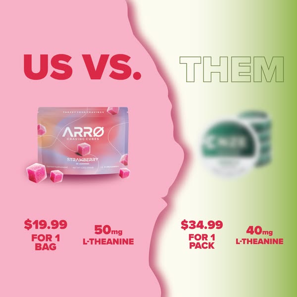
This square comparison ad is divided by a ragged, torn-paper edge into a pink left half and a cream-to-green right half. A huge red US VS. headline sits on the pink side, mirrored by an outlined, hollow THEM on the right, a subtle signal that the competitor is the weaker option. On the left, the ARRO Craving Cubes strawberry pouch is shown crisp and in full colour with loose gummies; on the right, a stack of green tins resembling nicotine pouches is deliberately blurred so the brand is unidentifiable. Under each product, two big red stats tell the story: ARRO at $19.99 for one bag with 50mg L-Theanine, versus $34.99 for one pack with 40mg L-Theanine. There is no other copy, logo or CTA on the image itself, so the numbers carry the entire argument. The design is bold, minimal and instantly readable even at thumbnail size in a fast-scrolling feed.
Meta ad · 338 × 600 · Smoking Cessation
Us vs. Them Comparison Ad: Craving Gummies Example
This square ARRO ad uses a classic Us vs. Them comparison format to position its strawberry craving gummies against a blurred nicotine-pouch-style competitor. Two numbers per side, price and L-Theanine dose, make the case. It is a reusable template for challenger brands selling against a pricier category leader.
Added
All brand names and logos are property of their owners. Adplaylist is not affiliated with or endorsed by these brands.
Details
Ad copy
Primary text
Why pay $34.99 for a pack when you can get more L-Theanine for $19.99? ARRO Craving Cubes give you 50mg L-Theanine per serving in a tasty strawberry gummy. Same goal, smarter price.
Description
$19.99 per bag vs $34.99 per pack. See the difference.
On-image text
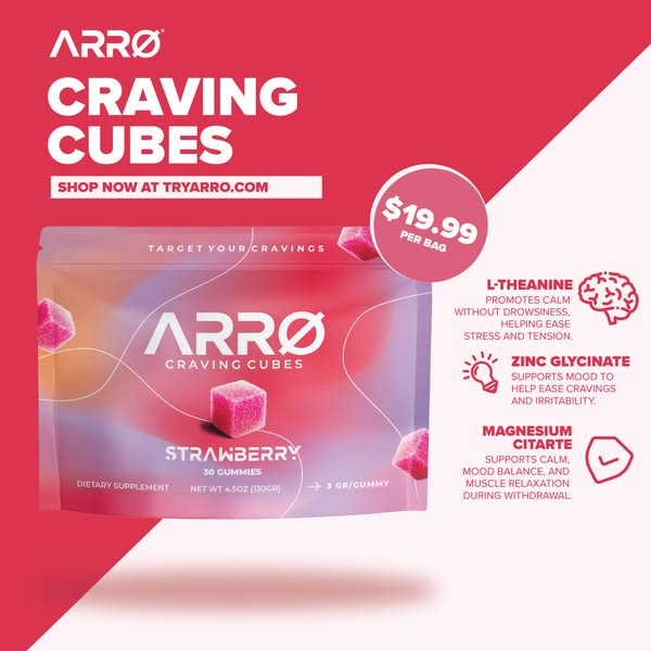
US VS. THEM | $19.99 FOR 1 BAG | 50mg L-THEANINE | $34.99 FOR 1 PACK | 40mg L-THEANINE | Pack: TARGET YOUR CRAVINGS, ARRØ CRAVING CUBES, STRAWBERRY
Headline ideas for this template
- 1Why Pay $34.99 When $19.99 Does More?
- 2More L-Theanine, Less Money
- 3Us vs. Them: The Smarter Way to Beat Cravings
- 4Switch and Save $15 on Craving Support
- 550mg vs 40mg – Do the Math
Meta image ad specs
| Placement | Ratio | Size (px) |
|---|---|---|
| Feed | 1:1 or 4:5 | 1080×1080 / 1080×1350 |
| Marketplace | 1:1 | 1200×1200 |
| Messenger inbox | 1:1 | 1200×1200 |
| Stories & Reels | 9:16 | 1080×1920 |
This template is 1:1. Request 4:5 or 9:16 to cover all placements.