Key takeaways
- Format: Case study carousel opener
- Best for: Retargeting and enterprise consideration campaigns
- Hook: A famous customer name highlighted as the hook
- Reuse it: Name your best-known customer and highlight the outcome in the headline
Available sizes
What is a testimonial ad?
A testimonial ad uses a real customer's words, such as a review, quote or comment, as the main message. It answers a buyer's doubts with social proof rather than brand claims, and works especially well when the testimonial is specific about who the customer is and what changed for them.
See all testimonial ads →Why this testimonial ad works
- 01
Borrowed authority
A globally known consulting firm as a customer instantly reduces perceived risk.
- 02
Highlight guides the eye
The blue marker effect makes the customer and outcome readable at a glance.
- 03
Co-branding signals partnership
Two logos side by side imply a real, endorsed relationship.
- 04
Simple, editorial design
Text-only layout feels like content rather than an ad, which suits B2B audiences.
Full creative breakdown
Who this ad targets
This ad targets HR, payroll and finance leaders at enterprises and multinationals, especially those running payroll in several countries through a patchwork of local providers. They are late in the buying journey, comparing vendors and looking for evidence that a platform works at scale. Showing a recognisable consulting firm as a customer gives risk-averse buyers social proof and helps internal champions build a business case for consolidating payroll with Deel.
Copywriting analysis
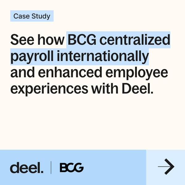
The headline uses a classic case study formula: See how [customer] achieved [result] with [product]. See how invites curiosity and promises a story. BCG adds authority, centralized payroll internationally states a concrete operational outcome, and enhanced employee experiences adds a human benefit beyond cost and efficiency. Ending with Deel ties the result to the product. The Case Study label sets expectations, signalling that this is proof rather than a claim. There is no explicit CTA text; the arrow works as a swipe cue to the results slide, so the copy only needs to earn the next tap.
Visual design
The design is minimal and editorial: cream background, large black sans-serif headline, a light blue label and a matching highlight. Light blue also fills the footer, tying the colour system together. The footer is split into a logo area and a square icon tile with an arrow, a pattern repeated across the carousel. Generous margins and left alignment make it feel like a report cover.
How to adapt this template for your brand
- Get approval from a well-known customer to use their name and logo.
- Lead with a short case study headline that names the customer and the outcome.
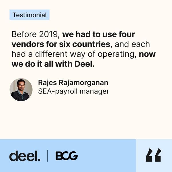
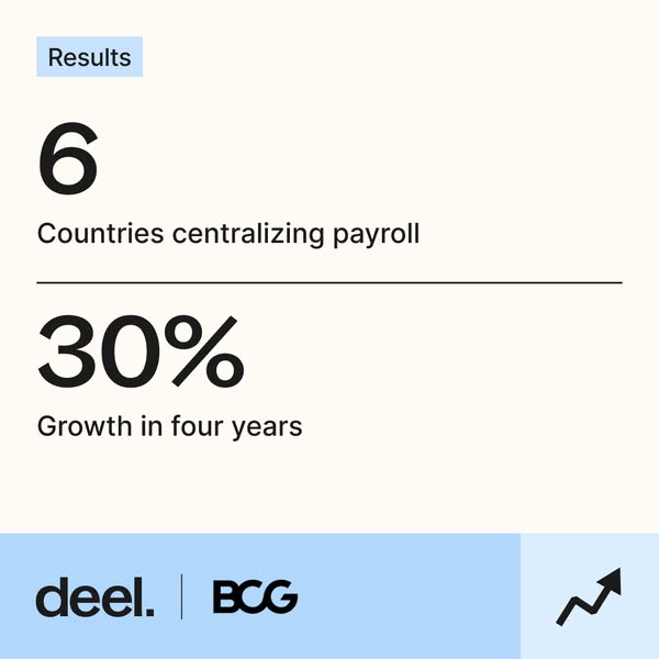
- Follow with a slide of two or three hard numbers and a slide with a named quote.
- Use a co-branded footer with both logos and a consistent icon per slide.
- Run it as a carousel to retargeting audiences and decision-makers in the consideration stage.
Tips for hr software ads on Meta
These slides are designed to run as a carousel. On LinkedIn, use a carousel or document ad so buyers swipe from claim to numbers to quote; on Meta, use the carousel format with one headline per card and the same landing page. Lead with the strongest card, keep the arrow icon as a swipe cue and target HR, payroll and finance job titles. Retargeting website visitors with proof-led carousels usually lifts conversion.
About this creative
This is a typographic, text-only square. On a warm off-white background, a small light blue label at the top left reads Case Study. Below it, a large black headline reads “See how BCG centralized payroll internationally and enhanced employee experiences with Deel.” The phrase BCG centralized payroll internationally is highlighted with a light blue background, like a marker highlight, pulling attention to the customer name and the result. The bottom band is light blue and holds the Deel logo, a vertical divider and the BCG logo, signalling a co-branded partnership. A paler blue square at the bottom right contains a black arrow, inviting a swipe. This is the first card in a three-part carousel followed by results and a testimonial. There are no photos or illustrations; the credibility of the customer name carries the creative, which is typical for late-funnel B2B proof ads aimed at enterprise buyers.
Meta ad · 338 × 600 · HR Software
Deel x BCG Case Study Ad: Centralizing Payroll Internationally
This Deel ad opens a customer proof carousel with a simple case study headline about how BCG centralized payroll internationally and enhanced employee experiences. The clean, co-branded square uses highlighted text, a cream background and a blue footer to turn a well-known customer name into social proof.
Added
All brand names and logos are property of their owners. Adplaylist is not affiliated with or endorsed by these brands.
Details
Ad copy
Primary text
See how BCG centralized payroll across countries and improved the employee experience with Deel. Read the full case study.
Description
Read the Deel x BCG case study
On-image text
Case Study | See how BCG centralized payroll internationally and enhanced employee experiences with Deel. | deel. | BCG | →
Headline ideas for this template
- 1How BCG runs payroll in six countries with Deel
- 2Why BCG chose Deel for global payroll
- 3One payroll for BCG across borders
- 4BCG's playbook for centralized payroll
- 5See how a global firm simplified payroll
Meta image ad specs
| Placement | Ratio | Size (px) |
|---|---|---|
| Feed | 1:1 or 4:5 | 1080×1080 / 1080×1350 |
| Marketplace | 1:1 | 1200×1200 |
| Messenger inbox | 1:1 | 1200×1200 |
| Stories & Reels | 9:16 | 1080×1920 |
This template is 1:1. Request 4:5 or 9:16 to cover all placements.
Browse similar by tag