Key takeaways
- Format: Split-screen before and after with feature pills.
- Best for: Event tech, hardware and SaaS that fix a visible operational pain.
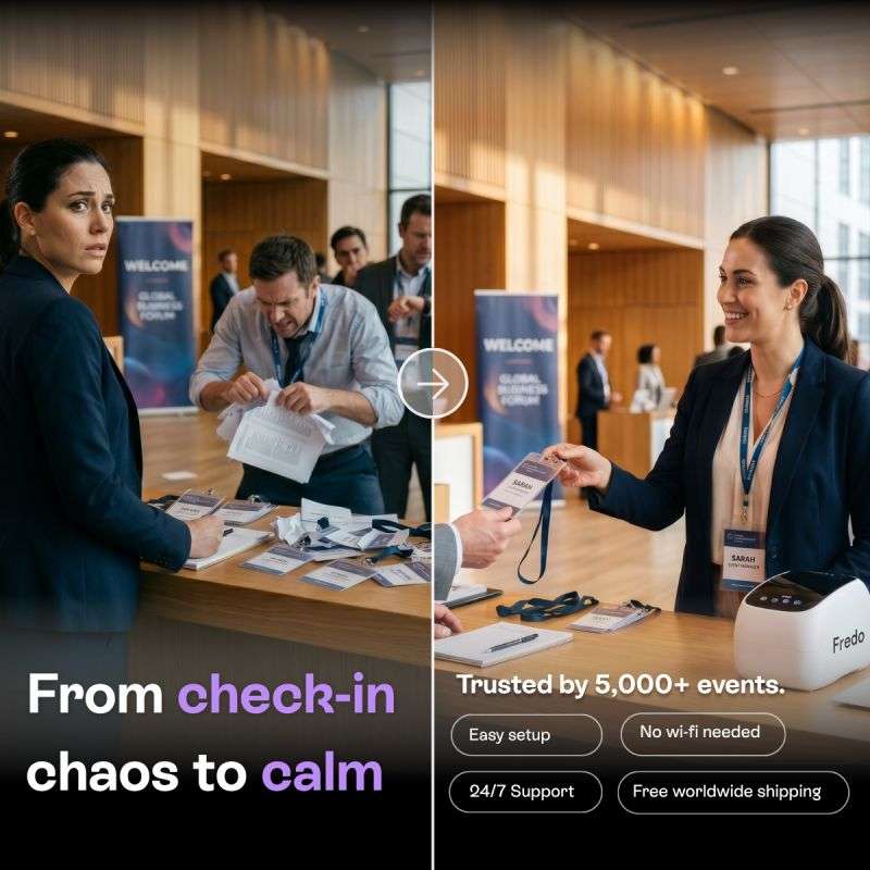
- Hook: A stressed organiser surrounded by badge chaos is instantly relatable.
- Reuse it: Show your customer's worst moment on the left and the calm result with your product on the right.
Available sizes
What is a before and after ad?
A before and after ad shows the same subject in two states side by side, so the result of using the product is visible at a glance. It's common in skincare, cleaning, fitness and home improvement, but claims shown must be realistic and typical to stay within ad platform policies.
See all before / after ads →Why this before / after ad works
- 01
Instant story
The split frame and arrow tell the transformation in under a second, even without reading the copy.
- 02
Relatable pain
Anyone who has run an event recognises the messy badge table and the anxious staff member.
- 03
Social proof
'Trusted by 5,000+ events' reassures buyers that the solution is proven at scale.
- 04
Objection handling
Feature pills answer common worries about setup, connectivity, support and shipping right on the creative.
Full creative breakdown
Who this ad targets
The ad targets event managers, conference organisers, corporate event planners, trade show teams and event agencies who handle attendee registration. They fear long queues, misspelled or missing badges and a poor first impression. Venue operators and association event teams are also relevant. The 'free worldwide shipping' and 'no wi-fi needed' callouts suggest an international audience running events in venues with unreliable internet.
Copywriting analysis
The headline 'From check-in chaos to calm' uses alliteration and a before-to-after structure that mirrors the image. Highlighting 'check-in' and 'calm' in lilac draws the eye to the problem and the promise. 'Trusted by 5,000+ events' adds a concrete number for credibility. The four feature pills are short, scannable benefits that address purchase objections without long sentences. The copy avoids technical specifications and focuses on outcomes and reassurance. Overall it is tight, benefit-led and easy to grasp on a phone screen.
Visual design
A vertical divider splits the frame into two matching scenes, making the comparison obvious. The left side has cooler, cluttered elements while the right feels warmer and tidier. A semi-transparent circular arrow in the centre guides the eye left to right. A dark gradient at the bottom holds the copy. Lilac accents tie the headline to the brand. Outlined pills create a neat, app-like look for features.
How to adapt this template for your brand
- Identify the most visible, frustrating moment your product removes.
- Stage the same scene twice: chaotic before and calm after with your product visible.
- Place a divider and arrow to signal the transformation.
- Write a 'From X to Y' headline and highlight the key words in your brand colour.
- Add a proof number and three or four feature pills to handle objections.
Tips for events ads on Meta
On Meta, use the square in feeds and test a 4:5 crop for mobile. Retarget website visitors with a demo video showing badge printing speed. On LinkedIn, target event management, marketing and operations titles in conference, association and corporate event sectors. If images are AI-generated, check that they meet platform policies and look believable. Promote seasonally before big conference and trade show periods.
About this creative
This square ad from Fredo, an event check-in and badge printing solution, uses a classic before-and-after split. The left half shows a stressful registration desk at a conference called Global Business Forum: a worried woman looks at the camera while a frustrated man digs through crumpled paper and a mess of pre-printed badges and lanyards. The right half shows the same venue transformed: a smiling event staff member calmly hands a freshly printed name badge to an attendee, with a compact white Fredo printer on the desk. A circular arrow button in the centre signals the transformation. At the bottom left, large white text reads 'From check-in chaos to calm' with 'check-in' and 'calm' in lilac. The bottom right lists proof and benefits: trusted by 5,000+ events, plus outlined pills for easy setup, no wi-fi needed, 24/7 support and free worldwide shipping. The images appear AI-generated but tell the story instantly.
Meta ad · 338 × 600 · Events
Event Check-in Ad Example: Fredo Before and After Creative
This Fredo ad sells an on-site badge printing and check-in solution for events. The before-and-after format splits the frame into a chaotic registration desk and a calm, smiling check-in powered by the Fredo printer. Use it as a template for any product that removes a visible pain point.
Added
All brand names and logos are property of their owners. Adplaylist is not affiliated with or endorsed by these brands.
Details
Ad copy
Primary text
Long check-in queues ruin first impressions. Fredo prints name badges on the spot, works without wi-fi and sets up in minutes – so your attendees walk straight in.
Description
Trusted by 5,000+ events worldwide
On-image text
From check-in chaos to calm. Trusted by 5,000+ events. Easy setup. No wi-fi needed. 24/7 Support. Free worldwide shipping.
Headline ideas for this template
- 1No more badge chaos at the door
- 2Check in guests in seconds, not minutes
- 3Print name badges on the spot, no wi-fi needed
- 4The calm check-in 5,000+ events trust
- 5First impressions start at registration
Meta image ad specs
| Placement | Ratio | Size (px) |
|---|---|---|
| Feed | 1:1 or 4:5 | 1080×1080 / 1080×1350 |
| Marketplace | 1:1 | 1200×1200 |
| Messenger inbox | 1:1 | 1200×1200 |
| Stories & Reels | 9:16 | 1080×1920 |
This template is 1:1. Request 4:5 or 9:16 to cover all placements.