Key takeaways
- Format: Split-screen us-vs-them with ticks and crosses.
- Best for: Premium products competing with a mainstream category.
- Hook: Personalised fresh food plan vs. supermarket kibble.
- Reuse it: Contrast your product with the generic category, not a named rival.
Available sizes
What is a comparison ad?
A comparison ad sets the product against an alternative, such as a competitor, the old way of doing things or a cheaper option, usually in a two-column layout or table. It helps buyers who are already weighing options see quickly why this one is the better choice.
See all comparison ads →Why this comparison ad works
- 01
Category, not competitor
Comparing with 'generic supermarket kibble' avoids naming a brand while still making the point.
- 02
Ticks vs. crosses
Three matched pairs make the comparison quick and easy to judge.
- 03
Dog eating vs. empty bowl
An engaged dog on one side and a plain bowl on the other adds emotion to the facts.
- 04
Personalisation hook
'Personalised plan' suggests the food is made for your specific dog.
Full creative breakdown
Who this ad targets
UK dog owners aged 28–55 who currently buy supermarket kibble but are curious about fresh, personalised dog food. They want to do the best for their dog and may feel uneasy about processed ingredients. They respond to clear, factual comparisons and like the idea of a plan tailored to their dog's age, weight and health goals. They tend to research options online and compare reviews before trying something new.
Copywriting analysis
Headlines frame the comparison clearly: 'your dog's personalised plan' feels warm and specific, while 'generic supermarket dry kibble' sounds cold and impersonal. Each tick has a matching cross, which makes the argument fair and logical. Claims are mostly factual but 'filled with processed meals' is a generalisation that some may challenge. The biggest issue is branding: the 'generic' logo and 'Similar ad to <IMAGE 0>' text look like placeholders and must be replaced with the real brand before running. Overall, the tone is clear, friendly and easy to understand at a glance.
Visual design
Cream and deep green halves create a strong, balanced contrast. Navy type on cream and cream type on green keep both sides readable. The left photo is warm and lively, while the right is a flat, uniform top-down shot that feels plain by comparison. Navy ticks and peach crosses reinforce the good-versus-bad message without harsh red. Nothing feels cluttered, which helps the key message land quickly.
How to adapt this template for your brand
- Split the canvas into two contrasting colours.
- Put your product with an engaged pet on one side.
- Show the generic alternative plainly on the other.
- List three ticks and three matching crosses.
- Replace every placeholder with your real brand before launch.
Tips for pets ads on Meta
Comparison ads like this work well on Meta Feed for kibble buyers. For Stories, stack the two sides vertically. Avoid naming competitors and keep claims factual to reduce policy risk. Remove the template text and add a clear logo and call to action. Test this against a testimonial ad to see which drives more sign-ups. Refresh the creative every few weeks to avoid ad fatigue.
About this creative
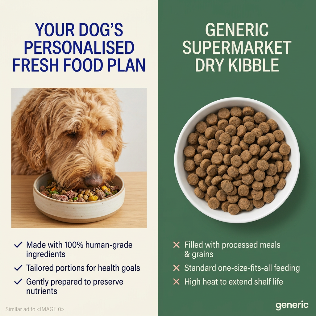
A vertical split-screen. The left half has a cream background with a navy headline in capitals: your dog's personalised fresh food plan. Below it, a photo shows a shaggy apricot doodle eating from a speckled stoneware bowl full of fresh minced meat and vegetables on a wooden surface. Three navy tick points list the benefits: made with 100% human-grade ingredients, tailored portions for health goals and gently prepared to preserve nutrients. The right half has a deep green background with a cream headline: generic supermarket dry kibble. A top-down photo shows a white bowl full of uniform brown kibble. Three peach cross points list the drawbacks: filled with processed meals and grains, standard one-size-fits-all feeding and high heat to extend shelf life. In the bottom-right corner, the word 'generic' appears like a logo, and small grey text in the bottom left reads 'Similar ad to <IMAGE 0>' – both appear to be template leftovers rather than real branding.
Meta ad · 1200 × 1200 · Pets
Fresh Food Plan vs. Kibble Comparison Ad
This comparison ad splits the canvas between a doodle eating a personalised fresh food plan and a plain bowl of supermarket kibble, with three ticks against three crosses. Use it as a template for any premium product competing directly against a cheaper, mainstream category.
Added
All brand names and logos are property of their owners. Adplaylist is not affiliated with or endorsed by these brands.
Details
Ad copy
Primary text
Not all dog food is created equal. Your dog's personalised fresh food plan uses 100% human-grade ingredients, tailored portions for their health goals and gentle cooking to preserve nutrients. Generic supermarket kibble just can't compare.
Description
Personalised fresh food plans
On-image text
YOUR DOG'S PERSONALISED FRESH FOOD PLAN | ✓ Made with 100% human-grade ingredients | ✓ Tailored portions for health goals | ✓ Gently prepared to preserve nutrients | GENERIC SUPERMARKET DRY KIBBLE | ✕ Filled with processed meals & grains | ✕ Standard one-size-fits-all feeding | ✕ High heat to extend shelf life | generic | Similar ad to <IMAGE 0> (template artefact)
Headline ideas for this template
- 1Fresh Plan vs. Supermarket Kibble
- 2Made for Your Dog, Not for Shelves
- 3Why Fresh Beats Dry
- 4Personalised Food Your Dog Deserves
- 5Swap Kibble for a Plan
Meta image ad specs
| Placement | Ratio | Size (px) |
|---|---|---|
| Feed | 1:1 or 4:5 | 1080×1080 / 1080×1350 |
| Marketplace | 1:1 | 1200×1200 |
| Messenger inbox | 1:1 | 1200×1200 |
| Stories & Reels | 9:16 | 1080×1920 |
This template is 1:1. Request 4:5 or 9:16 to cover all placements.
Browse similar by tag