Key takeaways
- Format: Comparison: us vs them on a split screen with matching rows.
- Best for: Challenger brands replacing a common default product.
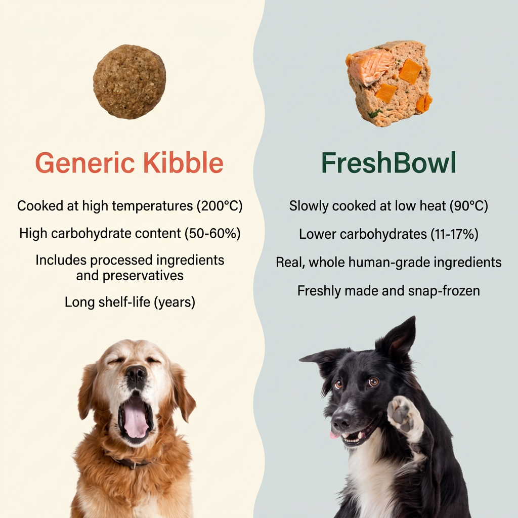
- Hook: A yawning dog vs an excited dog.
- Reuse it: Keep the split, mirror four facts and pick two contrasting pet reactions.
Available sizes
What is a comparison ad?
A comparison ad sets the product against an alternative, such as a competitor, the old way of doing things or a cheaper option, usually in a two-column layout or table. It helps buyers who are already weighing options see quickly why this one is the better choice.
See all comparison ads →Why this comparison ad works
- 01
Numbers make it concrete
200°C vs 90°C and 50–60% vs 11–17% carbs turn vague "healthier" claims into hard facts owners can compare.
- 02
Mirrored rows
Each kibble point has a direct FreshBowl counterpart on the same line, so the eye compares side by side without effort.
- 03
Emotional dog contrast
The bored yawn vs the eager paw adds humour and shows the outcome before anyone reads the text.
- 04
Colour coding
Warning-red for kibble and healthy green for FreshBowl frame the verdict instantly.
Full creative breakdown
Who this ad targets
Dog owners who currently feed dry kibble and have started to question whether it is the best option. Typically 25–50, health-conscious and influenced by human nutrition trends such as low-carb and whole foods. They respond to facts and numbers, read labels, and need a rational reason to justify paying more. The UK-style metric temperatures suggest a UK or European audience.
Copywriting analysis
The copy is built for side-by-side scanning. Every kibble line uses neutral but unflattering facts (high temperatures, high carbs, preservatives, years of shelf life), while every FreshBowl line uses positive sensory words such as slowly, real, whole and freshly. Brackets hold the numbers, which adds proof without cluttering the sentences. "Generic Kibble" avoids naming a competitor, keeping the ad compliant while still positioning against the whole category. There is no offer or CTA on the image, so the creative is purely educational and relies on the post copy for the call to action.
Visual design
A wavy divider gives the split a soft, friendly feel rather than a harsh line. Cream on the left and cool grey-blue on the right separate the two sides while staying calm. Each half has the same structure: food on top, brand name, four facts, dog at the bottom. Cut-out dogs and food on plain backgrounds keep the look clean and modern. Coral and dark green headlines carry the verdict through colour alone.
How to adapt this template for your brand
- Split the canvas in two with a soft divider and contrasting light backgrounds.
- Show the competitor's generic product top left and yours top right.
- Write four matching facts per side, with numbers wherever possible.
- Add a pet with a negative reaction on their side and a positive one on yours.
- Colour-code the headlines, warm red for them and your brand colour for you.
Tips for pets ads on Meta
Comparison ads perform well in Meta feed where people pause to read. Keep claims accurate and avoid naming competitor brands to stay within ad policies. For Reels and TikTok, reveal each row one by one with a swipe transition. Test an added offer strip at the bottom for retargeting audiences, and keep the pure educational version for cold audiences. Pin the source of the figures in comments.
About this creative
A split-screen comparison ad divided by a wavy line. The left side, on a cream background, is labelled Generic Kibble in a coral-red headline. Above it floats a single round brown kibble pellet, and below it a golden retriever yawns with its eyes closed, looking bored. Four lines list kibble's drawbacks: cooked at high temperatures of 200°C, high carbohydrate content of 50–60%, processed ingredients and preservatives, and a shelf life of years. The right side, on a pale blue-grey background, is labelled FreshBowl in dark green. A chunk of fresh food with visible salmon and orange vegetables sits at the top, and a black and white border collie raises a paw at the bottom, looking alert and happy. Its four matching lines read: slowly cooked at low heat of 90°C, lower carbohydrates of 11–17%, real whole human-grade ingredients, and freshly made and snap-frozen. The mirrored structure makes each point easy to compare.
Meta ad · 1200 × 1200 · Pets
Fresh Dog Food vs Kibble: Split-Screen Comparison Ad
This FreshBowl ad splits the frame between generic kibble and fresh food, comparing cooking temperature, carbohydrates, ingredients and shelf life line by line. A yawning dog and an excited dog sum up the difference. It is a comparison format for challenger brands that want to win over buyers of the default option.
Added
All brand names and logos are property of their owners. Adplaylist is not affiliated with or endorsed by these brands.
Details
Ad copy
Primary text
Not all dog food is made the same. Kibble is cooked at 200°C and packed with carbs. FreshBowl is slow-cooked at 90°C with real, human-grade ingredients, then snap-frozen to lock in goodness. Your dog will notice the difference.
Description
Slow-cooked, human-grade, snap-frozen
On-image text
Generic Kibble | Cooked at high temperatures (200°C) | High carbohydrate content (50-60%) | Includes processed ingredients and preservatives | Long shelf-life (years) | FreshBowl | Slowly cooked at low heat (90°C) | Lower carbohydrates (11-17%) | Real, whole human-grade ingredients | Freshly made and snap-frozen
Headline ideas for this template
- 1Why Fresh Beats Kibble
- 2200°C vs 90°C: It Matters
- 3Fewer Carbs, More Real Food
- 4Your Dog Deserves Better Than Kibble
- 5Swap the Kibble for FreshBowl
Meta image ad specs
| Placement | Ratio | Size (px) |
|---|---|---|
| Feed | 1:1 or 4:5 | 1080×1080 / 1080×1350 |
| Marketplace | 1:1 | 1200×1200 |
| Messenger inbox | 1:1 | 1200×1200 |
| Stories & Reels | 9:16 | 1080×1920 |
This template is 1:1. Request 4:5 or 9:16 to cover all placements.
Browse similar by tag