Key takeaways
- Format: Product shot – seasonal swatch grid
- Best for: Launching a seasonal colour range or collection
- Hook: Cozy seasonal headline tied to a shared feeling
- Reuse it: Swap swatches for any multi-variant product line
Available sizes
What is a product shot ad?
A product shot ad puts the product itself at the centre of the frame, usually on a clean or styled background with little text. It works best when the packaging or product is distinctive enough to stop the scroll and the viewer already understands what it does.
See all product shot ads →Why this product shot ad works
- 01
Seasonal emotion first
The sweater-weather headline links the product to a feeling everyone recognises in autumn, which makes the range feel timely.
- 02
Named shades sell
Playful names like Pumpkin Patch and Cherry Mocha add personality and make each design easier to remember and ask for.
- 03
Menu-style choice
The grid lets shoppers compare eight options at a glance, so the click feels like picking a favourite, not deciding whether to buy.
- 04
Colour frame stops the scroll
The bright orange border stands out in a feed and instantly signals autumn without extra copy.
Full creative breakdown
Who this ad targets
This ad targets women aged roughly 18–40 who care about their nails but want to avoid salon appointments and costs. They follow seasonal trends, like refreshing their look when the weather changes, and enjoy browsing collections before choosing. Many will already know press-on nails or gel manicures and want something quick for autumn plans like dinners, weddings or Thanksgiving. The audience is style-aware, shops on mobile and responds to cozy, aesthetic content.
Copywriting analysis
The copy is short and mood-driven. "Made for Sweater Weather" borrows a phrase people already use in autumn, so it reads as relatable rather than salesy. The subline does the positioning work: calling the range autumn's answer to salon nails sets up the comparison with expensive appointments without saying it outright. The shade names carry the rest of the copy, each one a small piece of storytelling that hints at the colour and mood. The sticker adds one useful product detail. The CTA is a plain Shop Now, which suits a catalogue-style ad where the decision is which design, not whether.
Visual design
The design relies on a warm palette of orange, beige and deep browns that matches the product colours. A wide border frames the content like a printed card. Typography mixes a condensed bold serif headline with tracked uppercase sans and italic serif labels, giving an editorial beauty feel. Generous spacing and a consistent grid keep eight products readable on a phone. The outlined button sits clearly at the bottom as the final step.
How to adapt this template for your brand
- Pick a seasonal or occasion phrase your audience already uses as the headline
- Add a one-line subline that positions your product against the expensive alternative
- Lay out 6–9 product variants in an even grid with short, catchy names
- Use a background or frame colour that signals the season or theme
- Highlight one unique feature with a small sticker and finish with a single CTA button
Tips for beauty ads on Meta
On Meta, use the 4:5 portrait size for feed placements to take up more screen space. Pair it with a carousel ad where each card links to a single shade for shoppers who want detail. Retarget past site visitors with this collection view, as they already know the brand and only need a reason to return. Refresh the colour frame for each season to keep the template working all year.
About this creative
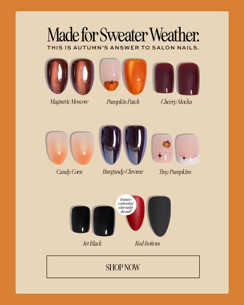
The creative is a 4:5 portrait ad for Glamnetic's autumn press-on nails. A thick pumpkin-orange border frames a soft beige card, giving the ad a warm, seasonal feel before a single word is read. At the top, a bold serif headline reads "Made for Sweater Weather." with a small uppercase subline positioning the range as autumn's answer to salon nails. Below, eight nail designs are shown as pairs of floating tips arranged in a three-three-two grid: Magnetic Moscow, Pumpkin Patch, Cherry Mocha, Candy Corn, Burgundy Chrome, Tiny Pumpkins, Jet Black and Red Bottom. Each pair carries an italic name label, turning the layout into a shoppable menu. A small circular sticker highlights that Red Bottom features a contrasting colour under the nail. The ad ends with an outlined SHOP NOW button. There is no model, no price and no offer; the product range and the seasonal mood do all the selling.
Meta ad · 338 × 600 · Beauty
Glamnetic Autumn Press-On Nails Ad: Made for Sweater Weather
This Glamnetic press-on nails ad presents eight autumn shades as a tidy swatch grid on a beige card framed in pumpkin orange. It is a product shot format built for Meta feeds, and a strong template for any brand launching a seasonal colour or product range.
Added
All brand names and logos are property of their owners. Adplaylist is not affiliated with or endorsed by these brands.
Details
Ad copy
Primary text
Cozy season calls for cozy nails 🍂 Meet our autumn lineup – from Pumpkin Patch to Cherry Mocha. Salon-quality press-ons you can apply in minutes.
Description
Autumn's answer to salon nails
On-image text
Made for Sweater Weather. This is autumn's answer to salon nails. Magnetic Moscow, Pumpkin Patch, Cherry Mocha, Candy Corn, Burgundy Chrome, Tiny Pumpkins, Jet Black, Red Bottom, Features contrasting color under the nail!, SHOP NOW
Headline ideas for this template
- 1Autumn Nails, No Salon Needed
- 2Your Cozy Season Mani Is Here
- 3Fall In Love With These 8 Shades
- 4Sweater Weather Calls For New Nails
- 5Pick Your Autumn Shade In Seconds
Meta image ad specs
| Placement | Ratio | Size (px) |
|---|---|---|
| Feed | 1:1 or 4:5 | 1080×1080 / 1080×1350 |
| Marketplace | 1:1 | 1200×1200 |
| Messenger inbox | 1:1 | 1200×1200 |
| Stories & Reels | 9:16 | 1080×1920 |
This template is 1:1. Request 4:5 or 9:16 to cover all placements.